Feeds:
Posts
Comments

Archive for the ‘Tsimshian’ Category

Last night, I was at the reception for Tahltan artist Alano Edzerza’s new exhibit, “Gift of the Raven.” The show features Edzerza’s work of the last six months. Also on display were a number of pieces by Morgan Green, a recent recipient of the YVR Art Foundation Scholarship and (as she may be tired of hearing) the daughter of Tsimshian master carver Henry Green.

The evening started with a performance of “Raven Steals the Light” by Victor Reece’s Big Sky Multi-Media Storytelling Society. The performance was held in the courtyard of the Waterfall Building, the complex in which the Edzerza Gallery is located. It featured a dancer with suitably nervous bird-like movements and a light mask with mirrors for eyes, and ended with him climbing to an overhead walkway to conclude the performance – all in all, a successful blending of the traditional and the contemporary.

Then, the crowd squeezed inside the gallery for the viewing.

The show did not include any new traditional style work by Edzerza. Otherwise, it was a good representation of the different strains in his work. My main problem was dodging the crowd and finding gaps in it that lasted long enough to snap a picture. Combined with the fact that some paintings were hung high, the result is pictures that are less than professional quality (to say the least), but should give some idea of what was on display.

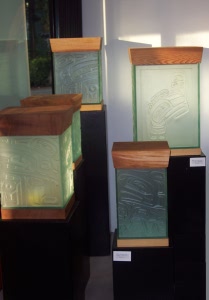
In one corner of the front of the gallery was a collection of Edzerza’s glass boxes:
alano-glass-boxes1

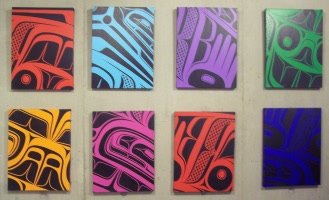
Elsewhere, you could see some of his experiments with color, such as this collection of closeups of traditional formline designs done in the electric colors of pop-art on a back wall:
alano-colors

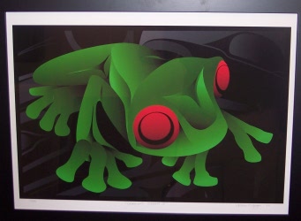
The same pop-art sensibility appeared in a couple of contemporary paintings of frogs, which were inspired, I am told, by a tattoo on a woman’s back:
alano-frog3

But the major works in the exhibit were the multi-panel ones, like this one that was hung near the ceiling, facing the door:

alano-orca-multi

Another orca design, a triptych, was hung just inside the door, and a triptych featuring ravens on the back wall. The raven triptych was especially dramatic, as one of its panel shows:

alano-eagle-triptych2

All these multi-panel works shared features that are characteristic of Edzerza’s work: A three-dimensional contemporary take on traditional Northwest Coast designs, an experiment with color in mainly grayscale designs, and a dramatic sense of movement that is enhanced by the separate canvases and draws your eyes from one to the next.

Morgan Green is not as an experienced an artist as Edzerza, but, in the last year, her work has matured quickly. Previously, the work by Green that I knew best were her leather cuffs and a somewhat over-ornate wolf helmet in the gallery, but the works I saw last night shows some other sides to her work, and an interest in different media that, if anything, is even greater than Edzerza’s.

Green’s works included a wall hanging and a variety of earth-colored ceramics inspired by a recent trip to Arizona and the First Nations work she saw there. A plate depicting Mouse Woman was particularly striking:

morgan-green-mouse-woman-plate

So far as I know, no historical depictions of Mouse Woman survive. But Green’s rendering seems a reasonable one, with features like the ears, the round eyes and the incisors providing the defining features that you would expect in a traditional design. At the same time, placing the design on grainy ceramic creates a pictograph-like effect, all the more so because the formline is hinted at more than fully realized.

Perhaps the most accomplished work by Green on display was a Dogfish Woman robe she had created for an elder. The design was fairly standard (that is to say, more or less a descendant of Charles Edenshaw’s sketch via Bill Reid), but the cutting of the design and the assembly of the robe made for a first rate piece of work. As Green was discussing it with some of the guests, one of them agreed to model it:

morgan-green-dogfish-woman-robe

The evening was a fund-raiser, with a quarter of all sales going to the Vancouver Foundation. How successful the evening was a fund-raiser, I didn’t ask. But from the perspective of spotlighting two promising young artists, no one could have asked for more. I came away from the evening with increased respect for both, and an even greater determination to watch and enjoy their future growth.
Read Full Post »

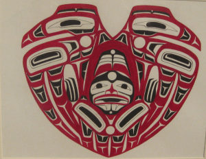
Someday, I am going to jot down the stories of my art acquisitions. There’s the story of how I had to trek to the South Terminal of the Vancouver Airport not knowing the distance, and the story of how a simple bank transfer assumed nightmare proportions as I returned again and again to the bank. And now, after yesterday, I have the story of stopping by the Chateau Granville to pick up Shawn Aster’s “Raven Heart” to the befuddlement and bemusement of the desk clerk and manager, who had obviously never heard of such a thing.

The situation was no one’s fault – just one of those times when the perversity of the universe seems set to stun. I had reserved the painting when I was in Terrace five weeks ago, but I didn’t have the time to get to a bank machine and return before the show closed for the day. As a result, I didn’t pay until after I returned home. We had floated various schemes for delivery, ranging from leaving the piece at the Grayhound station to picking it up at the Spirit Gallery reception yesterday. But an emergency had forced Aster to return home early, and the hotel desk was his improvised way of getting the piece to me.

Now that Aster has won a couple of scholarships at the Freda Diesing School, his work is starting to sell, and people are expecting a successful career ahead of him. As he takes his first steps, I can’t resist a bit of self-congratulation for having discovered the young Tsimshian artist’s work several months ago at the school’s mid-term show (and some mild complementary scorn for those who needed the scholarships to realize the quality of his work).

Many young artists seem to enjoy designs in which Northwest Coast designs are incorporated into the shapes of modern culture. For instance, Latham Mack, another scholarship winner at the Freda Diesing, did a group figure of traditional designs that formed the outline of a Playboy bunny on a T-shirt. In the same way, “Raven Heart” takes two traditional ravens and constrains them in a heart design.

This practice, I suppose, is the extension of the tradition of adjusting a design to fit the contours of the shape it is on – a pole, or a bowl, spoon, hat, or box. The main difference, of course, is that the possibilities for innovation and commentary open up when a modern shape informs the design. In the case of “Raven Heart,” the two ravens resemble a traditional split design, but, when put into a heart, suggest a rather unhappy relationship, the raven of mythology being associated more with promiscuity than faithfulness, and more with clever and expedient lies than the truthfulness that is generally thought to be a necessity for a successful relationship. A confirmation that the relationship is less than smooth is the constrained feathers on the wings that seem almost like bars confining the trapped figure inside the heart — which has a decidedly unhappy look on its face.

It is probably no accident, either, that the piece was first exhibited at a show shortly before Valentine’s Day this year. The piece seems to play one culture against the other, using each to comment sarcastically upon the other.

But what interests me most about “Raven Heart,” like all of Aster’s work that I have seen, is its technical skill. Its form lines do not have the most graceful curves that I have seen, but for the most part they are suitably varied in thickness, and the use of interior U-shapes to minimize the thickness of the intersections is well done. In addition, of course, the use of red as the primary color – a relatively rare practice, traditionally-speaking – is suited to the heart shape.

The design itself is made up of only a few shapes – notably the U-shapes and T-shapes – which vary in length and whose colors are sometimes inverted. The composition has an obvious horizontal symmetry, but it also includes a less noticeable vertical symmetry, made up of groups of threes and fours: three feathers on the stylized wings, three fingers on the trapped figure’s hands (or are they the claws of the ravens?), four interior shapes on the outer wings, and four tail feathers on the bottom. Each side, too, has three large ovoids filled with black. Similarly, the circles at the joints of the wings are balanced by one that might be the tail-bone, while three circles, irregularly shaped, are also at the center of the trapped figure’s design. There is an economy in the relatively few shapes used in the design, and an almost mathematical precision in the vertical symmetry that is rare in any Northwest Coast art, but especially rare in an artist over thirty.

I have talked off and on with Aster about a commission, and I still hope to see it one day. Meanwhile, “Raven Heart” is a masterful small performance that makes me believe that Aster has a future every bit as promising as everyone is saying.

aster

Read Full Post »

I’ve always thought that Beau Brummel has a lot to answer for. He’s the one who, in the early 19th century, set the standards that reduced the color palette in men’s clothes to brown, black, gray, and dark blue and – even worse – restricted men’s jewelry to rings, watches, cuff links and tie pins. No doubt his look was an improvement on Prinny’s excesses, but what Beau did was to condemn us to drabness. And if, like me, you don’t wear ties or French cuffs or carry a wrist watch because you look at it every twenty seconds if you do, your choices are even more limited. But, yesterday, I found a way around these restrictions that nobody can find fault with: I took home a three inch West Coast bracelet.

I suppose I could have opted for the full Scottish effect for formal wear. Never mind that I don’t have the remotest connection to a tartan; kilts suit short-legged, barrel-torsoed men like me, and, like my late friend Paul Edwin Zimmer, I could have used an unclaimed one like Ancient MacAlpin. And Scottish regalia has the advantage of allowing you to wear more jewelry, although too much of it has banal thistle designs and you have to be careful that nobody that nobody calls your skean dhu a concealed weapon. But kilts are even more trouble than suits, and fabulously expensive as well.

I suppose, too, that I could have got a tattoo. But tattoos are too permanent for my liking, and good ones surprisingly rare. And why go through discomfort for the sake of mediocrity?

Instead, for almost twenty years, I’ve wanted a thick West Coast copper bracelet. At least in British Columbia, such bracelets are works of art, thanks to the fame of artists like Bill Reid, and nobody is going to make tiresome remarks about effeteness if you’re lucky enough to have one to wear (not that I would care if they did; my identity as a straight male is well-established, thanks very much). Not only First Nations men, but men of every ethnicity can wear West Coast bracelets and nobody thinks twice about it – everyone’s too busy envying them.

But most West Coast bracelets you see are in silver or gold, metals that don’t catch my eye nearly as much as copper, even if they are more expensive. Besides, although I know that modern West Coast art is a blend of First Nations traditions and modern metal work techniques, copper seems more appropriate because the local cultures did work copper before their first contact with Europeans.

Moreover, few bracelets in any metal are more than an inch and a half wide, and most are made for the tourist trade. What I wanted was an original work of art, on a surface whose size would do the design full justice, and a weight that I could never forget while it was on my wrist. And for years I couldn’t afford one, although I came close once or twice to placing an order.

But in December, I suddenly had the the spare cash. I had long since narrowed down the shops to order from to two or three that were far above the watered down traditions in the Gastown tourist shops. Further investigation showed that Coastal Peoples in Yaletown was the only shop among those known to me that would take custom orders, so I placed my order there.

My choices were limited by a lack of artists who work in copper. However, I did have three or four possible artists – assuming any were available for a commission. After careful consideration, I decided I wanted Tsimshian artist Henry Green. Not only is Green a versatile artist who works in several media – his carved masks are especially fine – but all his work had a strong sense of line that the others lacked.

The Coastal People staff were polite, but non-committal about whether Green would accept the commission. However, a few days later, one emailed to tell me that he could do the piece in about a month. I rushed to put a deposit down before his schedule filled.

Then came the design decision. Not wanting to be too exacting for fear of receiving uninspired or merely competent work, I diffidently suggested that the design include Raven and Mouse Woman. Raven, of course, is the trickster, while the lesser-known Mouse Woman is the keeper of tradition and domestic values, so I thought the combination an interesting contrast. So, apparently, did Green, since he told Coastal Peoples that he liked the idea.

We did bandy about the idea of receiving a sketch from Green of the design, so that I could approve it. However, when I learned that it would be only a sketch and not a finished design, I decided it was not worth the additional sum he would charge. I abandoned the idea and settled down to wait.

A month passed, and I heard nothing. I didn’t want to get impatient. Art doesn’t work well to timetables, and, besides, the holiday season had intervened, yet I was nearly shaking in anticipation.

Then, yesterday afternoon, I received a call that the bracelet was ready. I soon abandoned the pretense of working, and knocked off early to pick it up; one of the advantages of being freelance is that you rarely have to work to schedule.

The work was – overwhelming, in a word. Green had created not only an inspired work of art, but, between the size, metal, and design, a unique one. It was also a well-engineered one, since Green had chosen the gauge of the copper to be thick enough for strength, yet thin enough to be pliable and relatively light. Even the staff at Coastal Peoples seemed impressed. I told the clerk to tell him that I was extremely satisfied, and left wearing it.

I plan to wear it in the future whenever possible, until it becomes my trademark for the rest of my life. Living with art is always uplifting, and, while Green did all the work, as the patron of the work with my stipulations, I can’t help feeling that I played a small part in its creation. And to have waited so long to get something that exceeded my expectation means that I couldn’t be more pleased to have this cuff of copper on my wrist

Someday, I might get a matching bracelet for my other wrist, and cement my reputation for eccentricity. Meanwhile, I keep looking at the design of Mouse Woman in the center and raven below her, and marveling at the bit of metallic beauty that has come into my life.

Bracelet by Henry Green

Read Full Post »

« Newer Posts