Feeds:
Posts
Comments

Archive for the ‘Latham Mack’ Category

I first became aware of Nuxalk artist Latham Mack when I visited Terrace for the Freda Diesing School graduate exhibit. He had already won one YVR scholarship, and would go on to win another, and his paintings and drawings were among the best in the class – so much so that the teachers gave him the privilege in his second year of working in the Nuxalk rather than the Northern tradition. In fact, when he showed me a sketch for a painting of the Four Carpenters, I said I would buy it sight unseen. However, that painting was never done, and at the time his sculptural work was no more than competent, the best feature of his masks being the painting.

lmgbs2

Mack’s patience and hard work, though, mean that his story today is very different. Under the mentorship of Dempsey Bob, Mack has become one of the outstanding carvers of his generation, and the prices of his work should soon edge beyond my affordability. So when he showed me his relatively inexpensive “Grizzly Bear Spoon” outside Dempsey Bob’s “North” exhibit in 2014, I jumped at the chance to buy. I had to wait six months while the spoon was on display at the Richmond Art Gallery, but in early 2015 I finally carried home an example of his work.

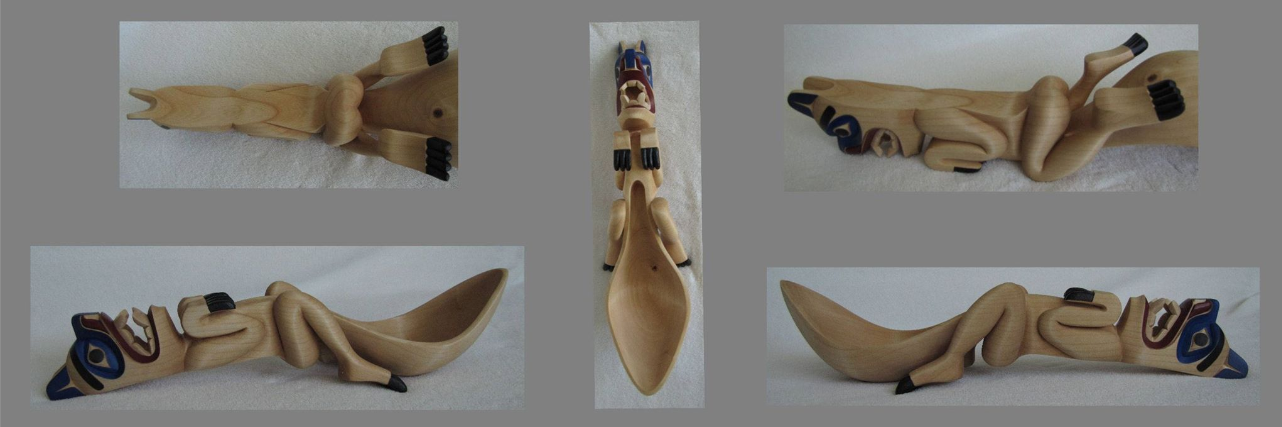
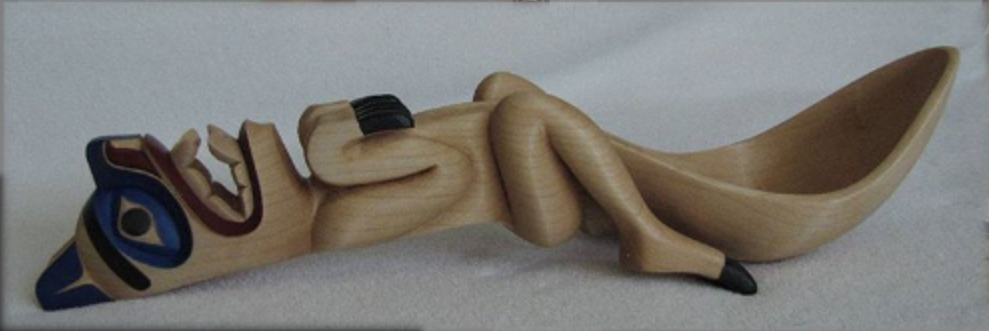
My understanding is that Mack began the spoon while still at the Freda Diesing School and finished it in 2014. Certainly its quality and execution is closer to that of his current work than his student masks. If I didn’t know Mack’s connection to Bob, I might have guessed it by the minimal paint job, although Mack does use what I mentally tag “Nuxalk Blue” around the eyes and ears. The wood is soft to the touch, and the lines of the paint completely straight, both signs of a highly-finished work (and, in the case of the paint, a steady hand. What I especially like is that, with the minimal paint, the contours of the grain because as much a part of the result as the carving.

Adding to the piece are the proportions and curves of the spoon’s bowl. They are framed by the legs, with the knees marking where the bowl begins to widen, and the descent of the bowl’s curve by the calves. Further up the handle, the start of the bowl is framed by the claws.

Most of the body is simply carved, with the roundness of legs and arms emphasizing the wood’s grain. But what really catches the eye is the depth of the carving on the head. Typically, deep carving is a sign of excellence in northwest coast carving, and this spoon is no exception. The tip of the chin is at least three centimeters from the base of the neck, and the inside of the mouth slightly more. The lips are half a centimeter thick, the eye-sockets symmetrically about the same. The result is dramatic, especially when painted, and even more so in dim light.

Currently, “Grizzly Bear Spoon” sits on a tea trolley in my living room, where I pass it twenty times a day and my glance can hardly help but linger on it. I suppose it is a minor work compared to Mack’s larger pieces, but between the curves, the grain, and the depth of the carving, I consider it every bit as much an accomplishment.

lmgbs

Read Full Post »

Which upcoming First Nation artists in the Pacific Northwest are worth having a look at? Giving an answer is not easy, because traditional art forms and contemporary variations are thriving as never before.

Still, if I had to give answer, these are the seven artists I would tell people to look for. Many post their work on Facebook, or somewhere else on the Internet:

  •  Mitch Adams (Haida): Adams has made a specialty of miniatures – everything from masks to combs and usable pipes – and of exploring different kinds of woods – including ebony and laminated blocks in which the layers substitute for paint. However, his best work so far has been in carving sculptures about thirty to forty centimeters high.
  •  Morgan Green (Tsimshian): Many Northwest Coast artists show versatility, but few can match Green. Her work includes cloth and leather design, wood carving, ceramics, and, more recently, metal work. Although in the past she seemed more interested in experimenting with new media than in developing her art, for the past couple of years, she has focused on jewelry and metal sculpture.
  •  Latham Mack (Nuxalk): Mack first attracted attention at the Freda Diesing School for his design work. However, since graduating, Mack has continued to apprentice with Dempsey Bob, and his discipline and carving is starting to reach the same standards as his designs.
  •  Kelly Robinson (Nuxalk, Nuchunulth): Robinson began as a painter, but since branched out into jewelry and carving. His work in both of his traditions has a strong sense of individuality, but in Nuchunulth style, he has the distinction of being one of the first to treat his subject as high art, rather than historical re-creation.
  • Todd Stephens (Nisga’a): As a carver, Stephens still needs practice, but few artists of any experience can match him as a designer. Study the details of his paintings, such as the different ways that the join of two formlines is thinned out, and you will soon know most of what you should be looking for.
  •  John Wilson (Haisla): Primarily a carver, Wilson is known for the speed with which he can finish high-quality masks. More recently, he has landed commissions for corporate logos and artwork. He is rapidly becoming the best Haisla artist since Lyle Wilson, but, right now, his work is extremely reasonably priced.
  •  Carol Young (Haida): The first winner of the Freda Diesing School’s Mature Student Award, Young first emerged as an artist to watch during her second year at the school, when she started doing naturalistic, unpainted masks. Since then, she has gone from strength to strength with more traditional carvings, some painted, some not. Once or twice, she has introduced female themes into her work.

Other artists who are less successful (so far) but still worth searching out include:

  •  Sean Aster (Tsimshian): Aster is one of the strongest designers who has graduated from the Freda Diesing School. Unfortunately, he does not seem to have marketed his work as well as it deserves.
  • Cody McCoy(Salishan): McCoy has won two YVR art awards, but he is marketing his work in both First Nations galleries and in mainstream shows as surrealism. The best of his work is strikingly original, with traditional forms half-hidden in the thick, restless brush strokes.
  •  Colin K. Morrison (Tsimshian): Morrison is an outstanding carver. However, he only produces a few pieces a year, so the danger is that he might eventually choose another way to earn a living.
  •  Chazz Mack (Nuxalk): Well-known for his design work, Mack seems to do much of his work for family and friends, instead of making many attempts to develop his reputation.
  •  Nathan Wilson (Haisla): Wilson’s high-standards of craft are obvious, but his design sense is sometimes no more than adequate and could use more individuality. However, sooner or later, I expect consistently strong work from him.

Neither of these lists is anything like complete. There are always promising artists whose work does not appear in Vancouver or Victoria, or in galleries anywhere, so I am sure to have missed some. If so, my apologies – chances are, my ignorance explains any omissions, not any judgment of quality.

Read Full Post »

I have read about and seen something of the culture of the Haida, Tsimshian, Nisga’a and other First Nations of the northern British Columbia coast. However, I know little about the Nuxalk of the central coast beyond the fact that the nation prefers not to be referred to as the Bella Coola, as they once were. For that reason, when Latham Mack, one of this years’ graduates of the Freda Diesing School danced a Nuxalk mask, I was an attentive member of the audience.

I am used to thinking of Latham Mack, who twice won the YVR Art Foundation scholarship, as a designer more than a carver. Certainly, he has done far more designs than masks to this point, including a limited edition print. However, as part of his final work in the Freda Diesing program, Mack finished two Thunder masks, a blue one for the year end exhibit and the upcoming  show at the Spirit Wrestler gallery, and a black one that he has announced that he will keep in his private collection.

Both masks reflect the story of the four brothers who saw a dancing figure on the mountain who created the thunder – an important story in the Nuxalk tradition. The hooked nose and flaring nostrils are a traditional part of the figure’s depiction.The small branches attached to the head, presumably to suggest lightning, are also traditional, although Mack’s mask makes greater use of them than several others that I’ve seen pictures of. This tradition, as Mack emphasized to me, is separate from the Thunderbird of the Kwakwaka’wakw or other First Nations, with the central figure representing the spirit of the storm.

Latham Mack tells me, “Two major dance rituals make up our winter dance ceremonies, the Sisaok (ancestral family dances) and the Kusiut (secret society ceremonies). The Thunder dance is performed by members of the Kusiut society. According to Bella Coola belief, the supernatural ones in the upper land resemble human beings in performing Kusiut dances. Corresponding to the prowess of his patron, the dance of his human protégé is one of the most important Kusiut rituals. Only the strongest of course danced the Thunder because of the movements and physical fitness you had to be in to actually dance it. Only the families who owned the story actually danced it, but as the years have gone by, we have lost the identity of those owners. So now it’s basically owned by the whole Nuxalk people.”

Mack goes on to say that, “The dance of Thunder can be performed with four, two or one masked dancers, depending on the prerogative of the protégé. When the dance is done with four Thunders, these represent the four brothers in the oral tradition. Numerous dances lead up to the Thunder dance, the Herald introduces the dance of Thunder. He beats his stick on the floor and announces the impending Thunder dance.”

Many dances can lead up to the Thunder dance, but, in this case, the performance was divided into three sections, each introduced and narrated by a member of Mack’s family who also provided a rattle accompaniment.

Since the mask had never been used before, the ceremony began with a blessing of the mask by sprinkling down over it.

Then, before Mack’s actual dance, three female members of his family prepared the area in which he would dance with their own dance. It was a stately dance, done with upraised palms and constant circular steps. The narrator explained that this preparation was a traditional role for women in Nuxalk dances.

Then Mack danced. He wore an apron threaded with loose pieces of wood that he shook for percussion, and wooden clappers on his back.

Frequently, he threw himself down on his knees and climbed to his feet again.

His hands and lower arms made constant flickering gestures, as if to shoo people away, but actually to bestow blessings upon the audience.

It was an energetic dance, enough to scare several young children at the front of the audience, who quickly moved away. He also wore cuffs around his ankles and wrists and the modern innovation of knee pads (which was wise, since he was dancing on a concrete floor, and would have otherwise damaged his knees). It was an obviously exhausting performance, powerful and contrasting sharply with the graceful motions of the women’s dance a few moments before

All too often, those of us who are not directly involved in First Nations culture can forget that the masks that we admire have a ceremonial purpose — or are supposed to have. Mack’s dance was a small reminder of this basic fact, and left me wondering where I could find more about Nuxalk culture.

(Note: Ordinarily, this dance is not photographed, but Latham Mack’s grandfather, Lawrence Mack (Lhulhulhnimut), a chief of the Grizzly clan from the ancestral village of Nusq’lst gave permission for those in attendance to photograph it. He also graciously gave me permission to post the pictures I took on this blog. Needless to say, any mistaken cultural references here are due to my ignorance or to lapses in my memory, and not to his kindness. Should anyone see any mistakes, please let me know so that I can correct them.).

Read Full Post »

This was only the second year that I attended the Freda Diesing School’s year end exhibition, but the show has become a must-see for me. For one thing, it is one of the largest exhibitions of Northwest Coast art in any given year. For another, I never know what I might find, either because a student is unknown, or has taken a giant leap forward in their understanding of their art.

The 2010 show was slightly smaller than the previous year’s, and emphasized carving more than design, although a few limited edition prints and drawings were available up in the loft, as well as a sampling of giclee prints by second year student Mitch Adams. But in compensation, the level of carving was higher than last year, probably because, instead of specifying that each student submit three pieces to the show, the teachers urged students to focus on producing their best work, and starting it early (even so, there were many groans about last minute all-night sessions).

Close to the door were masks by people whose work I have bought in the past. John Wilson contributed his hawk woman mask to the show, which I had seen pictures of, but was glad to see in person:

Wilson also contributed a large spoon, whose beaver handle included more detail work than I had seen before in his work:

Besides Wilson’s mask hung Colin Morrison’s second mask, whose red design made the wood look like a sun-tan, and contrasted with the white hair he used:

Moving on from Wilson’s and Morrison’s masks, I quickly discovered work from artists I remembered from 2009. Previous YVR award winner Shawn Aster, whose main interest seems to be design rather than carving, contributed a mask whose interest is largely in the painting:

Second year Metis artist Mathew Daratha was one of the more prolific contributors to the show, displaying several masks, such as this one:

Still another second year student, Latham Mack, the two-times recipient of the YVR Award, was allowed to carve in his family’s traditional Nuxalk style, producing a strikingly different Thunder Mask:

Mack also danced a similar mask after the graduation ceremony.

But perhaps the most development among the second year students was shown by Sheldon Dennis, whose carving showed a considerable advance over his work last year, as well as a strong sense of originality:

Female students continue to be a minority at the school, but those enrolled in the first year class this year made a strong showing. Cherish Alexander showed a talent for combining feminine faces with bold designs:

Carol Young, the winner of the first Mature Student Award, showed a similar interest in women’s faces, and added a traditional labret to indicate high status in one of her masks:

Another first year female student, Nina Bolton chose a more traditional shape for her mask, but gave it a strong, contrasting design when she painted it:

Some of the most striking work in the show was created by Chazz Mack, Latham Mack’s cousin. Chaz Mack include two pieces in the show: a small print, and a mask whose painted design shows a strong sense of line in its curves:

However, if the show had a single outstanding piece, it was Mitch Adams’ “Blue Moon Mask.” The piece was the despair of at least one of the school’s teachers, all of whom work in the northern style and favor masks with much less paint than “Blue Moon Mask,” but its clean lines and carefully selected palette made it a crowd favorite, with at least half a dozen people clamoring to buy it:

When Adams agreed to sell it to me, several other would-be buyers frankly expressed their jealousy, and cursed their lack of initiative; apparently, I was the only one who actually asked Adams if he was firm about the Not For Sale label.

In fact, if the show had a fault, it was that most of the best pieces were labeled as not for sale for one reason or the other. If I had had my way, I could have returned home with another three or four pieces from this years’ show.

However, that’s a selfish wish. Many of the pieces marked as not for sale were reserved for the upcoming Northern Exposure show at Vancouver’s Spirit Wrestler Gallery. For many students, the show is their first chance to display their work to a large audience, so I can hardly blame them for withholding their work from sale. All of them thoroughly deserve that chance, and I hope that I will have many chances in the future to buy their work.

Read Full Post »

Someday, I am going to jot down the stories of my art acquisitions. There’s the story of how I had to trek to the South Terminal of the Vancouver Airport not knowing the distance, and the story of how a simple bank transfer assumed nightmare proportions as I returned again and again to the bank. And now, after yesterday, I have the story of stopping by the Chateau Granville to pick up Shawn Aster’s “Raven Heart” to the befuddlement and bemusement of the desk clerk and manager, who had obviously never heard of such a thing.

The situation was no one’s fault – just one of those times when the perversity of the universe seems set to stun. I had reserved the painting when I was in Terrace five weeks ago, but I didn’t have the time to get to a bank machine and return before the show closed for the day. As a result, I didn’t pay until after I returned home. We had floated various schemes for delivery, ranging from leaving the piece at the Grayhound station to picking it up at the Spirit Gallery reception yesterday. But an emergency had forced Aster to return home early, and the hotel desk was his improvised way of getting the piece to me.

Now that Aster has won a couple of scholarships at the Freda Diesing School, his work is starting to sell, and people are expecting a successful career ahead of him. As he takes his first steps, I can’t resist a bit of self-congratulation for having discovered the young Tsimshian artist’s work several months ago at the school’s mid-term show (and some mild complementary scorn for those who needed the scholarships to realize the quality of his work).

Many young artists seem to enjoy designs in which Northwest Coast designs are incorporated into the shapes of modern culture. For instance, Latham Mack, another scholarship winner at the Freda Diesing, did a group figure of traditional designs that formed the outline of a Playboy bunny on a T-shirt. In the same way, “Raven Heart” takes two traditional ravens and constrains them in a heart design.

This practice, I suppose, is the extension of the tradition of adjusting a design to fit the contours of the shape it is on – a pole, or a bowl, spoon, hat, or box. The main difference, of course, is that the possibilities for innovation and commentary open up when a modern shape informs the design. In the case of “Raven Heart,” the two ravens resemble a traditional split design, but, when put into a heart, suggest a rather unhappy relationship, the raven of mythology being associated more with promiscuity than faithfulness, and more with clever and expedient lies than the truthfulness that is generally thought to be a necessity for a successful relationship. A confirmation that the relationship is less than smooth is the constrained feathers on the wings that seem almost like bars confining the trapped figure inside the heart — which has a decidedly unhappy look on its face.

It is probably no accident, either, that the piece was first exhibited at a show shortly before Valentine’s Day this year. The piece seems to play one culture against the other, using each to comment sarcastically upon the other.

But what interests me most about “Raven Heart,” like all of Aster’s work that I have seen, is its technical skill. Its form lines do not have the most graceful curves that I have seen, but for the most part they are suitably varied in thickness, and the use of interior U-shapes to minimize the thickness of the intersections is well done. In addition, of course, the use of red as the primary color – a relatively rare practice, traditionally-speaking – is suited to the heart shape.

The design itself is made up of only a few shapes – notably the U-shapes and T-shapes – which vary in length and whose colors are sometimes inverted. The composition has an obvious horizontal symmetry, but it also includes a less noticeable vertical symmetry, made up of groups of threes and fours: three feathers on the stylized wings, three fingers on the trapped figure’s hands (or are they the claws of the ravens?), four interior shapes on the outer wings, and four tail feathers on the bottom. Each side, too, has three large ovoids filled with black. Similarly, the circles at the joints of the wings are balanced by one that might be the tail-bone, while three circles, irregularly shaped, are also at the center of the trapped figure’s design. There is an economy in the relatively few shapes used in the design, and an almost mathematical precision in the vertical symmetry that is rare in any Northwest Coast art, but especially rare in an artist over thirty.

I have talked off and on with Aster about a commission, and I still hope to see it one day. Meanwhile, “Raven Heart” is a masterful small performance that makes me believe that Aster has a future every bit as promising as everyone is saying.

aster

Read Full Post »

Most Saturdays, noon sees me barely staggering out to the gym. But today, noon or shortly after saw us arriving in Gastown for the reception to mark the opening of the Northern Exposure 2009 show at The Spirit Wrestler Gallery. The show is an exhibit of the graduating class of the Fred Diesing School of Northwest Coast Art, plus this years’ scholarship winners. It has already become a tradition in the three years that the school has existed.

With 19 carvings and no graphics, the show was a subset of the graduation show I saw in Terrace, which had some 75 pieces. One or two second year students were missing, as well as most of the first year, including some artists like Mitch Adams or John Wilson who I’d rate above some of those who were represented. Still, space was limited, so some way of reducing the numbers was probably unavoidable.

At any rate, the reduced number also had the benefit of allowing you to pay close attention to each piece – something that is impossible with four times the number. It was especially interesting to see the graduates’ work beside that of their teachers, Stan Bevan and Ken McNeil. That way, you could see the teachers’ influence, and which students were on their way to establishing their own style.

To my eye, the exhibit was somewhat weaker than last years’, which included the work of Dean Heron, who is rapidly becoming one of the major up and coming young artists in the Northwest Coast Tradition. However, the show included the paddles I had admired in Terrace by Latham Mack and Shawn Aster. Another standout was Mack’s “Northern Beauty” mask with its striking painting and individualistic detailing of the nostrils and mouth.

northern-beauty

I also appreciated two samples of Reynold Collins’ detailed, often intricate work. While I think Collins’ work would be improved by more finishing and greater attention to the grain, his work never suffers from the clumsy blank spaces found in many of the other students’ work and shows a vividness of imagination that makes me suspect it is only a matter of time until I find the right piece of his work to buy.

reynold-collins

Only a half dozen students were at the reception, and their time was in demand. However, because the event was smaller than the graduate show, it was easier to have a few words with them and find what motivated them. I talked briefly with Sophia Patricia Beaton, Darryl W. Moore, and Reynold Collins, each time finding something in the conversation to bring me back for another look at the pieces they were exhibiting.

Last years’ show, as well as the work of other recent graduates was priced somewhat high – a mistake that means that the pieces do not sell, and that the artist is tempted to try to charge prices elsewhere that their reputation cannot sustain. By contrast, this year, the students seem to have priced their own work, and, thanks to the guidance of their teachers, this year, realism prevailed. Most of the pieces were under $1400, and only one over $2000. This realism seems to have helped; as I write seven hours after the start of the reception, some six of the pieces in the show have sold, including two each by YVR award-winners Todd Stephens and Shawn Aster. Not bad for a day’s display.

Especially at realistic prices, the show cannot be much of a money-maker for Spirit Wrestler, which often sells works by Robert Davidson or glass artist Preston Singletary for tens of thousands of dollars. In fact, when the cost of publicity, reception and staff wages are taken into account, the show might even cost the gallery money. That makes the show a public-spirited effort, or at the very least, a long-term investment in the next generation of artists.

Certainly, it means a considerable amount to the artists, many of whom have limited funds and some of whom had to go to some effort to get to Vancouver. But, after several days that included the YVR ceremony, and a tour of several local galleries and a CBC interview for the award-winners, the reception was clearly the highlight of their trip. Many said as much, and their sincerity was unquestionable. The reception gives them a taste of the lives they would like to live – and, thanks to Spirit Wrestler, for some of them, those lives may now be that much closer.

Read Full Post »

“How does this compare to a show down south?” John Wilson asked me last week, shortly after I arrived at the Freda Diesing School Student Art Exhibition in Terrace. He seemed surprised when I told him that a 23 person show with some 75 pieces almost never happened, but it’s true. The annual show is one of the largest annual exhibits of modern Northwest Coast Art anywhere.

The show lasted only two days, with a private viewing for friends and family on Friday and a public viewing on Saturday. The location is the Freda Diesing Studio on the Terrace campus of Northwest Community College, a well-lit building with a large lower floor ordinarily occupied by work benches and a loft for a more conventional class room setting:

fd-studio1

Just inside the door, above the table with the show catalog and price list were a few prints by Freda Diesing herself, including a self-portrait mask:

fd-self-portrait

These works were not for sale, but stood as tutelary spirits of the show – or, more precisely, as the standards to which the students should aspire.

Several months ago, I reviewed the school’s mid-term show via a collection of pictures sent to me by John Wilson. That show was mostly painting and sketches, the first year class in particular having not begun its study of carving at the time. By contrast, the year-end show had a few two-dimensional pieces, but consisted largely of paddles, spoons, and masks.

Painted paddles are closer to two dimensional than three dimensional works, so I was not surprised when two of the best-designed paddles were from Shawn Aster and Latham Mack, two artists who were among the standouts at the earlier shows and scholarship winners at the graduation ceremonies that accompanied the private viewing:

shawn-aster-paddle

latham-mack-paddle

However, making the transition from the two-dimensional craft of painting to the three-dimensional one of carving does not always comes easily, and many students are still making it. Latham Mack, for instance (who as a Nuxalk, is learning his second style of carving), is well on the way, using the same blue that I am starting to recognize as characteristic of his two-dimensional designs:
latham-mack

By contrast, a mask by Shawn Aster shows a sense of surfaces, but seems more tentative, with a shallowness in the carving and a thinness of line that makes you only appreciate the mask up close, as seen in this (unfortunately cropped) picture:

shawn-aster-mask

A similar lack of ease in three dimensions is true of Todd Stephens, another scholarship winner from whom I’ve bought several paintings:

todd-stephens

Other students showed similar learning curves – and, as might be expected in a student show – a certain tendency to conformity – although Norman McLean, Sr., in a triumph of social sensibility over aesthetics did do a bright pink mask, as well as a spoon with a more discrete pink ribbon around the handle as fund-raisers for breast cancer. Still, there were some interesting pieces here and there.

Sophia Patricia Beaton, another scholarship winner, had only one piece in the show, but the wavy hair and the obviously feminine face and the labret were original enough to make me wonder what the rest of her work might be like:

sophia-beaton

I also noticed James Weget-McNeil’s frog mask, which, although in a very different style, reminded me of some of the faux-artifacts that Beau Dick has been carving recently:

james-weget-mcneil1

However, much of the interesting carving came from mature students with more experience.

Charles Richard Wesley, whose work I noticed in the mid-term show, came up with two interestingly intricate masks:

charles-richard-wesley

I also appreciated John Wilson’s work, which he says represents an advance in finishing details over his earlier work – pointing, for example, an indentation of the eye sockets at the top of the nose:

john-wilson

These are just some of the pieces in the show, but, aside from the bowls (something needing to be left out), they give an idea of the variety to be seen at the show. I appreciate the chance to see students learning and mastering their craft, and while some flaws and weaknesses are apparent, there are just as many examples of solid and skilled works.

In fact, I could have come away from the show considerably poorer. Fortunately or unfortunately, depending on my shifting perspective, most of the pieces I considered buying were marked NFS, many earmarked for a show at the Spirit Wrestler Gallery in Vancouver later this month.

But buying is only one reason to attend such a show. A far better reason is spend a few hours surrounded by efforts of art – and that, so far as I am concerned, is more than enough reason for me to want to attend next year’s show.

My thanks to Stan Bevan for seeing that I got an invitation. That small kindness gave me an enriching day.

Read Full Post »

The Freda Diesing School of Northwest Coast Art in Terrace teaches not only design and carving, but also the business of being an artist. For this reason, its program includes several school shows. A few weeks ago, when I heard that the mid-term show was being held, my Internet acquaintance John Wilson said he would take some pictures for me.

I expected maybe half a dozen pictures. Instead, he sent fifty, covering most of the show and giving me a preview of the next generation of Northwest Coast artists, at least so far as sketches and paintings go.

The presentation of some of the works left something to be desired (unless, of course, you think brown parcel paper or cardboard makes a good matting), but I hardly noticed such shortcomings. Since I am just learning some of the fine points of formline and other elements of Northwest Coast design – strictly from an enthusiast’s viewpoint – I’ve had many pleasurable hours over the last few weeks pouring over the photos.

I can’t hope to mention every picture I looked at. In particular, I won’t mention John Wilson’s contributions, since I’ve blogged about his work in some detail before. However, when I narrowed them down to eight or nine, I found that I was consistently picking the same three or four artists – one of whom I already knew, and the rest of whom were new to me.

One of the pictures that stood out for me was Charles Wesley’s double whale. I am always partial to split designs, and this one caught my eye immediately, with its symmetry of lines and color. The formlines on the top of the body of the whales might be a little thick, especially at the shoulders where they meet the bottom formline, but the thickness does give a boldness to the design. Elsewhere, though, the junction of formlines is neatly minimized – especially where the bodies meet the tail. Moreover, the u-shapes between the heads and shoulders and the matching red and black designs on the body and outside it show the attention to detail of a true perfectionist.

46

By contrast, Latham Mack’s killer-whale uses a different perspective, showing its subject head-on in a style that is more common to carving that two-dimensions, and that seems to flatten the snout . In this piece, the formlines are so thick that the design could easily have been a disaster, but mack manages to pull them off with lots of tapering and white space. at the joins I like, too, the way that the design is framed by ovoids, and similar shapes are re-used in slightly different positions throughout. Another interesting element is the way that the design on the fin suggests a hat with a potlatch ring, a detail that suggests both chieftainship and transformation.

13

Another artist whose work caught my eye is Todd Stephens, who had several works in the show, including a beaver and a simple mask. What appeals to me is the elegant simplicity of his designs. For instance, on Stephen’s beaver, the formlline becomes the arms. Stephens also consistently minimizes the thickness of merging formlines, inserting spaces and spacers to control them. All these formlines nearing but only touching at a point or two give a realistic restlessness to the beaver, adding up to more than what Bill Reid called “the obligatory Canadian content.”

03

As for Stephen’s mask, it is interesting for being more a sketch of a mask than a two-dimensional face and for its inversion of the primary colors. Add the simplicity, and the result is a surprisingly contemporary look.

29

But perhaps the most interesting pieces in the show were by Shawn Aster, a young artist from whom I’ve already commissioned a painting, but whose show pieces I picked out without knowing who did them. Aster has several pieces in the show, but two in particular are strikingly original. The wolf seems almost archaic in its design (look at the teeth and the body decorations) while having enough traditional elements to place it squarely within the northern tradition. The spikiness in the design, which suggests fur, and the spirit in the tail, as well as the posture, which seems a mixture of a howl and a crouching to spring are other details I appreciate.

49

Aster’s conjoined birds are equally intriguing. The compression of the elements into the overall shape brings the already abstract elements of Northwest Coast design to an even greater level of abstraction. Meanwhile, the contrast between the serenity of the birds’ faces and the tormented, imprisoned figure between them adds another element of interest to the composition. Considering the timing of the show and the overall shape, I suppose you could consider this a Valentine’s Day design, with the central figure representing the strain of two people in a relationship – but, no matter how you interpret this design, it is one of the standouts of the show.

22

Some of these artists I hope to buy a painting or two from. Others I plan to keep an eye on. John Wilson tells me that another show is planned for the end of term in April, and I can only hope to get a remote viewing of it as well.

Read Full Post »