Feeds:
Posts
Comments

Posts Tagged ‘Northwest Coast Art’

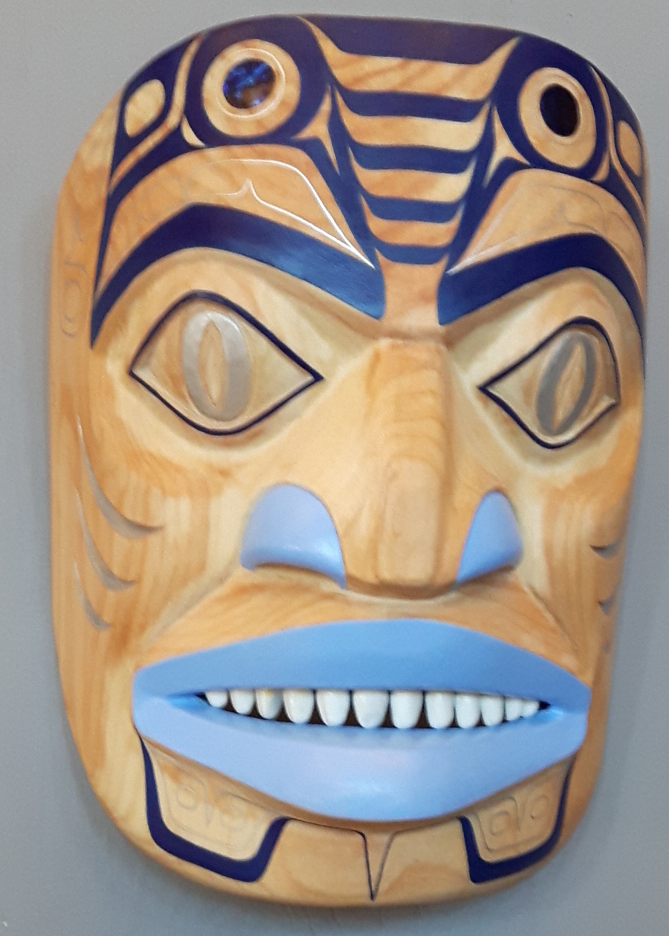
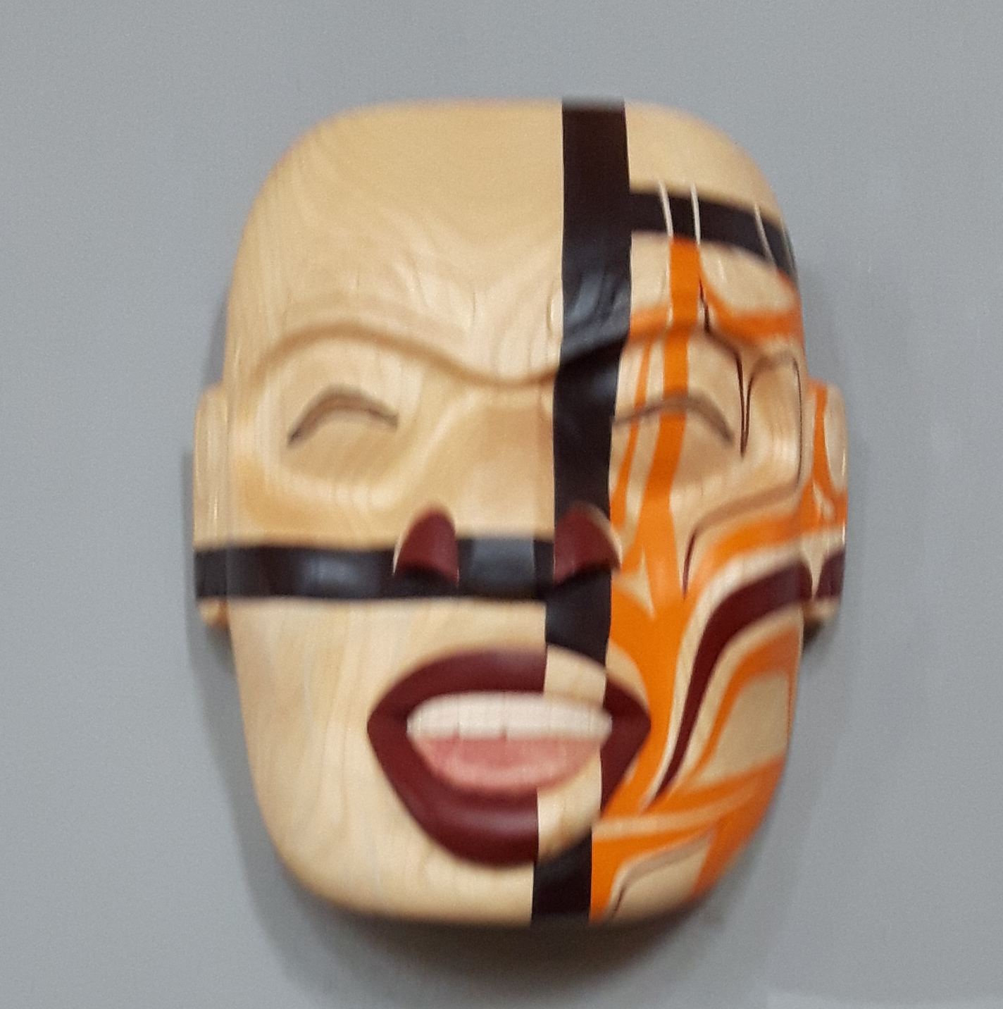
Kelly Robinson is one of my favorite First Nations artists. I live with two of his paintings and three of his masks, all of which are strikingly different. Partly, his versatility is explained by the fact he works in both the Nuxalk and Nuu-chah-nulth traditions, but, whatever the reason, he is always trying something new. “Shamed Spirit” is no exception, although I have put off writing about it for several months, waiting for him to tell me more.

Until the other week, the mask didn’t even have a name. Robinson himself seems reluctant to talk about it, suggesting it is highly personal.

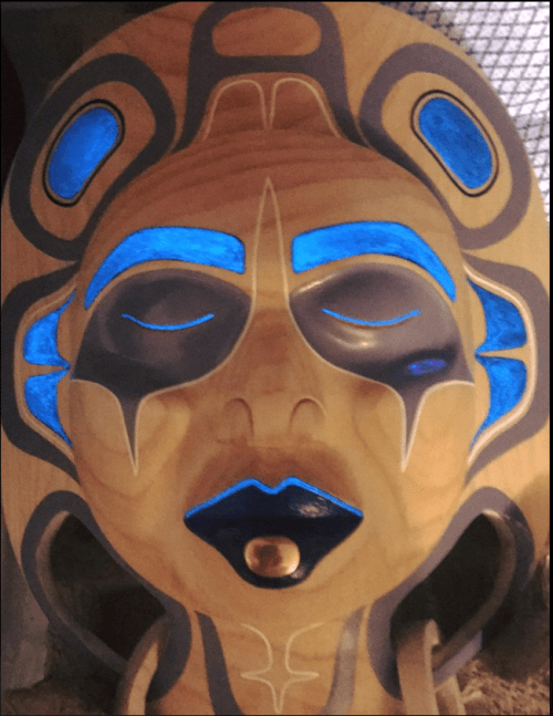
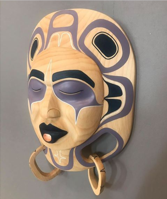
I recognized, of course, that it is a ridicule mask. Ridicule masks are a tradition on the Northwest Coast, a public display reproof of someone’s behavior through the destruction of artwork. This gesture is, perhaps, comparable to the breaking of a copper, as Beau Dick did a few years ago on the grounds of the British Columbia legislature and later at the Canadian Parliament Buildings – a gesture of contempt emphasized by the destruction of something personal and beautiful.

Modern ridicule masks generally feature the marring of half a mask. Often, they make a similar statement to Dick’s breaking of a copper; I remember Mike Dangeli, for example, contributing a ridicule mask that was an overt comment about the treatment of the First Nations to the opening show at the Bill Reid Gallery.

However, I still don’t know whether Robinson intends a similar comment. From a couple of hints, it might be a comment about sexual abuse, although how personal or how political it might be, I am no means sure.

Still, no matter what the target of the mask might be, it remains a powerful symbol. From the right side of the mask, you can see that the design is a mature display of skill, simple yet striking and well-finished. The left side, which Robinson tells me actually spent some time in a fire (and still smells like it did) is both a tragedy for lovers of art, and an expression of strong emotion. After all, who destroys such a piece of art without a strong motivation?

The whole idea of a ridicule mask seems the ultimate example of passive-aggressiveness, a gesture whose sincerity is undeniable, yet comes at a tremendous cost, both personally and aesthetically. I can only hope that one day I get to hear the story behind “Shamed Spirit,” because as a statement, it seems important – even to my limited understanding. But, then, who says that art is supposed to be easy?

Read Full Post »

When I attended the Freda Diesing School’s year end exhibit last April, I was the first in the doors when the campus longhouse was opened. As I stepped in, a mask caught my attention from across the room. The closer I came, the more I admired it. Eventually, I checked the artist, who turned out to be Jamie Katerina Nole, whose “Pregnant Frogwoman” print I bought several years ago. I hovered waiting for Nole, and, as soon as she arrived, I bought it – and who can blame me? “Princess Luna” is a piece of carving that starts with solid foundations, and consistently makes an extra effort that produces an outstanding work.

princess-luna

“Princess Luna.”

Of course I could not have foreseen that, through a series of misadventures that were no one’s fault, I would take four months to receive the mask. However, the delay only makes me appreciate the mask all the more.

As the name suggests, “Princess Luna” is a moon mask. Moon masks are common at the school, because the moon is not a family crest, but often they are learning exercises at best. The basic design consists of a face surrounded by a ring of U-shapes or ovoids and “Princess Luna” obviously begins with that design, although it soon heads off in its own direction.

To start with, the mask is made of alder, a pale wood that through a combination of selection and sanding seems suitable for the moon. Both the painting and the copper labret are restrained, and the face itself is more realistic than that of most moon masks, with closed eyes that create a sense of serenity and mystery that is reminiscent of standing in the light of the full moon. Like the “Pregnant Frogwoman,” print, the result is a sense of emotion that is rare in northwest coast art.

Similarly, the decorations around the rim can be viewed as covering the phrases of the moon, with the blank ovoid at the top the new moon, and the full moon at ear level on both sides of the mask.

Just these basics would be enough to make the mask more than a classroom exercise, but they are just the beginning. At the bottom, the stars are indicated, with cutouts and two loose rings cut from the same piece of wood as the rest of the mask – an impressive and seldom-seen display of skill. Turn the mask over, and the phases of the moon are shown again, although few people are likely to see it.

princess-luna-back

The back of the mask, showing the phases of the moon. Notice, too, the smooth finish on the back.

Yet the greatest extra effort is the use of luminous paint. If, like me, your eyes see some distance into the ultra-violet, this luminous paint adds to the sense of wonder in the mask by creating a sense of something that cannot quite be seen. In the twilight, the pale wood turns almost golden, and, under black light, creates an entirely different look to the mask, transforming it into a figure of power more awake that the mask appears under ordinary light.

princess-luna-blacklight

“Princess Luna” by black light.

Nole is still experimenting with different styles. The Northern Exposure show included another two more of her experiments, “Trickster Flow,” which places a Modernist design across a conventional portrait mask, and “Raven – Don’t Froget Me Crest,” a frontlet painted in a non-traditional style. Neither is as successful as “Princess Luna,” but, like it, they create the impression of an innovative artist who is prepared to make the extra effort to produce original work. Nole has clearly made intelligent use of her time at the Freda Diesing school, and “Princess Luna” is proof that “The Pregnant Frogwoman” was a start and not just an accidental success.  I can’t wait to see what she carves next — or what she will be carving in another twenty years.

Read Full Post »

In the renaissance of Northwest Coast art, the story of how Raven stole the light is the equivalent of the Madonna and Child in classic European art: sooner or later, most artists produce at least one version of it. Several years ago, I bought Bill Hudson’s version of the story, which shows Raven opening a box labeled Sun Crispies as he sits down at a kitchen table. Now, in James Crawford’s “Raven Steals the Lightbulb – Unscrewed,” I have found another modern updating of the story.

If anyone knows one story from the local First Nations, it is the story of how Raven stole the light from the chieftain who held in locked in his chest. Raven turns himself into a pine-needle and has himself swallowed by the chieftain’s daughter so he can be born as her son. The chieftain dotes on his grandchild, and one day gives him the light as a toy – and Raven promptly flees with it, burning himself black as he escapes through the smokehouse of the longhouse, and scattering the sun, moon, and stars, accidentally creating the world as we know it. With variations, the story is told in many different cultures. Usually, the depiction has Raven holding a sphere of light in his beak as he flees.

Crawford gives a modern rendering of this familiar scene. It is evidently a supernatural light bulb, since it appears to be still radiating light after being unscrewed, and in the upper left is what might be the rising sun. Raven looks mischievously pleased with his theft, or perhaps with the updating of the well-known scene.

However, the print is more than a one-punch piece. Instead, it is one of Crawford’s experiments with lino block prints: images that are carved, then inked and used as a stamp. It is a seldom used technique, although Stan Bevan, one of Crawford’s instructors at the Freda Diesing School, released at least one block print of his own. The effect is totally unlike any other medium, with irregular lines, and an often blocky appearance. It reminds me of the woodcuts in books from the 16th and 17th Centuries, which used a similar technique. The result gives Crawford’s print the eerie impression of being an artifact from some alternate universe in which the local First Nations had European-style printed books.

Needless to say, block prints require tremendous care when they are printed, especially when more than one color is used. Consequently, the print is small, roughly 12 by 25 centimeters. However, the effect is so appealing to my eye that I plan to buy some of Crawford’s other block prints – and to keep an eye on his work in other media as well.

Read Full Post »

I missed the 2016 Freda Diesing School’s graduate exhibit, so attending this one meant all the more for me. The moment I walked into the campus longhouse, with its carvings, natural light and high ceilings, I immediately felt at ease. Within moments, I was circling around the exhibit, trying to get pictures while staying one step ahead of the crowd.

This year’s show included a skillful piece by instructor Dean Heron, an alumnae of the first graduating class. I was glad to see it; focusing on his teaching, Dean does far less carving that I would prefer.

However, the emphasis was on the students’ work. The classes of 2017 were some of the stronger ones of recent years, with several outstanding graduates of the program and a promising collection of first year students. I found myself dividing the pieces displayed into those whose main appeal was their painting, and those whose appeal combined both painting and carving.

It takes a steady hand to paint convincingly – a steadier one than I have ever had – and the exhibit included several examples. Joseph Campbell, Lorraine Wolf, and Roger Smith all hung portrait masks with a steady hand and palettes of primary colors. In her moon mask, Kari Morgan took another direction with a minimalist white that put the emphasis on the finish of the wood and her carving.

More exotic were Sage Novak’s “Ghost Mask” and Violet Gatensbury’s “Fire Mask,” which blended paint skillfully into the wood and also featured rows of beads on the mask.

Among those with both strong painting and carving were Raven LeBlanc’s Dogfish mask, which rapidly went on my shortlist of possible purchases.

Similarly, Amanda Hugon showed her skill and versatility with her Tsimshian-like “Great Canadian Beaver” mask and Salish Moon Mask.”

However, the standouts in the show were Reuben Mack and Jaimie Katerina Nole. Mack submitted two Nuxalk-style masks,and only his absence from the crowd kept me from asking if they were for sale:


By contrast, Nole submitted three masks in three very different styles: the “Don’t Froget Me” frontlet, the “Trickster Flow” portrait mask, and the “Princess Luna” moon mask.

With an unlimited budget, I could have willingly bought most of these masks, assuming they had been for sale. However, since my parents refused to let me be born rich, I could only buy Nole’s “Princess Luna” – to my eye the pick of the show In fact, it caught my attention from across the floor as I stepped into the exhibit, and within twenty minutes, I was begging to buy it.

All these masks, and possibly more, are scheduled to be in the 2017 Northern Exposure show opening on May 27 at the Spirit Wrestler Gallery in Vancouver. If you have an interest in First Nations art, take the time to have a look at them in person. Even if you don’t buy, the pleasure of seeing what has become one of the biggest yearly exhibits in British Columbia is too great to miss. Believe me, I won’t make the mistake of missing it again – and neither should you.

Read Full Post »

I first became aware of the work of Heiltsuk artist Kc Hall’s when I saw a tattoo he designed on Facebook. Instantly, I put him on the short list of young artists I wished to buy from.

It was not just the graffiti style. These days, half the newer artists seem to playing with similar styles, and, while I like the idea of First Nations artists doing something new, many graffiti-inspired works frankly seem to me tiresome and lacking inspiration.

However, Hall’s work is not like that. I could tell at once that he was well-grounded in traditional work. Later, I was not at all surprised to learn that he had designed the vests given to the Duke and Duchess of Cambridge when they visited recently (an assignment for which he drew some sharp criticism from those who imagine that artists share the politics of their patrons), because his graffiti style – or styles, I should say, to be more exact – show a knowledge of tradition that is often missing from modernist works. Unlike many working in similar styles, Hall knows what he is playing with in h is modern work.

So, although Hall seems incredibly busy, both with canvases and tattoo designs, last summer I commissioned a work from him and took it home from the Starbucks at New Westminster station after a pleasant talk about local art punctuated by the arriving and departing Skytrains.

After some discussion, Hall painted “Happy Mess,” a colorful canvas that breaks just about every traditional aspect imaginable. To start with, it is not confined to a primary color of black and a secondary red, with perhaps a third blue. Nor is it symmetrical, as most First Nations designs are, nor even a hint of a formline.

Instead, as the title indicates, the painting is a collection of random traditional elements spill across the page at an angle. Only an analytical eye is likely to notice that it is a series of interlocking triangles, with objects at each angle, subtly structuring the apparent randomness.

The objects themselves are often traditional. The rectangles with faces are borrowed from Chilkat weaving, while the hat is a traditional cedar one, painted with what looks like a traditional black raven. Meanwhile, the central part of the painting appears to be primarily a view up a pole from directly beneath, but also doubles as the fin of a killer whale with the blowhole transformed into what could almost be the Rolling Stones’ lip logo, and is held together by  what looks like a buttoned collar halfway up. And among these elements are arrows of two different sizes that would be more at home in a flow chart. There is even a stylized black blob, as if the artist left an accident uncorrected.

Add the cartoon clouds, and the overall impression is of an artist having fun with forms. The result is completely different from almost anything else in my collection, yet, because Hall knows the traditions he plays with, one that still manages to fit with the paintings around it. I have considered one day commissioning a traditional piece from Hall to hang beside it, but, until I do, it hangs at the entrance to my living room, where it never fails to get a reaction from my visitors.

kchall.png

Read Full Post »

I always appreciate recognizing talent before anybody else. What interests me is not so much the potential for a piece done early in an artist’s career to increase in value (since I never sell what I buy) so much as the satisfaction of recognizing talent before anyone else. So when Kelly Robinson, one of my favorite Northwest Coast artists, told me in December that he was teaching his brother Randall to carve, I was immediately interested in the results. And, given his selection of materials and the finish on “Rainwater,” in Randall James Robinson’s case I am already experiencing that satisfaction in the reactions of those who see the mask.

“Rainwater” is one of Robinson’s first masks. The carving is relatively simple, but a good choice for the material. The mask is carved from spalted alder – that is, alder infected with a fungus that discolors the wood. The discoloration apparently does not photograph well, and is actually much smoother-looking than it appears to be in the photo below, but the point is that the spalting is so interesting in itself that too-elaborate carving would be a distraction, especially since the spalting’s long lines of discoloration suggests long trails of rain running down the mask.

Robinson tells me that he got the wood from Gordon Dick, the carver and owner of the Ahtsik Gallery near Port Alberni, who produced the spalting, but found that it set off allergies when he tried to carve it.

Robinson is carving in the Nuxalk style. The Nuxalk have traditions that are vastly different from those of the northern first nations, such as the Haida, Nishga’a,Tsimsian, Tahltan. If I understand correctly, one of the major Nuxalk ceremonies is the thunder dance, which celebrates “the greatest of the supernatural beings in Nuxalk culture.” The thunder dance tells of four brothers’ encounter with the spirit of thunder on a lonely hillside, and is apparently the origin story of a major Nuxalk family.

I have seen the thunder dance performed several times by Latham Mack, who has carved a couple of thunder masks. However, I have never seen the rain-water dance, which is performed before the thunder dance. During the rainwater dance, the dancers sprinkle those watching with water as cleansing ritual. “It’s the bringer of rain before the thunder,” Robinson tells me, meant “to cleanse the earth before thunder.”

Since the entire coast is a rain forest from the American border to Prince Rupert and beyond into Alaska, a rain spirit seems only appropriate to a local culture. In the same way, “Rainwater”’s use of spalting to portray that rain spirit is a choice that speaks well of Robinson’s developing artistic sensibilities. Like any newcomer, Robinson has endless hard work and learning ahead of him in order to have an artistic career, but this early effort suggests that he has the talent to succeed if he chooses.

rr

Read Full Post »

Cody LeCoy is a young First Nations painter. Mentored by Lawrence Paul Yuxweluptun, he favors a surrealist style that has given him some mainstream success. However, to my eye, his painting are at their most original when he applies surrealism to First Nations tradition, as he does in “Mouse Woman, Keeper of the Neighborhood.”

Mouse Woman is a figure that has young artists today are fascinated by. The truth is, however, is that little is known about her, not even how she was depicted traditionally. What is known is that she is the helper of heroes, often meeting them on their journeys as a mouse in need of assistance, then re-appearing as a woman of high status who gives them shelter for the night and wise advice to take away with them. I think of her as the opposite of Raven, a guardian of the community against his individualism, a force for order as opposed to his chaos, and a preserver where Raven is both a creator and destroyer.

“Keeper of the Neighborhood” was hanging at a pizza parlor when I saw a picture of it in LeCoy’s mail out. I immediately arranged to meet him there, and arrived early, sitting next to the picture while I waited, as though to ward off any other potential buyers. I came home with it wrapped in garbage bags, during a break in the rain, getting it indoors again just before the rain returned again.

According to my interpretation, the painting is based on the idea that Mouse Woman continues to watch over the community of the First Nations, even when most of it is living in the city. In the upper left corner, she appears in her mouse form, looking fierce with hunger, and nervous. Her other form dominates the painting, her dual nature suggested by the difference between her right and left eye and her narrow, bony fingers, which holds a sphere up where she can view it more clearly – a sign that she is still a protector of her world.

Technically, what I admire about the painting is that it is painted on plywood. The color of the plywood is blended into the painting so well that, until I saw it up close, I had no idea that the brown of her face was actually the bare plywood. The rest of the painting is full of bristly strokes that appear layered from a distance, and add a sense of restlessness that fits into the concept of a guardian from the past uneasily continuing to carry out her responsibilities in a very different cultural setting than the one where she began – one that is perhaps potentially dangerous, and where she does not naturally belong, except that her people have moved there.

Just as in”Ridicule Mask,” the other painting by LeCoy that hangs on my wall, “Mouse Woman, Keeper of the Neighborhood” takes a traditional theme, and applies it to a modern setting, using a non-traditional style. I admit to a weakness for surrealism, but in these paintings, LeCoy produces a sense of tension and restlessness all his own. I look forward to watching where his talent takes him next.Mousewoman.JPG

Read Full Post »

Sheldon Steven Dennis is a Tahltan artist who graduated from the Freda Diesing School in 2010. He’s been on my short list of artists to buy from ever since, and a few weeks ago I finally bought copies of what I consider his best work, “The Dance of the Bear Dog.”

The print honors the Tahltan bear dog, which officially became extinct about fifty years ago. Dog owners are now trying to recreate the species from crossbreeds. Whether this effort is an honest effort or a scam is a matter of dispute, but you can understand why the idea captures people’s imagination.

About half a meter high, the Tahltan bear dog was mostly black, with erect ears and a tail that has been described as a shaving brush. Double-jointed, they were able to move quickly through the forest.
Hunters carried the dogs in packs on their back, releasing them to surround the bear and distract it with their yaps and attacks until the hunters caught up. At home, they were known for the gentleness as well as their loyalty and intelligence.

Dennis’ print shows the moment when the hunters and the dogs have surrounded the bear, which is huddled in the middle of the design, its claws bristling and red, as though it has drawn blood, but its open mouth and lolling tongue suggesting that it is tiring. The human faces are set in grimaces of exertion, while the dogs are crouched low with an intentness as though they are keeping close watch on the bear and are ready to leap out of the way if attacked.

The design is striking for its limited use of red as a secondary color, which makes its uses on the mouths and the bear’s claws all the more striking. It is a darker red than is usually seen in northern designs, suggesting the blood being shed by all those involved in the hunt.

The form lines, too, are particularly interesting, with the thin lines of the hunters’ chins suggesting vulnerability in contrast to the thick, powerful lines of the bear’s body. By contrast, the strength of the dogs’ bodies is suggested by two thick ovoids, while the relative thinness of the legs suggesting agility.

However, what makes the design so effective is the crowded, concentric circles of action. Many northern designs, especially modern ones, are defined as much by their white space as the design, but Dennis has chosen a busy dance that reflects the chaos of the hunt. This chaos is suggested even further by the way that the outer abstract ring gives way to to the second ring of hunters and dogs, which in turn gives way to the asymmetrical design of the bear and hunters that spirals down as though descending into a drain.

Dennis’ accomplishment is to suggest a rarely seen sense of movement and action while using nothing but traditional forms – a combination that makes the description of the moment as a “dance” a precise choice of words.

Dennis is not a prolific artist. The fact that much of his work is apparently for family and ceremonial  purposes makes his works for sale even rarer. As a result, the pieces available for sale are relatively few. However, on the strength of “The Dance of the Bear Dog,” I will be watching eagerly for more to buy.

tahltan-bear-dogs


Read Full Post »

I first became aware of Nuxalk artist Latham Mack when I visited Terrace for the Freda Diesing School graduate exhibit. He had already won one YVR scholarship, and would go on to win another, and his paintings and drawings were among the best in the class – so much so that the teachers gave him the privilege in his second year of working in the Nuxalk rather than the Northern tradition. In fact, when he showed me a sketch for a painting of the Four Carpenters, I said I would buy it sight unseen. However, that painting was never done, and at the time his sculptural work was no more than competent, the best feature of his masks being the painting.

lmgbs2

Mack’s patience and hard work, though, mean that his story today is very different. Under the mentorship of Dempsey Bob, Mack has become one of the outstanding carvers of his generation, and the prices of his work should soon edge beyond my affordability. So when he showed me his relatively inexpensive “Grizzly Bear Spoon” outside Dempsey Bob’s “North” exhibit in 2014, I jumped at the chance to buy. I had to wait six months while the spoon was on display at the Richmond Art Gallery, but in early 2015 I finally carried home an example of his work.

My understanding is that Mack began the spoon while still at the Freda Diesing School and finished it in 2014. Certainly its quality and execution is closer to that of his current work than his student masks. If I didn’t know Mack’s connection to Bob, I might have guessed it by the minimal paint job, although Mack does use what I mentally tag “Nuxalk Blue” around the eyes and ears. The wood is soft to the touch, and the lines of the paint completely straight, both signs of a highly-finished work (and, in the case of the paint, a steady hand. What I especially like is that, with the minimal paint, the contours of the grain because as much a part of the result as the carving.

Adding to the piece are the proportions and curves of the spoon’s bowl. They are framed by the legs, with the knees marking where the bowl begins to widen, and the descent of the bowl’s curve by the calves. Further up the handle, the start of the bowl is framed by the claws.

Most of the body is simply carved, with the roundness of legs and arms emphasizing the wood’s grain. But what really catches the eye is the depth of the carving on the head. Typically, deep carving is a sign of excellence in northwest coast carving, and this spoon is no exception. The tip of the chin is at least three centimeters from the base of the neck, and the inside of the mouth slightly more. The lips are half a centimeter thick, the eye-sockets symmetrically about the same. The result is dramatic, especially when painted, and even more so in dim light.

Currently, “Grizzly Bear Spoon” sits on a tea trolley in my living room, where I pass it twenty times a day and my glance can hardly help but linger on it. I suppose it is a minor work compared to Mack’s larger pieces, but between the curves, the grain, and the depth of the carving, I consider it every bit as much an accomplishment.

lmgbs

Read Full Post »

Last summer, I contributed to Haida Raid 3: Save Our Waters, an environmentalist animation. I couldn’t resist, given the cause and the perk of a print: Jaalen Edenshaw’s “K’alt’side K’aa” (“Laughing Crow”).

Edenshaw is the brother of Gwaii Edenshaw, one of the foremost jewelers on the coast. Much of his work is on poles and other community art, with only an occasional piece making it as far south to Vancouver. So I was happy when, a few weeks after the Haida Raid fundraiser closed, I received this small sample of his work. Many people assume that Haida art has no humor, and I’m glad to have a piece that proves otherwise.

What particularly interests me about this piece is its resemblance to some of the figures on the ring I bought from Gwaii Edenshaw five years ago. I had asked Gwaii to do a ring illustrating the story about how Raven turned the crows black. Not wanting to share their salmon with Raven, the crows put crumbs in the dozing Ravens’ mouth, then try to convince him that he already eaten when he wakes up. But Raven is not deceived, and throws the crows into the fire, singeing them so that their feathers turn from white to black.

bruce-ring3

On the ring, Gwaii depicts the crows in the middle of sprinkling Raven with crumbs of salmon, rolling them into his mouth and along his back. The crow figures resemble the ones on Jaalen’s print, and I mean to ask him which came first the next time I see him.

Meanwhile, the print is a good example of how I can enjoy a hundred dollar piece as much as a ten thousand dollar one. With a print run of 270, the print is unlikely ever to be valuable, but I admire it for its unusual posture, as well as the lines indicating movement on both sides of the figure. Compared to most prints, it is a cartoon – but that, I suspect, is exactly what was intended.

laughing-crow

Read Full Post »

Older Posts »