Feeds:
Posts
Comments

Posts Tagged ‘Dean Heron’

I missed the 2016 Freda Diesing School’s graduate exhibit, so attending this one meant all the more for me. The moment I walked into the campus longhouse, with its carvings, natural light and high ceilings, I immediately felt at ease. Within moments, I was circling around the exhibit, trying to get pictures while staying one step ahead of the crowd.

This year’s show included a skillful piece by instructor Dean Heron, an alumnae of the first graduating class. I was glad to see it; focusing on his teaching, Dean does far less carving that I would prefer.

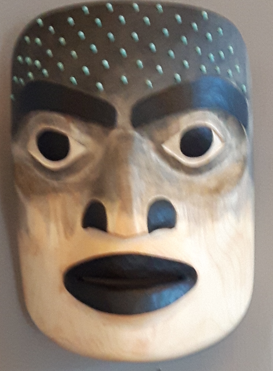
However, the emphasis was on the students’ work. The classes of 2017 were some of the stronger ones of recent years, with several outstanding graduates of the program and a promising collection of first year students. I found myself dividing the pieces displayed into those whose main appeal was their painting, and those whose appeal combined both painting and carving.

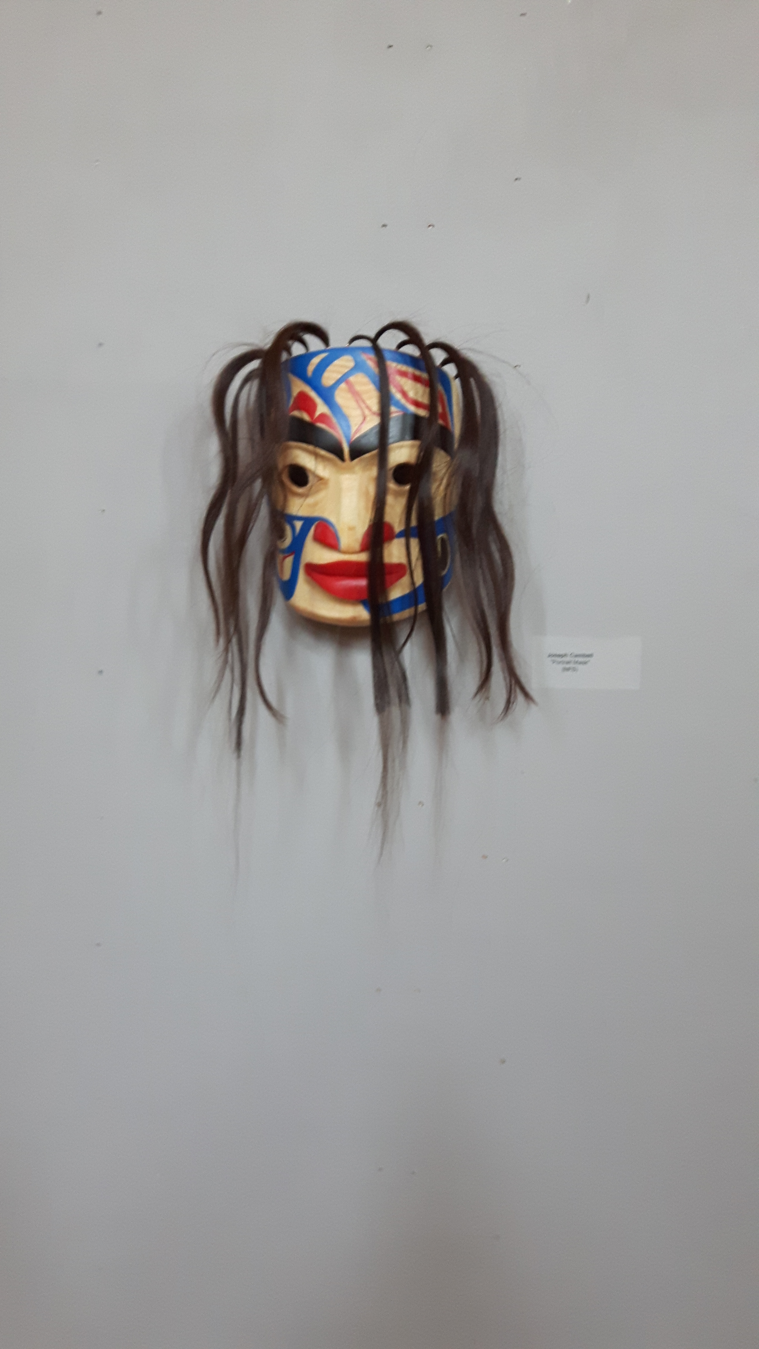
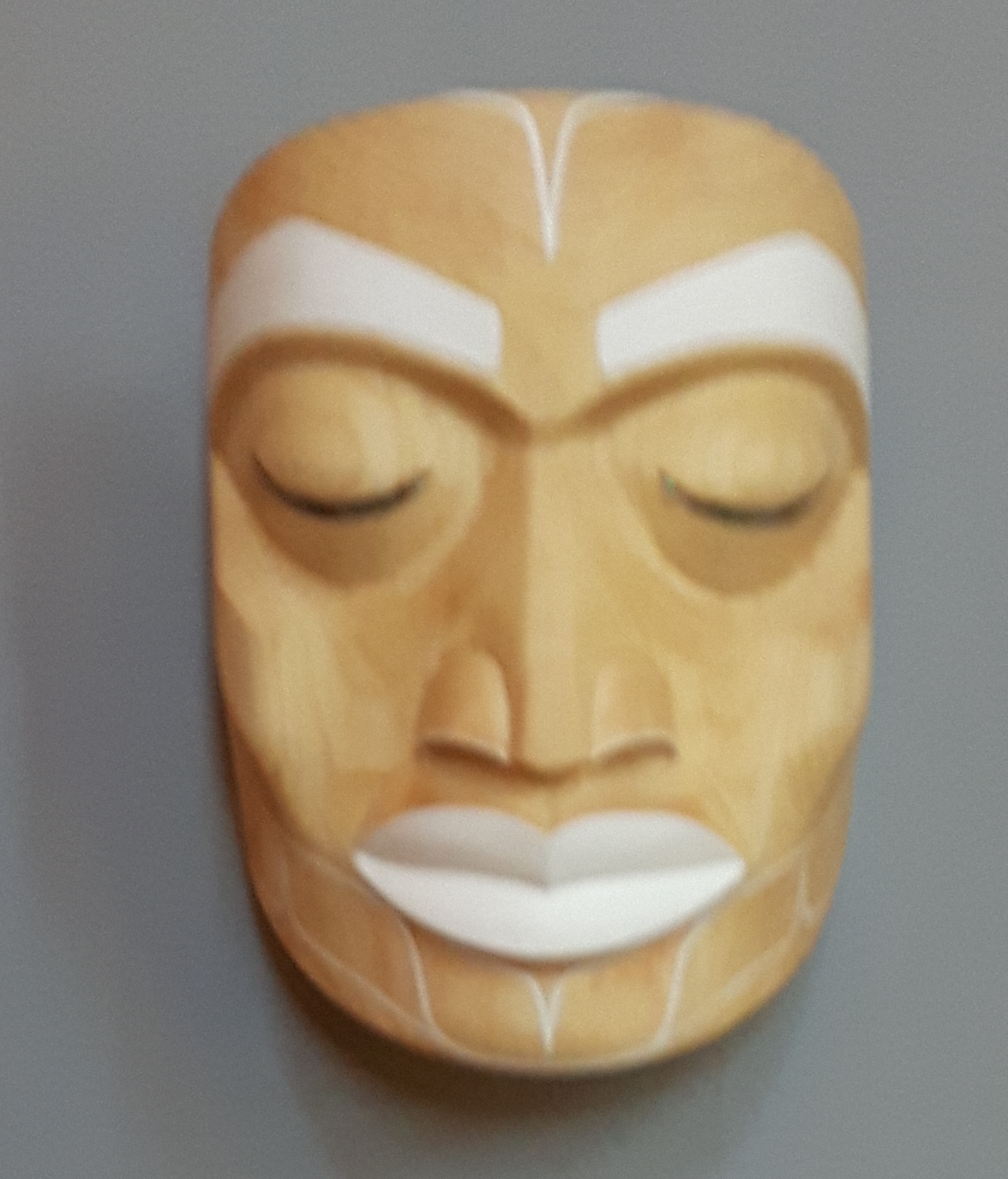
It takes a steady hand to paint convincingly – a steadier one than I have ever had – and the exhibit included several examples. Joseph Campbell, Lorraine Wolf, and Roger Smith all hung portrait masks with a steady hand and palettes of primary colors. In her moon mask, Kari Morgan took another direction with a minimalist white that put the emphasis on the finish of the wood and her carving.

More exotic were Sage Novak’s “Ghost Mask” and Violet Gatensbury’s “Fire Mask,” which blended paint skillfully into the wood and also featured rows of beads on the mask.

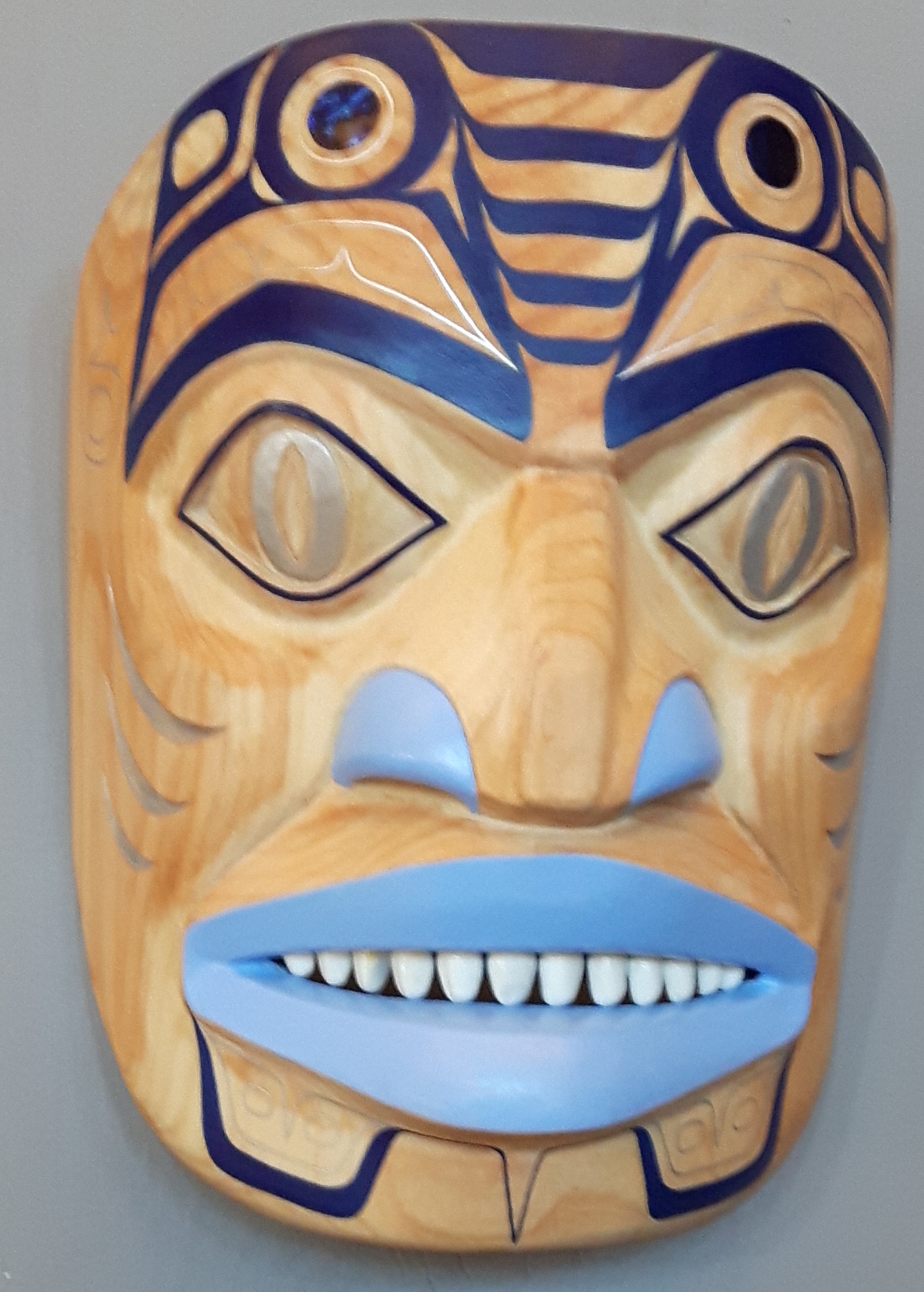
Among those with both strong painting and carving were Raven LeBlanc’s Dogfish mask, which rapidly went on my shortlist of possible purchases.

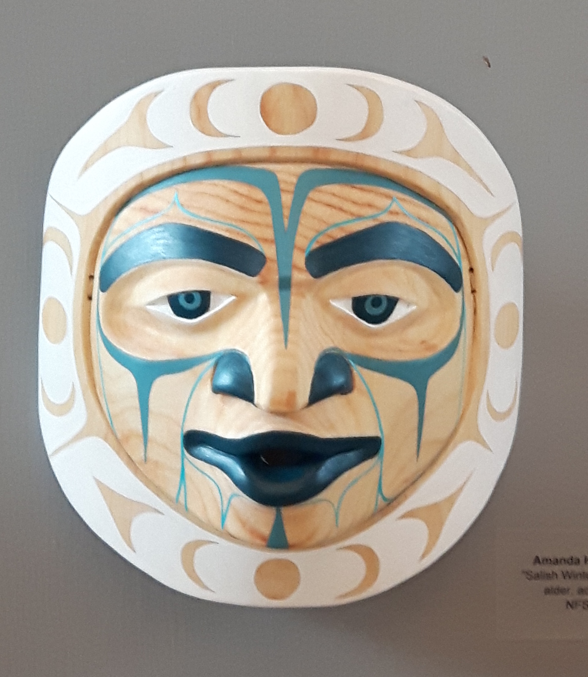
Similarly, Amanda Hugon showed her skill and versatility with her Tsimshian-like “Great Canadian Beaver” mask and Salish Moon Mask.”

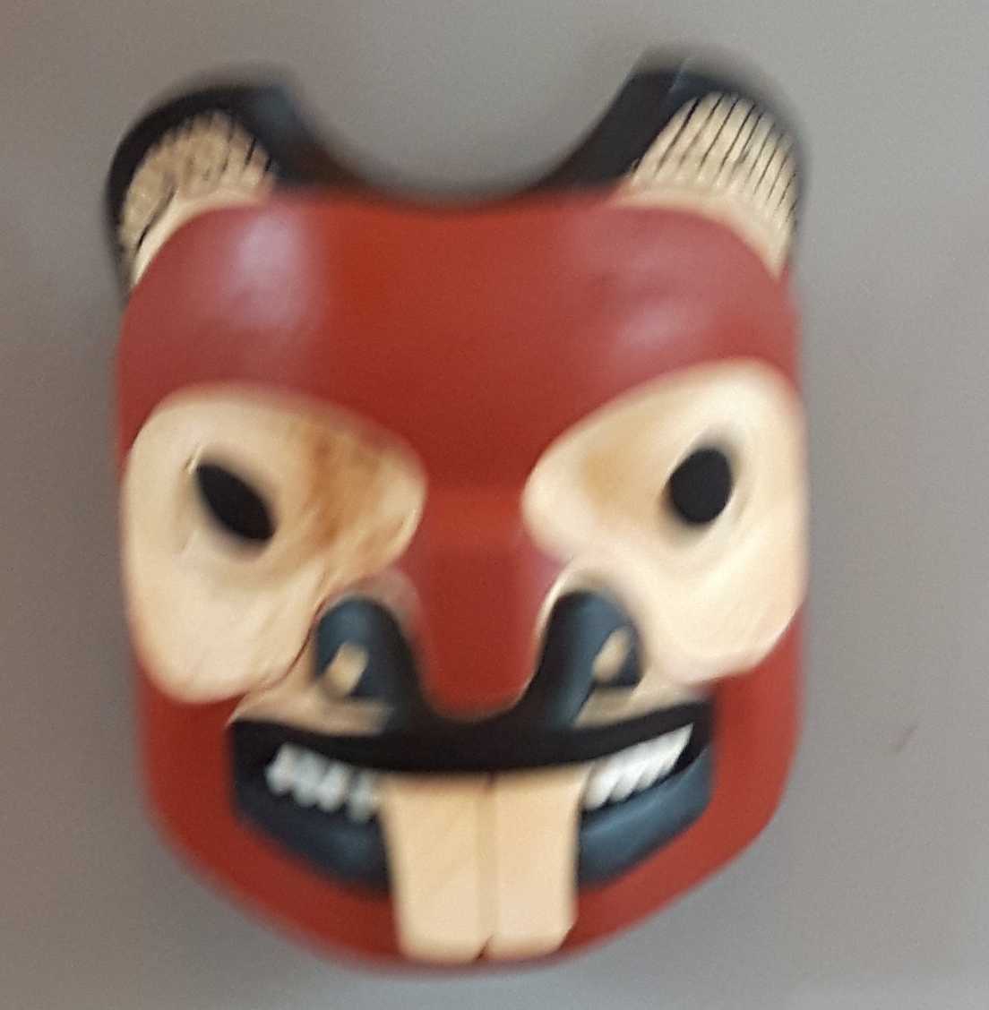
However, the standouts in the show were Reuben Mack and Jaimie Katerina Nole. Mack submitted two Nuxalk-style masks,and only his absence from the crowd kept me from asking if they were for sale:


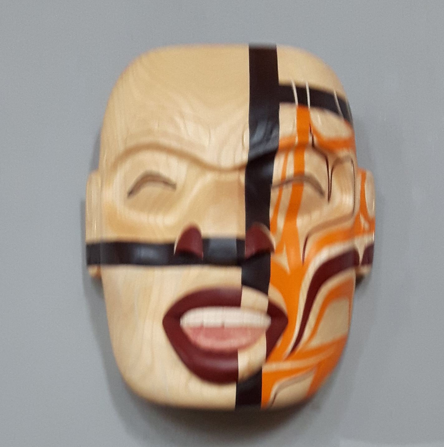
By contrast, Nole submitted three masks in three very different styles: the “Don’t Froget Me” frontlet, the “Trickster Flow” portrait mask, and the “Princess Luna” moon mask.

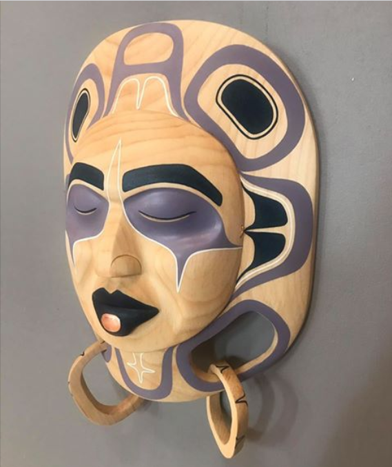
With an unlimited budget, I could have willingly bought most of these masks, assuming they had been for sale. However, since my parents refused to let me be born rich, I could only buy Nole’s “Princess Luna” – to my eye the pick of the show In fact, it caught my attention from across the floor as I stepped into the exhibit, and within twenty minutes, I was begging to buy it.

All these masks, and possibly more, are scheduled to be in the 2017 Northern Exposure show opening on May 27 at the Spirit Wrestler Gallery in Vancouver. If you have an interest in First Nations art, take the time to have a look at them in person. Even if you don’t buy, the pleasure of seeing what has become one of the biggest yearly exhibits in British Columbia is too great to miss. Believe me, I won’t make the mistake of missing it again – and neither should you.

Read Full Post »

I’ve long admired the graphics work of Dean Heron, but a couple of months ago I realized that I didn’t have any in the townhouse. I quickly remedied that by buying “Northern Raven,” a small acrylic on paper painting that I’m sure will be the first of many purchases.

“Northern Raven” is a split design, with two views of the same figure connected to a central core. Historically, split designs were often used to fill a space, or to wrap the design around a curved surfaced like a handle or the bowl of a spoon. However, they were also frequently used, as here, on a flat surface. They have always struck me as one of the most pleasing forms of symmetrical design, because the fact that one side of the design mirrors the other reduces the static repetition of a perfectly balanced design.

In addition to this natural advantage, “Northern Raven” has several other qualities that make it stand out. To start with, split designs usually have the heads facing outward, leaving a space in the middle. Although reversals of this arrangement are not entirely unknown, they are still rare enough to be noticeable when you see them. By replacing what is usually blank space with design, here Heron creates a far busier design than he would otherwise have, which further helps to break down the staticness of the design.

Another departure from the norm is the use of blue as the secondary color in place of red. This is not an unheard-of innovation in contemporary art, but seeing it in what in other ways is a very traditional piece is somewhat unusual. Added to the pale blue of the paper itself, this choice of colors suggest a cool, icy quality that suggests the first half of the painting’s name (which I otherwise take as referring to the fact that Heron describes himself as a Kaska/Tlingit artist). It also has the advantage of being less arresting than any shade of red, which forces the eye to linger over the design and discover its details at leisure.

However, what really stands out for me is the hand-painted quality of the piece. In some modern First Nations art, the ovoids and u-shapes are geometrically precise, and often drawn by a template, with their curves created by a compass (or, at least, so it appears). If the design is split, the two sides are literally, not just figuratively mirrored, and often created by flipping one side over in a computer drawing application.

By contrast, “Northern Raven”has the appearance of being less geometrically oriented. Much of this sense is created by the thin blue lines outlining the heads. But there is also a suggestion of irregularity in some of the interior elements. Moreover, if you look closely, some of the mirrored elements, like the U and T shapes at the bottom left and right of the design are not completely identical. Such irregularities might easily give a sense of amateurishness, but in this design they add a more human quality, breaking down the symmetry and keeping the design from becoming an exercise in applied geometry.

My only criticism of “Northern Raven” is its scale. With its bold, regular formlines throughout much of the design, the piece deserves to twenty or thirty times its size, and serving as the house front to a longhouse. Otherwise, I consider it a fine place to begin my collection of Heron’s work.

Read Full Post »

A couple of weeks ago when I was in Terrace, Dean Heron drove me the fifteen kilometers northeast to the Kitselas Canyon National Historic Site. We left the highway, bounced up a gravel road through some second growth forest to a gate and, after opening it, descended to the top of the site.

I’ve been hearing about construction on the site for a couple of years and the work that teachers, students, and graduates of the Freda Diesing School of Northwest Coast Art had been doing there, but nothing really prepared me for the site or the scope of the effort. The top of the site was dominated by a nearby mountain, so dramatically close that I could never quite keep it out of my glance, or resist looking up at it (or be unaware of it at my back):

To date, four longhouses have been completed. A fifth is largely complete but unpainted and will eventually display a wolf design, if I remember correctly.

In front of the line of longhouses, are the carved figures of a grizzly bear and a beaver:

Each of the longhouses, Heron explained to me, would become the showcase for a different aspect of the local Tsimshian culture. About a hundred meters across the gravel was the future gift shop and the washroom.

However, the current buildings were just the start of the plans. Eventually, part of the leveled gravel will become a ground for dances and ceremonies. And, behind the gift house, a path lead down to the archaeological site where the original village had been located. I would have liked to descend to the site, where an interpretive center was being built, but Heron was unsure of his right to go there. He had a key to the gate, and having worked on the top of the site, had no hesitation about going there, but the archaeological site was another matter – perhaps because he was not a member of the Kitselas First Nation.

Nor could we enter any of the longhouses, because alarms had been added recently to them. Naturally, I was disappointed, but I was glad that some pre-cautions were being taken, because apparently one of the longhouses had already been broken into. In fact, considering some of the art work there, I can see a day coming when the site has security staff around the clock.

Still, even without seeing everything, I was impressed, both by what had been done and what I imagined the finished result would be. Between the magnificence of the setting and the carvings by Dempsey Bob, Stan Bevan, and their current and ex-pupils, Kitselas Canyon has every chance of being the cultural and tourist landmark it is intended to become. Personally, I can’t wait to see what it should become in a few years — and I’m grateful to Dean for the preview.

Read Full Post »

I’m not looking forward to the 2010 Winter Olympics in Vancouver. I never watch sports, and I’m concerned about the costs, traffic, and the virtual declaration of martial law during the games. The fact that I once dreamed of being in the Olympics myself only makes me angrier at the travesty that they have become.

Still, I could almost reconcile myself to the games for the sake of all the First Nations art commissioned for them. Some of that art was on display this weekend at the Aboriginal Art Exhibition at Canada Place this weekend, and I thoroughly enjoyed it – even if the lack of organization at the event seems ominous if it is a foretaste of how the games themselves will be run.

Being appreciative of the commissioned art is something you can file under No-Brainer. I mean, what’s not to like about the art? There’re medals with Corrine Hunt designs, commemorative coins by Jody Broomfield. The snowboarding pavilion at Cypress Bowl will have a wall graced with a new work by Dean Heron. GM Place will have a new work by Alano Edzerza, Nat Bailey Stadium a new work by Aaron Nelson-Moody, and the list goes on and on.

After fumbling badly by making the symbol of the game the inukshuk – a symbol that has nothing to do with British Columbia, much less Vancouver – the games organizers have had the sense to commission locally, focusing on less established artists and on members of the Salish nation, whose territory the Vancouver venues are on. I understand that some 45 works of public art will be added to the Lower Mainland as a result of the games, and I consider that an unalloyed good.

Sadly, though, the Olympic organizers fumbled again in their first efforts to bring most of these works to the public. The display was almost completely unpublicized except for newspaper stories just before the event and some Internet transmission. Even then, it was called an exhibition, so that most people arrived unaware that most of the work on display was for sale – an oversight that bitterly disappointed the artists who had taken tables and paid the exorbitant prices charged for parking at Canada Place.

Even worse, the management of the event was haphazard. I heard artists complain that they were unable to set up for credit or debit cards, and the rumor was that the one bank machine in the exhibit hall required a substantial surcharge to use.

And perhaps the worst thing was that, in order to fill up the hall, the organizers seem to have let anyone exhibit who cared to pay for the table. As a result, many tables displayed tourist junk that did not belong in the same exhibit as the commissioned artists.

For me, the incompetence of the organizing was summed up by the sight of two singers on the stage gamely belting out songs to rows of empty chairs, and a snack bar that had closed down at least two hours before the end of the show. Meanwhile, the exhibitors were strolling around talking to each other.

Such poor planning undermines the celebration of the artists. My impression is that the exhibition organizers couldn’t have cared less if the artists were treated with respect.

Perhaps the organizers can learn, but if this is how they put on such a relatively small event, then we should expect chaos during the games themselves. I might be lured downtown to see the aboriginal market at the Queen Elizabeth Theatre, but I, for one, plan to spend the three weeks of the games bunkered down safely in Burnaby, far away from the insanity.

Read Full Post »