For many people, Bill Reid is the epitome of Northwest Coast art. The reputation is both deserved, given the quality and variety of his work and unfair, given the number of artists in the same tradition who are equally worthy of acclaim. But regardless of how you view his reputation, Reid has a strong claim to being the major Canadian artist of the late twentieth century, with one of his pieces both on display at the Canadian embassy in Washington, D. C. and on the back of the Canadian twenty dollar bill. And, like any admirer of Northwest art, for a long time, I’ve lusted to have one of his works but been unable to afford one – until now.
Even then, I only did so by getting into an area that the collectors haven’t discovered yet. I bought a canvas raven banner whose design is an expansion of the illustrations that Reid did for All the Gallant Beasts and Monsters, which was published in 1991. The banner was part of one of two complete sets of banners from the personal collection of Martine Reid, his widow, and was sold through the recently-opened Bill Reid Gallery in downtown Vancouver, so its provenance is unquestionable. In fact, I’ve left my email address with the gallery so that Martine Reid can give me more details about the banner.
The last stages of Reid’s development as an artist could be called his post-Haida era, in which Reid, while obviously basing his work on tradition, began incorporating more modern or personal elements into his work. The banner fits very clearly into this period.
While the ovoids and wings feathers are in the Northwest tradition, the torso, the foot at the bottom of the tail and head feathers are something else entirely. Similarly, while the twisting of the entire figure as though it is turning away from the viewer seems in keeping with the distortion of figures to fit a particular shape in classic works, Reid handles the distortion with high imagination, inverting shapes on one wing on the other, and presenting some shapes in full on one wing, but only hinting at them in another. It is as though Reid is inventing a new form of perspective that comes from neither Northwest nor modern art, although obviously drawing on both.
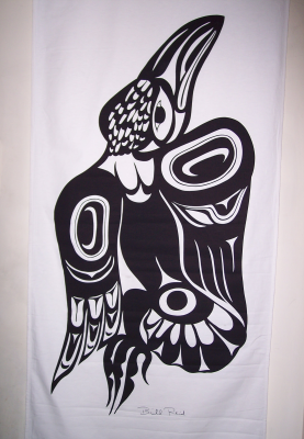
Reid’s design is equally playful when it comes to symmetry, seeming to abandon it at first glance, but really playing some complex games with it. The body of the raven is defined by the triangle formed by the ovoids on the wings and at the base of the tail, an unusual shape in traditional art. At first, too, the body seems asymmetrical, with the left wing showing three flight feathers and the right wing four – but then you notice that the right wing’s four feathers matches the four toes on the foot and the neck feathers, and forms another triangle whose angles are an inversion of the first triangle.
Then, in contrast to this complexity, there’s the simplicity of the head, with its economical lines and the heavy beak that suggests both the classic depictions of the raven and their actual appearance.

It’s a complex work, and one that could only come after decades of development, with clean lines that stand out all the more because the design is black on white.
I don’t know if I got a bargain or overpaid, or whether the purchase will prove a good investment. The price was acceptable to me, and, since I bought the work because I admired it, I don’t care if its value increases over time. But the work shows all the mastery of Reid’s last period, and I admire it hugely.
The only trouble is, I’ve hung it in our hallway, and the rest of the hallway cries out for a matching banner. So, I suspect this won’t be the only Reid banner I’ll be buying this year. But if I can get one that intrigues me as much as this one, I’ll be extremely well satisfied.
