Feeds:
Posts
Comments

Posts Tagged ‘Haidan art’

Last year, I started the Northwest Coast Art Meetup Group. But the assistant organizer proved unreliable, and, I couldn’t afford renting meeting space in downtown Vancouver every month – a necessity, since I’m in the suburbs. Lacking support, I stepped down as organizer. But I regretted the failure, and was as pleased as I could possibly be when Stacey Jessiman. took over and announced a new meeting.

Last night, a half dozen of us met at Stacey’s house on the west side of Vancouver to hear Bill McClennan, a curator at the Museum of Anthropology, deliver a slide show on the recently-concluded Charles and Isabella Edenshaw exhibit. Meeting in her house helped to keep the atmosphere informal, and the expenses down.

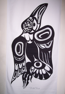
Charles Edenshaw is generally considered the premier Nineteenthh Century Haida artist, and recently his wife Isabella has received the credit she deserves for spruce root weaving of baskets and hats, many of which were painted by her husband. The show at the Museum was an unprecedented bringing together of his silver work (although not, unfortunately, his argillite carving) and her surprisingly well-preserved weaving, and I had visited it twice in the last year.

Not that I objected to seeing slides of some of the pieces, many of which came from private collections or distant museums, and aren’t easy to see. Charles Edenshaw’s work, with its use of negative space, remains surprisingly modern, especially in its use of blank space – perhaps because he heavily influenced artists like Bill Reid and Robert Davidson. Similarly, I am intrigued by the thought that Isabella’s work has distinct knots and patterns that, to an expert, identifies it as hers.

In addition, Bill did a good job of putting the Edenshaws in context, showing surviving pictures of the houses where they lived, and even the general store on the banks of the Skeena where Charles Edenshaw sold his art while Isabella Edenshaw labored in the salmon canneries down the beach.

However, I was equally intrigued by Bill ‘s behind-the-scenes account of the exhibit. The Edenshaws’ descendants number in the hundreds, and perhaps a quarter attended a private viewing and celebration the night before the official opening.

For example, Bill relates that as the descendants entered the exhibit’s gallery, he was surprised to see that many left quickly. Apparently, some were concerned that the spirits connected to the pieces were upset by the chaos of the crowd, and only re-entered after elders performed a ceremony to calm the atmosphere.

Bill also explained that, at any exhibit, some pieces always receive more attention than others, and that he was curious to see what those pieces would be at this one. To his surprise, the main attraction was a blown-up photograph of Isabella Edenshaw. Although the Haida were forced to become patrilineal by English and Canadian society, matrilineal remnants are still strong among the Haida (so much so that some thought the patrilineal descendants shouldn’t be invited), so Isabella was of of more interest than Charles. Many, too, were interested in the Edenshaw’s four daughters for the same reason, and some had never seen pictures of their female ancestors.

In fact, interest was so strong that the pictures were carried out of the gallery into the main hall for the celebration. In the slides Bill showed, the pictures stand in the background, almost, as he said, as though Isabella and her daughters were waiting to speak or to enter the dance floor. For me, hearing about these personal touches helped me to recognize that the exhibit was not just an artistic event, but a cultural and familial one as well.

This information was delivered informally, with Bill propped against a cushion on the floor next to the projector, and the rest of us arranged on the furniture around the fire. It was an atmosphere that rented space could never have matched, even without the buffet of salad, bread, cheese, and drinks that Stacey prepared.

All in all, I’d call it a successful re-launch. I look forward to the next meetings (although I suggest they be potluck, so that everyone can enjoy them). Obviously, the meetup is now in much more capable hands than before.

Read Full Post »

A banner, I’ve found, is hard to hang by itself. Several weeks after buying the Bill Reid raven banner that is one of my daily delights, I limped back to the Bill Reid Gallery to buy the wolf banner in the same series.

Since an injury had delayed me picking it up, I had been tormenting myself with visions of collectors discovering the banners and snapping them up, but, happily my fears were unrealized. Had I wall enough and cash, I could also have bought the frog, Mouse Woman, Dogfish Woman, and Beaver banners that were my alternate choices.

However, I am pleased to have the wolf banner, because it is one of the most playful in the set of 13 banners. As Reid himself points out in the text of All the Gallant Beasts and Monsters, the book from which the banner designs were taken, wolves must have been a fantasy figure in traditional Haida culture, since they are not found on the islands. He suggests they must have been semi-mythical, the epitome of ferocity and hunger, with their teeth always sunk in somebody’s belly.

It is this fantasy figure that Reid presents on the banner. The wolf’s twisted posture and the arrangement of the feet suggest that it stalking low to the ground. The head, which is as large as the body is dominated by the teeth, which are three-quarters the length of the head, with outsized nostrils and ears giving it a look of ferocity, especially with all these elements being red. The waving tail, also as large as the body, also helps to suggest intent, furious motion.

The most traditional element in the banner is the head, and even there, the design elements are designed to suggest a roundness of form – a kind of nod to realism. By contrast, only the back hip-joints in the body are classically designed. The length of the body, the feet are almost sketch-like in comparison, consisting of red ribs and black fur. As with the raven banner, in which the body is almost neglected in comparison to the body and the wings, in this banner Reid is focusing on the key aspects of the figure. Even the claws are not emphasized in any way, perhaps because it is the wolf’s hunger that he is most interested in.

All Northwest coast art has the habit of distorting figures to the surface, whether that surface is a ring, a box, or a spindle. Designing for the printed page or banner, Reid has no need to warp the design, but he does so anyway. His wolf twists asymmetrically, leaving much of the left side of the space blank – a suggestion, perhaps, that the wolf is stalking and trying to make itself less visible. One rear foot is stretched out behind suggesting that the wolf is moving low to the ground. At the front, though, the figure is so twisted that one foot is unseen, hidden by the head. Overall, the contortion of the wolf suggests a cat more than any canine – a reminder that this is a fantasy, but one whose blurring of natural categories adds to the menace.

Unlike the raven, the wolf banner has little sign of naturalism. With its modernly asymmetrical posture and the use of red to emphasize the wolvish elements, this is an animal that has been designed rather than observed. You sense right away that this wolf is the sort you have nightmares about. It’s a second cousin to the one in “Peter and the Wolf” and Tolkien’s wargs, the kind you imagine chasing sleds across the frozen Russian steppes in the hopes of snapping up a passenger.

At the same time, the depiction is so exaggerated that there is a kind of black humor to this wolf. From both the design and his remarks, I suspect Reid enjoyed both the menace and the humor. The result is an ambiguous design that is both these things at once.

Head Closeup

Read Full Post »

For many people, Bill Reid is the epitome of Northwest Coast art. The reputation is both deserved, given the quality and variety of his work and unfair, given the number of artists in the same tradition who are equally worthy of acclaim. But regardless of how you view his reputation, Reid has a strong claim to being the major Canadian artist of the late twentieth century, with one of his pieces both on display at the Canadian embassy in Washington, D. C. and on the back of the Canadian twenty dollar bill. And, like any admirer of Northwest art, for a long time, I’ve lusted to have one of his works but been unable to afford one – until now.

Even then, I only did so by getting into an area that the collectors haven’t discovered yet. I bought a canvas raven banner whose design is an expansion of the illustrations that Reid did for All the Gallant Beasts and Monsters, which was published in 1991. The banner was part of one of two complete sets of banners from the personal collection of Martine Reid, his widow, and was sold through the recently-opened Bill Reid Gallery in downtown Vancouver, so its provenance is unquestionable. In fact, I’ve left my email address with the gallery so that Martine Reid can give me more details about the banner.

The last stages of Reid’s development as an artist could be called his post-Haida era, in which Reid, while obviously basing his work on tradition, began incorporating more modern or personal elements into his work. The banner fits very clearly into this period.

While the ovoids and wings feathers are in the Northwest tradition, the torso, the foot at the bottom of the tail and head feathers are something else entirely. Similarly, while the twisting of the entire figure as though it is turning away from the viewer seems in keeping with the distortion of figures to fit a particular shape in classic works, Reid handles the distortion with high imagination, inverting shapes on one wing on the other, and presenting some shapes in full on one wing, but only hinting at them in another. It is as though Reid is inventing a new form of perspective that comes from neither Northwest nor modern art, although obviously drawing on both.

Raven Banner

Reid’s design is equally playful when it comes to symmetry, seeming to abandon it at first glance, but really playing some complex games with it. The body of the raven is defined by the triangle formed by the ovoids on the wings and at the base of the tail, an unusual shape in traditional art. At first, too, the body seems asymmetrical, with the left wing showing three flight feathers and the right wing four – but then you notice that the right wing’s four feathers matches the four toes on the foot and the neck feathers, and forms another triangle whose angles are an inversion of the first triangle.

Then, in contrast to this complexity, there’s the simplicity of the head, with its economical lines and the heavy beak that suggests both the classic depictions of the raven and their actual appearance.

Head Closeup

It’s a complex work, and one that could only come after decades of development, with clean lines that stand out all the more because the design is black on white.

I don’t know if I got a bargain or overpaid, or whether the purchase will prove a good investment. The price was acceptable to me, and, since I bought the work because I admired it, I don’t care if its value increases over time. But the work shows all the mastery of Reid’s last period, and I admire it hugely.

The only trouble is, I’ve hung it in our hallway, and the rest of the hallway cries out for a matching banner. So, I suspect this won’t be the only Reid banner I’ll be buying this year. But if I can get one that intrigues me as much as this one, I’ll be extremely well satisfied.

Read Full Post »