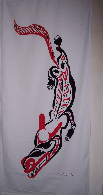
A banner, I’ve found, is hard to hang by itself. Several weeks after buying the Bill Reid raven banner that is one of my daily delights, I limped back to the Bill Reid Gallery to buy the wolf banner in the same series.
Since an injury had delayed me picking it up, I had been tormenting myself with visions of collectors discovering the banners and snapping them up, but, happily my fears were unrealized. Had I wall enough and cash, I could also have bought the frog, Mouse Woman, Dogfish Woman, and Beaver banners that were my alternate choices.
However, I am pleased to have the wolf banner, because it is one of the most playful in the set of 13 banners. As Reid himself points out in the text of All the Gallant Beasts and Monsters, the book from which the banner designs were taken, wolves must have been a fantasy figure in traditional Haida culture, since they are not found on the islands. He suggests they must have been semi-mythical, the epitome of ferocity and hunger, with their teeth always sunk in somebody’s belly.
It is this fantasy figure that Reid presents on the banner. The wolf’s twisted posture and the arrangement of the feet suggest that it stalking low to the ground. The head, which is as large as the body is dominated by the teeth, which are three-quarters the length of the head, with outsized nostrils and ears giving it a look of ferocity, especially with all these elements being red. The waving tail, also as large as the body, also helps to suggest intent, furious motion.
The most traditional element in the banner is the head, and even there, the design elements are designed to suggest a roundness of form – a kind of nod to realism. By contrast, only the back hip-joints in the body are classically designed. The length of the body, the feet are almost sketch-like in comparison, consisting of red ribs and black fur. As with the raven banner, in which the body is almost neglected in comparison to the body and the wings, in this banner Reid is focusing on the key aspects of the figure. Even the claws are not emphasized in any way, perhaps because it is the wolf’s hunger that he is most interested in.
All Northwest coast art has the habit of distorting figures to the surface, whether that surface is a ring, a box, or a spindle. Designing for the printed page or banner, Reid has no need to warp the design, but he does so anyway. His wolf twists asymmetrically, leaving much of the left side of the space blank – a suggestion, perhaps, that the wolf is stalking and trying to make itself less visible. One rear foot is stretched out behind suggesting that the wolf is moving low to the ground. At the front, though, the figure is so twisted that one foot is unseen, hidden by the head. Overall, the contortion of the wolf suggests a cat more than any canine – a reminder that this is a fantasy, but one whose blurring of natural categories adds to the menace.
Unlike the raven, the wolf banner has little sign of naturalism. With its modernly asymmetrical posture and the use of red to emphasize the wolvish elements, this is an animal that has been designed rather than observed. You sense right away that this wolf is the sort you have nightmares about. It’s a second cousin to the one in “Peter and the Wolf” and Tolkien’s wargs, the kind you imagine chasing sleds across the frozen Russian steppes in the hopes of snapping up a passenger.
At the same time, the depiction is so exaggerated that there is a kind of black humor to this wolf. From both the design and his remarks, I suspect Reid enjoyed both the menace and the humor. The result is an ambiguous design that is both these things at once.

Leave a comment