The Freda Diesing School of Northwest Coast Art in Terrace teaches not only design and carving, but also the business of being an artist. For this reason, its program includes several school shows. A few weeks ago, when I heard that the mid-term show was being held, my Internet acquaintance John Wilson said he would take some pictures for me.
I expected maybe half a dozen pictures. Instead, he sent fifty, covering most of the show and giving me a preview of the next generation of Northwest Coast artists, at least so far as sketches and paintings go.
The presentation of some of the works left something to be desired (unless, of course, you think brown parcel paper or cardboard makes a good matting), but I hardly noticed such shortcomings. Since I am just learning some of the fine points of formline and other elements of Northwest Coast design – strictly from an enthusiast’s viewpoint – I’ve had many pleasurable hours over the last few weeks pouring over the photos.
I can’t hope to mention every picture I looked at. In particular, I won’t mention John Wilson’s contributions, since I’ve blogged about his work in some detail before. However, when I narrowed them down to eight or nine, I found that I was consistently picking the same three or four artists – one of whom I already knew, and the rest of whom were new to me.
One of the pictures that stood out for me was Charles Wesley’s double whale. I am always partial to split designs, and this one caught my eye immediately, with its symmetry of lines and color. The formlines on the top of the body of the whales might be a little thick, especially at the shoulders where they meet the bottom formline, but the thickness does give a boldness to the design. Elsewhere, though, the junction of formlines is neatly minimized – especially where the bodies meet the tail. Moreover, the u-shapes between the heads and shoulders and the matching red and black designs on the body and outside it show the attention to detail of a true perfectionist.

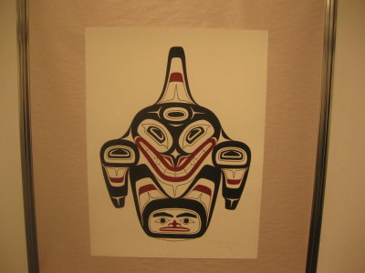
By contrast, Latham Mack’s killer-whale uses a different perspective, showing its subject head-on in a style that is more common to carving that two-dimensions, and that seems to flatten the snout . In this piece, the formlines are so thick that the design could easily have been a disaster, but mack manages to pull them off with lots of tapering and white space. at the joins I like, too, the way that the design is framed by ovoids, and similar shapes are re-used in slightly different positions throughout. Another interesting element is the way that the design on the fin suggests a hat with a potlatch ring, a detail that suggests both chieftainship and transformation.

Another artist whose work caught my eye is Todd Stephens, who had several works in the show, including a beaver and a simple mask. What appeals to me is the elegant simplicity of his designs. For instance, on Stephen’s beaver, the formlline becomes the arms. Stephens also consistently minimizes the thickness of merging formlines, inserting spaces and spacers to control them. All these formlines nearing but only touching at a point or two give a realistic restlessness to the beaver, adding up to more than what Bill Reid called “the obligatory Canadian content.”

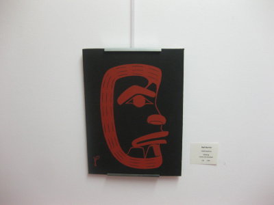
As for Stephen’s mask, it is interesting for being more a sketch of a mask than a two-dimensional face and for its inversion of the primary colors. Add the simplicity, and the result is a surprisingly contemporary look.

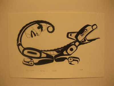
But perhaps the most interesting pieces in the show were by Shawn Aster, a young artist from whom I’ve already commissioned a painting, but whose show pieces I picked out without knowing who did them. Aster has several pieces in the show, but two in particular are strikingly original. The wolf seems almost archaic in its design (look at the teeth and the body decorations) while having enough traditional elements to place it squarely within the northern tradition. The spikiness in the design, which suggests fur, and the spirit in the tail, as well as the posture, which seems a mixture of a howl and a crouching to spring are other details I appreciate.

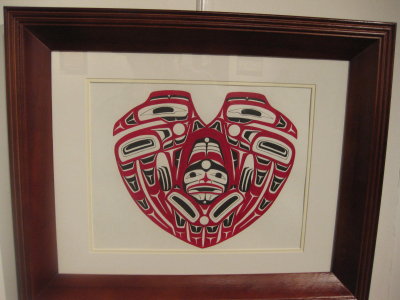
Aster’s conjoined birds are equally intriguing. The compression of the elements into the overall shape brings the already abstract elements of Northwest Coast design to an even greater level of abstraction. Meanwhile, the contrast between the serenity of the birds’ faces and the tormented, imprisoned figure between them adds another element of interest to the composition. Considering the timing of the show and the overall shape, I suppose you could consider this a Valentine’s Day design, with the central figure representing the strain of two people in a relationship – but, no matter how you interpret this design, it is one of the standouts of the show.

Some of these artists I hope to buy a painting or two from. Others I plan to keep an eye on. John Wilson tells me that another show is planned for the end of term in April, and I can only hope to get a remote viewing of it as well.