Feeds:
Posts
Comments

Archive for the ‘art appreciation’ Category

Kwakwaka’wakw carver Beau Dick is one of the names on my short list of people from whom I would one day like to buy a mask (for the record, the others are master carver Norman Tait, Nishga’a surrealist Ron Telek, and Tlingit carver Stan Bevan). Not only does Dick have a subtle sense of color that is rare in Northwest Coast mask-makers, but he manages to find endless creative possibilities in two main figures — Bukwus, the wild man of the woods, and Tsonoqua (also called Dzunuk’wa), the wild woman – producing countless masks of both without repeating himself very much. And, like the others on my list, he is meticulous about finishing details, although he often chooses a rougher look than Tait, Telek, or Bevan. So, last month, when I came across a few sketches by Dick for about the price of a quality limited edition print, I was instantly tempted to buy.

The first Dick sketches I saw were at the Inuit Gallery in Gastown. One was a colored pencil sketch of a mask with a quick gradient background, one was a mask done in charcoal, and the third was a colored sketch of a dancer. At first I thought them unique, but a week later at the Latimer Gallery, I saw some similar works, as well as some colored pencil sketches of dancers that I suspected were done from photos. The Latimer Gallery pieces were dated about four years later than the Inuit Gallery mask sketch, and were about two-thirds the price, although I judged them not quite so interesting.

From what I was told at the Latimer Gallery, the mask sketches were the result of a period in which Dick had sketched his designs before carving them. He had tried this experiment at least twice, once in 1999 and again in 2003. I don’t know, but I surmise that he either was not especially satisfied with the results, or found the exercise not useful for his carving since (so far as I know), he only tried the experiment a few times with masks. I hope one day to learn more.

Meanwhile, I was disappointed to find that the sketches weren’t as unique as I had imagined. Instead of coming down the next week to buy the mask sketch at the Inuit Gallery, I went to other galleries instead.

But, last Saturday, Trish was well enough to take a brief tour of some of the downtown galleries. When we reached the Inuit Gallery, she was as intrigued by the sketch as I had been, and we bought it on the spot, bearing it home in a mailing tube sealed with tape at both ends to keep out the rain and wrapped in a plastic bag. Tomorrow, it goes to the framer.

What interests me in the sketch is partly the subject matter. If you have ever been in the northern rainforest alone, especially near nightfall, you have no trouble understanding how Tsonoqua entered the local myths; she’s the sense of something terrifying moving just behind the trees.

But, just as importantly, the sketch is interesting for the way it is rendered. If you examine the lines of the face, you’ll see that they are not lines so much as surfaces. Even a single line, like the ones on either site of the mouth are not so much lines as areas, and their shadows are likewise. In other words, Dick is sketching with a carver’s eye.

The only exception to this approach is the hair of both the head and the shaggy eyebrows (although even the individual hairs tend to be thick). The mixture of the two different approaches only adds to the oddness of the face. So does the red patch on just one of the cheeks.

The sketch is rough, but not so rough that Dick didn’t give it a bit of a finishing touch with the gradient background. I suppose that some people would consider the roughness a fault, but, really, what else do you expect in a sketch?

Anyway, a calculated roughness is a common characteristic in a lot of Dick’s work, and seems to suit a character that has been living rough.

One day, I might be lucky enough to find the mask that matches the sketch. But, for now, the sketch is a small and slightly curious addition to our small art collection.

B

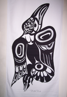
Tsonoqua Mask by Beau Dick

Read Full Post »

I confess: I’m an enthusiast for Northwest Coast art, yet I have no trace whatsoever of First Nations ancestry in me. This fact doesn’t bother me particularly; I like what I like. But, as I festoon every square centimeter of wall space with art, one or two people have wondered if I’m guilty of cultural appropriation. Can someone with my background really appreciate Northwest Coast art?

My first response is flippant: If not, then a lot of talented artists will have to take day jobs.

But the response deserves a more serious answer, if only because it keeps coming up. So, in short, I think that I have no trouble whatsoever finding ties to the school of art I like best.

I should say at the beginning that the appeal that Northwest Coast art has for me has nothing to do with primitivism. I despise primitivism as condescending and labored, and want nothing to do with it. If I felt otherwise, then my interest in Northwest Coast art would probably extend to the Woodlands and Inuit schools in North America, and to the Maori of New Zealand. But I have only a mild interest in any of those. I feel that I don’t know enough to properly appreciate them.

Besides, I don’t believe in the noble savage myth, and wouldn’t apply it to the Northwest Coast cultures if I did. They are far too complex and sophisticated.

In fact, Northwest Coast art today is not an isolated, entirely self-referential art form at all. Northwest Coast art as we have known it in the last sixty years or so is – for all its historical roots – a thoroughly modern art form. If it draws on the myths and cultures of the coastal peoples for inspiration and design, it relies just as much on European art for technique and reference. Not only are artists experimenting with new forms such as glass, but often they are working with a full awareness of not only the local school of art but also other schools from around the world.

For example, when the young artist Alano Edzerza can do a print called “Think Like a Raven” that he describes as a Northwest Coast version of Rodin’s Thinker, you know that he and his peers are not working in an isolated tradition. For all their local roots, they are also thoroughly internationalist. In this sense, it seems perfectly appropriate that the central figure in the Northwest Coast renaissance should be Bill Reid, a man who was not only of mixed European and Haida descent, but who also studied the latest jewelry techniques in Europe and applied them to the local school of art. When a school is so internationalist, then few people should have any trouble finding a connection to it.

Even were that not so, I could still appreciate Northwest Coast works for their sense of craft. By this, I do not just mean the finishing details on a Norman Tait mask or the sense of line in a Susan Point graphic design. Nor do I just mean that Northwest Coast artists today can choose between the classicism of working with traditional forms and the romanticism of innovation, although this situation means that Northwest Coast art is one of the most varied and flexible schools of modern art.

I am also referring to the whole geometric basis of the art, with the repetition of simple forms adding up to the creation of more complex ones. This structure seems to straddle the line between representational and semi-abstract art, falling to one side or the other according to the preferences or the whims of the artist. How each artist goes about creating complex shapes from the simple ones is an inexhaustible study, and one that exists at least to some extent outside the specific tradition. In many ways, it is a matter of pure technique.

However, the greatest appeal of Northwest Coast art for me is very simple. I am sure that I would appreciate the school even more if I were Haida or Tsimshian or Salish. Then, perhaps, I would have the cultural resonances and perhaps familial familiarity to understand more completely what I am seeing when I look at a piece of Northwest Coast art.

However, I do count myself lucky that I have the next best thing. My family may have been on the northwest coast for less than a hundred years, but I have lived all my life here. If my knowledge of the cultural references is learned from books, the natural references are second nature to me.

True, I live in a urban area, but that area is Vancouver, where modern industrial life and the wilds are so close together that you can go from downtown into wilderness in less than an hour unless it happens to be rush hour. Being in such proximity, the wild is always intruding on the city, and you don’t need to be a hiker or cross-country skier to find it.

Even though my day job is at a computer in my house, I have still confronted a raven eye to eye and knowing that another sentient being was watching me. From that experience, I have no trouble understanding why the raven is a trickster in local mythology. I have been deep enough into the northern rainforest that I have felt the disquieting silence that explains the stories about the Dzunuk’wa. I have seen orcas in the water, and my sense of spring is partly involved with the seals going upriver chasing the eulachon, just as the end of summer is marked by the salmon runs (or, increasingly these days, their failure). The landscape that the art talks about is the one that I live in, and, while as a city-dweller I see far less of it than the people living here three centuries ago did, enough remains for me to identify with it to a degree.

By contrast, I can feel far less for the art of the Celtic and Germanic peoples that likely make up my actual ancestry. I don’t live in the land that produces it.

No doubt for some people, these connections are still not enough to give me the right to appreciate Northwest Coast art. They might even say that I appreciate it for the wrong reasons. Yet, with six hundred years dividing me from the Italian renaissance, the same might be said of my appreciation of Michelangelo or Raphael. Art speaks to its viewers in many ways, and, in the end, what matters is that it speaks at all – not what dialect it uses.

Read Full Post »

This weekend, I scouted the Northwest Coast galleries around the south end of the Granville Bridge. Here are my impressions:

  • Eagle Spirit Gallery: Located on the edge of Granville Island, this gallery is one of the pleasanter viewing areas that I’ve seen, with lots of natural light and indirect sun. It seems aimed at the corporate or public buyer rather than the individual, with many larger-than-life plaques, masks, and sculptures. Its selection includes some of Robert Davidson’s recent sculptures (which you don’t see much of), as well as works by Lyle Campbell, but, for me, Francis Horne, Sr.’s “Spirit Raven” was the only really exceptional piece. Even browsing casually, I saw a surprising lack of finishing detail on some pieces, including some by artists whose work is usually more polished. In general, the selection seemed a little too safe for my taste.
  • Edzerza Gallery: I discovered this gallery by accident, occupying the space that used to be occupied by the Bentbox Gallery, a block from Granville Island. Owned by the young artist Alano Edzerza, it displays mostly his prints and jewelry, but includes selected pieces from up and coming artists. For a young artist, running your own gallery seems a daring move, but, I’m proof that it pays off, since it means that I noticed Edzerza’s work for the first time, and he’s now on my list of artists whose work I want to buy. While I was there, I also met another artist whose work I admire. The selection is relatively small, but I am sure that I’ll be coming back, both to support the venture and to buy.
  • Latimer Gallery: A block from the Edzerza Gallery, the Latimer features moderately priced limited edition prints, masks, and jewelry I remember this gallery as being more touristy than it was today, so either my memory is faulty or else its stock has gone upscale a little. I had no trouble finding some small treasures, including some old Bill Reid prints, and some very affordable crayon sketches by Beau Dick. I don’t think I’ll be a frequent visitor at the Latimer Gallery, but I will be dropping by now and then to check what they have.
  • Douglas Reynolds Gallery: Located in gallery row a block up from the south end of the bridge, this shop is aimed at the high end of the market. Besides the inevitable Robert Davidson and Susan Point prints, it includes a number of masks by Beau Dick, and at least two striking wall plaques by Don Yeomans. It also includes a selection of gold and silver bracelets, rings, and earrings, including a few small pieces by Gwaai Edenshaw. The stock seemed a little safe to me, but was adventurous enough here and there to make me want to return occasionally.
  • There are still Northwest Coast galleries I haven’t visited in Vancouver, but these four, together with the ones I visited last week in Gastown, are some of the better known ones. Besides finding which galleries seemed right for my own art buying, visiting a number of them has helped me to understand the market a bit better, including such as who are the established and upcoming artists, and what are the going prices for each artists’ work. This knowledge makes my visits well worth the effort, especially since you can easily see a number of galleries in an afternoon without doing much travelling.

Read Full Post »

Years ago, when we were buying Northwest Coast limited edition prints, our main criteria was often whether our budget could stretch to buying one. That is still a consideration, since although we have more spare cash than we did then, we are still far from wealthy. Besides, I’m born of Depression-era parents, so getting value for my money is as reflexive as breathing to me. But, the limited budget aside, I am starting to articulate my philosophy for buying art.

To begin with, I will buy nothing that I don’t like. I am not buying for an investment, even if it is at the back of my mind that in four or five decades I might be glad to be able to sell a few pieces so that I can buy the necessities of life. I am buying to bring a new strain of enjoyment into my daily life, something that can catch my straying glance or surprise me with its line or color or concept when I rediscover it in passing. I suppose you could say that I am more of an aficionado than a collector.

Second, I am not much interested in safe art that does what I have seen before. Some people want safe art as a kind of wallpaper, and there is no shortage of artists to provide it. But I want art that challenges or provokes me in some way. For example, one mask by Norman Tait has long eyelashes of hair that cover the eyes, giving a disturbing sense of blindness, or, perhaps more accurately, the sense of someone peering out from behind the illusion of blindness. The mask unsettles me, to say the least. If I can ever afford the mask, I’ll probably buy it, just so I can wrestle with why it makes me uneasy – and I’m guessing that understanding my reaction will take years. I’m fascinated with the surrealism of Ron Telek’s sculptures for much the same reason.

These two principles lead naturally to a third: I will not buy a piece simply because of the artist’s reputation. For one thing, buying work by artists like Robert Davidson or Susan Point, as talented as they are, is like buying Sony hardware – you are paying a premium for the name (or perhaps I should say brand).

More importantly, buying for the name means that you are letting someone else do your thinking for you, that you are becoming a consumer. Seduced by the name, you could just as easily buy a good piece as a bad, and third rate art by a first rate artist is still third rate. I consider art the antithesis of consumerism, so I refuse to hunt for art by brand.

That’s not to say that I reject buying anything by well-established artists. Currently, I have my eye on half a dozen well-known artists whose work intrigues me enough that I might buy one of their pieces if I find the right one. But I would rather wait for that right piece than buy something that pleases me less – even if I never find that right piece.

As a corollary to that third principle, I would rather find small masterpieces by lesser known artists than buy a piece from someone with an existing reputation. In the same way that I would rather discover a small, ethnic cafe with superlative food than eat at the latest trendy restaurant, I would rather find a largely unknown carver with superb finishing details or a quirky piece outside what a famous artist is known for than buy something safe and famous.

It’s not that I want a bargain, because I could just as easily wind up overpaying as finding a strong investment. Rather, half the fun of strolling the galleries for me is to find the unusual and go beyond the commonplace. Northwest Coast is an especially appropriate field for this habit, because it is full of newcomers, all determined to make their names – and many of them are succeeding. The discovery of such artists and their works is one of the pleasures of appreciating it.

Looking back, I’m afraid that these principles sound hopelessly unaesthetic, to say nothing of overly-suspicious and in the worst middle-class traditions. Tell you what, though: I bet that they give me more pleasure than buying from the exhibit book does for a dozen wealthier connoisseurs.

Read Full Post »

A banner, I’ve found, is hard to hang by itself. Several weeks after buying the Bill Reid raven banner that is one of my daily delights, I limped back to the Bill Reid Gallery to buy the wolf banner in the same series.

Since an injury had delayed me picking it up, I had been tormenting myself with visions of collectors discovering the banners and snapping them up, but, happily my fears were unrealized. Had I wall enough and cash, I could also have bought the frog, Mouse Woman, Dogfish Woman, and Beaver banners that were my alternate choices.

However, I am pleased to have the wolf banner, because it is one of the most playful in the set of 13 banners. As Reid himself points out in the text of All the Gallant Beasts and Monsters, the book from which the banner designs were taken, wolves must have been a fantasy figure in traditional Haida culture, since they are not found on the islands. He suggests they must have been semi-mythical, the epitome of ferocity and hunger, with their teeth always sunk in somebody’s belly.

It is this fantasy figure that Reid presents on the banner. The wolf’s twisted posture and the arrangement of the feet suggest that it stalking low to the ground. The head, which is as large as the body is dominated by the teeth, which are three-quarters the length of the head, with outsized nostrils and ears giving it a look of ferocity, especially with all these elements being red. The waving tail, also as large as the body, also helps to suggest intent, furious motion.

The most traditional element in the banner is the head, and even there, the design elements are designed to suggest a roundness of form – a kind of nod to realism. By contrast, only the back hip-joints in the body are classically designed. The length of the body, the feet are almost sketch-like in comparison, consisting of red ribs and black fur. As with the raven banner, in which the body is almost neglected in comparison to the body and the wings, in this banner Reid is focusing on the key aspects of the figure. Even the claws are not emphasized in any way, perhaps because it is the wolf’s hunger that he is most interested in.

All Northwest coast art has the habit of distorting figures to the surface, whether that surface is a ring, a box, or a spindle. Designing for the printed page or banner, Reid has no need to warp the design, but he does so anyway. His wolf twists asymmetrically, leaving much of the left side of the space blank – a suggestion, perhaps, that the wolf is stalking and trying to make itself less visible. One rear foot is stretched out behind suggesting that the wolf is moving low to the ground. At the front, though, the figure is so twisted that one foot is unseen, hidden by the head. Overall, the contortion of the wolf suggests a cat more than any canine – a reminder that this is a fantasy, but one whose blurring of natural categories adds to the menace.

Unlike the raven, the wolf banner has little sign of naturalism. With its modernly asymmetrical posture and the use of red to emphasize the wolvish elements, this is an animal that has been designed rather than observed. You sense right away that this wolf is the sort you have nightmares about. It’s a second cousin to the one in “Peter and the Wolf” and Tolkien’s wargs, the kind you imagine chasing sleds across the frozen Russian steppes in the hopes of snapping up a passenger.

At the same time, the depiction is so exaggerated that there is a kind of black humor to this wolf. From both the design and his remarks, I suspect Reid enjoyed both the menace and the humor. The result is an ambiguous design that is both these things at once.

Head Closeup

Read Full Post »

Since I bought the Bill Reid banner last week, I’ve been thinking a lot about living with art. I pass the banner several dozen times a day, and, at just under two by one meters with a powerful design, it constantly catches the eye.

My first conclusion about living with art is that it’s not a possessive thing – at least, not for me. I don’t gleefully exclaim to myself “Mine!” when I see it, or even the more proper, “Ours!” Nor do I think that I’ve made a good investment, or how much the banner might increase in value over the years, because I have absolutely no intention of selling it.

So far as I can tell, I would get the same pleasure if I was undertaking an extended stay in a hotel room that included the banner, or if it was simply on loan. It’s being around a work of art that is important to me, not who owns it.

My chief reaction is a feeling of being privileged to see the banner every day. Having my aesthetic appreciation stirred several times a day is an intense feeling. It relaxes me and leaves me content in a way that very few other things do. Great art (by which I mean art that is skillfully done and more than just giving people what they think they want, not simply art made by someone that consensus classifies as a great artist) has a purity of intent that contrasts strongly with the everyday world. Like learning, it’s above the petty corruptions and compromises that we usually just accept without questioning. It has a sustaining quality that arbitrary, constant-changing fashion can never have. Its excellence is the best of us, and I am quickly becoming convinced that we are better for living with such art. Or, at least, I am.

Another benefit of living with art is that you get a chance to see how an artist works. When you see art in a gallery or in a book, you rarely have time to pinpoint why you react the way you do. But when you see a piece every day, you start to appreciate it in much greater detail.

For instance, after a week of living with the banner, I now understand that Reid was a meticulous planner, and that his designs not only frequently have a geometric pattern in them (such as triangles whose corners consist of similar shapes or a certain number of objects such as feathers), but also are constantly playing symmetry against asymmetry – a contrast that seems utterly fitting for an artist who is at once working in a tradition and with modern concepts of design. For years, I’ve been spell-bound by Bill Reid’s work, but until now I never noticed these characteristics of his work.

Of course, I don’t claim that one piece teaches me everything about his work, or that I have discovered everything about this particular work – especially not in seven days. But I know more about his work than I did, and now I understand more about his style and his design sense, as well as that of other artists in the same tradition. By living with the piece, I know a little more than I have previously done, and I look forward to learning more.

Living with art, I’ve decided, is one of the great civilized pleasures of the world, like an unexpectedly fine beer or wine or discovering a superb restaurant. It’s also a pleasure that I’ve mostly overlooked for a number of years and that I plan to pursue from now on as much as a limited budget allows.

Read Full Post »

For many people, Bill Reid is the epitome of Northwest Coast art. The reputation is both deserved, given the quality and variety of his work and unfair, given the number of artists in the same tradition who are equally worthy of acclaim. But regardless of how you view his reputation, Reid has a strong claim to being the major Canadian artist of the late twentieth century, with one of his pieces both on display at the Canadian embassy in Washington, D. C. and on the back of the Canadian twenty dollar bill. And, like any admirer of Northwest art, for a long time, I’ve lusted to have one of his works but been unable to afford one – until now.

Even then, I only did so by getting into an area that the collectors haven’t discovered yet. I bought a canvas raven banner whose design is an expansion of the illustrations that Reid did for All the Gallant Beasts and Monsters, which was published in 1991. The banner was part of one of two complete sets of banners from the personal collection of Martine Reid, his widow, and was sold through the recently-opened Bill Reid Gallery in downtown Vancouver, so its provenance is unquestionable. In fact, I’ve left my email address with the gallery so that Martine Reid can give me more details about the banner.

The last stages of Reid’s development as an artist could be called his post-Haida era, in which Reid, while obviously basing his work on tradition, began incorporating more modern or personal elements into his work. The banner fits very clearly into this period.

While the ovoids and wings feathers are in the Northwest tradition, the torso, the foot at the bottom of the tail and head feathers are something else entirely. Similarly, while the twisting of the entire figure as though it is turning away from the viewer seems in keeping with the distortion of figures to fit a particular shape in classic works, Reid handles the distortion with high imagination, inverting shapes on one wing on the other, and presenting some shapes in full on one wing, but only hinting at them in another. It is as though Reid is inventing a new form of perspective that comes from neither Northwest nor modern art, although obviously drawing on both.

Raven Banner

Reid’s design is equally playful when it comes to symmetry, seeming to abandon it at first glance, but really playing some complex games with it. The body of the raven is defined by the triangle formed by the ovoids on the wings and at the base of the tail, an unusual shape in traditional art. At first, too, the body seems asymmetrical, with the left wing showing three flight feathers and the right wing four – but then you notice that the right wing’s four feathers matches the four toes on the foot and the neck feathers, and forms another triangle whose angles are an inversion of the first triangle.

Then, in contrast to this complexity, there’s the simplicity of the head, with its economical lines and the heavy beak that suggests both the classic depictions of the raven and their actual appearance.

Head Closeup

It’s a complex work, and one that could only come after decades of development, with clean lines that stand out all the more because the design is black on white.

I don’t know if I got a bargain or overpaid, or whether the purchase will prove a good investment. The price was acceptable to me, and, since I bought the work because I admired it, I don’t care if its value increases over time. But the work shows all the mastery of Reid’s last period, and I admire it hugely.

The only trouble is, I’ve hung it in our hallway, and the rest of the hallway cries out for a matching banner. So, I suspect this won’t be the only Reid banner I’ll be buying this year. But if I can get one that intrigues me as much as this one, I’ll be extremely well satisfied.

Read Full Post »

My friend Bob Ley has been an art collector as long as I’ve known him. The office where he practices psychology is carefully decorated with unique paintings and antiques – mostly modernist, with a tendency to primitivism and abstracts, but all of them a welcome change from the endless reprints of 19th century impressionists or the bland corporate art visible elsewhere. “I’ll never understand why my friends will pay $100 for a print of Van Gogh’s Sunflowers and then another $400 for the frame,” he says, “When for the same price they could get an original work of art.” After my purchase of a custom West Coast bracelet a couple of weeks ago, I know what he means.

Buying original art may be expensive, but it’s also very satisfying. For one thing, in West Coast art, at least, it means experiencing another level of quality. I’ve long been aware of the vast difference in quality between the bracelets and masks in tourist shops in Vancouver and the true art galleries; you don’t need the price difference to see the difference in quality. But when you enter the world of custom art, you discover a new standard altogether. It’s not that the art galleries are full of shoddy work, or that you can’t find quality pieces in the tourist shops if you search carefully. Rather, there’s a freshness in custom work that you don’t usually see in designs knocked off for the tourist shops, or even for limited editions. Custom work tends to engage the artist in ways that other work doesn’t, simply because it’s unique.

For another, when you commission an original piece of art, you experience the pleasure of being a patron. Besides the beauty of the piece itself, you have the pleasure of knowing that, if not for you, the piece wouldn’t have come into existence. The artist, of course, is the primary creator, but, as patron, you have a minor secondary role. On a small scale, you can glimpse why Lorenzo de’ Medici was such an enthusiastic supporter of artists.

Even more importantly, you can view new art with a clean eye, in a way that’s rarely possible with works firmly enshrined in the canons of great art. Short of a radical step such as the cleaning of the Sistine Chapel’s ceiling, I doubt that anyone can appreciate works from the high renaissance like da Vinci’s Mona Lisa in the same way that people in the sixteenth century could. We’ve not only seen these works too often, but we’ve been told too often what to think of them. While some appreciation can be gained by seeing such works in person as opposed to in a print or an illustration, for the most part we’ve lost the power to see these works for themselves. With newer, less familiar works, we can still see the accomplishment for themselves.

This ability is important, because living with art enriches and relaxes us. A room designed by an architect of genius is simply a comfortable place to live or work, although many people would be hard-pressed to notice or tell you why. A room decorated with art that you can still see with fresh eyes has much the same effect. Both are at the opposite end of the spectrum from public institutions with deliberately mediocre art. What’s more, such rooms become more comfortable as people spent more time relaxed in them; the way we use room really can create an impression or aura that we can respond to (which is why I don’t frequent the coffee shop in the old gatehouse of the BC Penitentiary – there’s been too much misery, however justified, in the place for it ever to be a place I’d care to linger).

In the same way, with my new bracelet, I walk a little straighter and my stride has a bit more of a bounce because I am always aware of its weight on my arm, and the way it catches the light. Moreover – even better than an artistic room or a room full of art – I carry the bracelet with me, and can enjoy a closer look at the design whenever I want.

That, really, is the ultimate pleasure in commissioning a new piece of art for yourself: You not only have a unique relation to it, but your life is broadened by an appreciation of something breathtaking and new.

Read Full Post »

« Newer Posts