Feeds:
Posts
Comments

Archive for the ‘masks’ Category

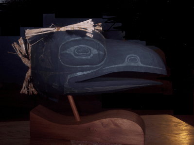
Recently, a gallery owner said to me, “Your collection of Northwest Coast Art has some really unusual pieces in it. After a moment’s thought, I replied, “Why would I want pieces I could find anywhere?” I’m not buying tourist junk, and most artists are at their most interesting when they are doing something outside of their normal range. Certainly, that is one reason why I bought Kwakwaka’wakw artist Steve Smith’s “Raven Mask.”

Smith’s work is regularly on sale at the Lattimer and Coastal Peoples Galleries in Vancouver. Most of his work has two characteristics: first, it is painted with intricate geometric shapes, primarily in black,green, and red, and, second, it has a wide varieties of forms – everything from boxes and vases to canvases, baseball caps, leather cuffs and Munnies. It’s a highly distinctive style, one identifiable from a distance, and I’ve enjoyed it for some years without being quite moved to buy, although I figured it was only a matter of time before I found the right piece.

I found the right piece while attending the opening of the Lattimer Gallery’s Annual Bentbox Charity Auction in November 2010. Having admired the boxes being auctioned, I was leaning on the main display case when I glimpsed “Raven Mask” out of the corner of my eye, and went over for a closer look. I looked several times again that evening, and a few times more on subsequent visits to the gallery, until I bought it a few weeks later.

Perhaps because I remember black and white television and photographs from my early childhood, I often find monochromatic work more dramatic than colored work, especially when in shadows. But even without this personal preference, Smith’s “Raven Mask” is striking among his more colorful other works. Even the black is more faded than on his other works, and the white is closer to a dirty silver color. And instead of Smith’s usual geometric shapes, the piece is simply painted with a few basic shapes. It could almost be a survivor from the 19th century, except that it is not a functional mask.

Not only that, but it seems a survivor that has come through fire, singed so that it looks like charcoal or ash, and the paint has started to blister. So far, I have not been able to ask Smith why he departed so far from his usual color palette, but to me the piece seems a reminder of the art that was burned as unacceptably pagan in the late nineteenth and early twentieth centuries. At the same time, its appearance of being lightly damaged suggests the artistic tradition of the coast today – damaged, yet still powerful. Extending the metaphor even further, you might say that the bundled cedar and the feathers are a literal grafting of new media and techniques on to the old.

However you view it, it remains an arresting piece, especially in darkness. As I type, it is a few meters away on a tea tray, pointed so that it catches my attention when I glance over my left shoulder. I have to be deep in the torments of writing before it fails to capture my attention and make my glance linger for a few moments.
Read Full Post »

One of the dangers of knowing artists (pity me!) is that, when they’re in town, they usually have pieces for sale. That is what happened a few weeks ago when Mitch and Diana Adams were in Vancouver a few weeks ago for the Chinese New Year celebrations. After dim sum, Mitch took my back to his mother-in-law’s apartment to show me what he had brought with him – and, inevitably I bought two: A Gagiid mask and a Killer Whale Comb.

The Gagiid features in the dances of Haida secret societies. The Gagiid is a castaway who, as he wanders the shoreline by himself, grows so crazed that in his endless foraging he devours sea urchins without removing the quills, which embed themselves around his mouth. Cryptozoologists often take the story as evidence for the existence of the Sasquatch, but this identification requires a giant leap of illogic, since the Gagiid is originally a normal man, and in the dances (if what I have heard is correct), the point is to reintegrate him into society. Today, at least, the Gagiid is frequently green, a depiction that often encourages Incredible Hulk jokes – a comparison that is actually closer than you might at first think, since the story of the Hulk is also about reintegrating him into society.

Mitch Adam’s Gagiid caught my attention because of the attention to details. His mask’s blue eyes are not an anomaly, and most likely not an effort to connect the Gagiid with Europeans; blue-eyed Haida were apparently noted by the first Europeans to reach Haida Gwaii in the eighteenth century. However, like a shaman, this Gagiid has eyes with pupils that roll upward, suggesting he is in an altered state of consciousness.

Other details follow naturally from the story. The Gagiid’s face is long and thin, as though he is half-starved. The gaps between his teeth suggest that some are missing, while those that remain are irregularly shaped and sized, as though they have been chipped, either through eating hard food or perhaps after too many falls on the rocks that line the shore. Moreover, not only are the lips swollen, but the the lower face is out of proportion, as though it has swelled, too. Similarly, the blood drawn by the sea-urchin quills (on the mask depicted as porcupine quills) is fresh and running on some, as though the wounds were fresh, and simply a ring of red on others, as though the wounds were made some time ago and the blood has dried.

What makes this detailing all the more impressive is the size of the mask: approximately sixteen by ten centimeters. I have seen masks twice or three times the size with less attention to detail (several with woolly eyebrows that give the Gagiid the appearance of Groucho Marx, an effect that Adams has avoided, I’m glad to say).

The same attention to detail is found in Adam’s Killer Whale comb, which is about the same height as the mask. Combs of this design, he tells me, were not for tidying a head of hair, as most people assume, but for untangling the warp of wool on a loom. Perhaps this knowledge of the shape’s purpose encouraged him – unlike the designers of many combs in Northwest art – to carve a comb that is actually functional, with flat sizes and tapering ends, and not just an approximation of the shape.

Made of yew, Adam’s comb benefits from the beauty of the tight and highly visible grain. However, the grain probably caused him trouble, too, since it runs vertically while the design is horizontal. On one side, the pupil of the eye looks as though it might been a knot, and, if you look closely, you can see several other places, such as the outer curves of the mouth or the shape of the nostrils, in which the two sides are not perfect mirror images. At any rate, even were identical sides possible, differences would remain, because the grain is much darker on one side than the other.

Ironically, the most regular part of the carving is the front design – probably the part least likely to be observed. Yet it is an indication of Adam’s determination and skill that the irregularities are minimized and unnoticeable to the casual eye. Having set himself a difficult task, he proves his skill by doing it extremely well.

Notice, too, how the design conforms to the shape of the comb. Only one design feature positively identifies the carving as a killer whale – the fin depicted on both sides of the handle.

Like “Peaceful Warrior,” the laminate mask I bought several months ago, these two pieces show Adams’ ability to work in miniature. He is perfectly capable of a stunning work at larger sizes, as his “Blue Moon Mask” demonstrates, but Adam’s attention to detail makes his smaller works consistently stand out from similarly-sized pieces from other artists.

My only reservation about buying these pieces is that, when I did, Adams lost the opportunity to show these work to the galleries while he was in town, and extend his reputation. I am sure that both would have sold. But, despite the danger of visiting an artist, I feel privileged to have had first chance at them, and to display them in my townhouse.

Read Full Post »

Back in June, I had dinner at the Steamworks pub with Haida / Tsimshian artist Mitch Adams and his wife Diana. Mitch kindly offered me a selection from the giclee prints that he was in Vancouver to sell. Few things feel so luxurious as a choice like that, and I could have selected several from his portfolio. However, eventually I decided on “January Moon,” which was the inspiration for his “Blue Moon Mask,” which was one of the standouts at the 2010 graduation exhibit for the Freda Diesing School of Northwest Coast Art.

The connection between the two pieces would have been obvious even if Mitch had not mentioned it. But the differences are interesting, because they show the evolution from a good execution of an idea to an outstanding one. There is little in “January Moon” that is not improved in “Blue Moon Mask.”

"January Moon" (left) and "Blue Moon Mask" (right)

The most obvious differences are in the shape and color. With its perfectly round shape, “January Moon” feels relatively static, and more abstract. In comparison, the change to an oval face in “Blue Moon Mask” is more ambiguous, as well as more realistic. Just as importantly, the colors are bolder and more glossy in the mask, as well as the contrast between them. In the print, the colors are muted, and the tones are a better match, but the result is that design tends to fade into the paper.

The exception to this general observation is the blue and black design on the rim. “January Moon”’s rim has more contrast between the colors, while “Blue Moon Mask”’s uses a darker blue that is much closer to the black. This change works because it frames the face most clearly; in “January Moon,” the blue of the rim is closer to those of the face, so that the rim frames less effectively.

However, the greatest changes are in the face. Some elements remain the same, most noticeably using the same colors for the lips, nostrils, and eyebrows. But, in “January Moon,” the eyes are also the same color, which is probably one feature too many for the design, which seems much busier than the mask.

By contrast, on “Blue Moon Mask,” the design is simplified. The teeth are gone, whose black outline is mildly discordant in “January Moon,” and much of the complication of the highlighting as well. The eyes shrink from an angry glare to closed eyelids, and the lips are smaller and barely parted instead of scowling.

The only element that is added is the tear tracks from the eyes, which I suspect originated in an accidental trickle of paint, but which works brilliantly, helping to emphasize the elongation of the face and suggesting an undercurrent of suppressed intense emotion beneath the surface appearance of serenity.

Somewhere in the middle of all these changes, the gender changes as well. “January Moon” registers as masculine to my eye (and that of those who have seen it), perhaps because of the mouth and bared teeth. “Blue Moon Mask,” however, seems female, or at least sexually ambiguous. Added to the suggestion of intense emotion being controlled, this ambiguity makes most eyes keep returning to “Blue Moon Mask” in a way that they do not to “January Moon.” Despite “January Moon”’s aggressive expression – or perhaps because of it – the eye has a hard time lingering over it. Its anger has nothing of the mystery found in “Blue Moon Mask.”

None of this is to dismiss “January Moon.” Its non-traditional eyes with their crescent moon and the creation of the nose through a clever use of negative space are admirable in themselves – so much so that I could wish they could have somehow been retained in “Blue Moon Mask.” But in the end, “January Moon” could be described as a first draft for “Blue Moon Mask.” Although “Blue Moon Mask” is the superior work, very likely it would not have succeeded if “January Moon” had not been created first. Together, they show an artist taking a leap in his development – and, I suspect, learning a lot in the process himself.

Read Full Post »

The Northwest Coast art in our home includes many contemporary pieces. However, I am also fascinated by traditional pieces, particularly recreations of historical masks according to modern sensibilities. That is why, when John Wilson’s “Voices of Our Ancestors” (aka “Portrait Mask”) became available, I jumped at the chance to buy it.

John Wilson, "Spirit of Our Ancestors"

“Voices of Our Ancestors” is based on two historical Haisla masks in J. C. H. King’s “Portrait Masks from the Northwest Coast of America,” a book first published in 1979. It is a mask well worth studying for its own sake, all the more so because examples of Haisla design are relatively rare. When you do see them, you have no trouble placing the Haisla geographically, because their art often seems like a combination of Kwakwaka’wakw and Tsimshian traditions. Nor is Wilson’s mask an exception.

Artists Unknown, Historic Haisla Masks

However, what especially interests me is Wilson’s reinterpretation of the historic masks. To start with, Wilson chooses a less rounded, more northern shape for the mask. This change is accompanied by some changes in proportions, such as a wider space between the lips and nose, and a higher placement of the ears. He has also decided not to include the teeth that are in the originals, and replaced the originals’ rounded eyes with more smaller, more slanted ones. In addition, the cheekbones of Wilson’s mask are far less prominent than in the originals. The result is a less human, more supernatural look – a fitting change, considering that the mask is a work of a modern man looking back on the past.

Another noticeable difference is in the selection of colors. This difference is not just a matter of what was available; one of the older masks actually has a brighter red than the one that Wilson uses. By contrast, even allowing for aging, the historical piece has a more subdued blue than Wilson uses. Wilson also accents the red by drawing thicker formlines, and using it in places where the historical piece uses blue.

Wilson has followed the general designs of the original, including the stylized mustache and goatee, but almost always he has put his own interpretation on them. For instance, he has taken the rows of parallel lines just visible on the colored original, and added them as a design element below the nose, replacing the rather uninspired blobs of cross-hatching, and perhaps suggesting mustache stubble.

However, the largest difference between Wilson’s mask and its inspiration is in the form lines. Although formline influence is obvious in the originals, Wilson’s formlines are more disciplined, with more variation in thickness and more balance. For instance, where the formlines on the forehead in the original meets above the left eye, Wilson’s meet between the eyes. Similarly, where the original has formlines meet on on the cheeks, Wilson’s meet at the nostril.

Probably the most obvious difference in the design is on the cheeks, where the formline helps to replace the cross-hatching, and the blue u-shapes are greatly reduced in size. Even more importantly, the red formline that follows the line of the cheek curves upwards rather than downwards as in the original, doing more than any single element to make the modern mask less human and more arresting than the originals.

“Spirit of Our Ancestors” is obviously influenced by the sources that Wilson acknowledges, but clearly it is more than imitation, or an unthinking copying of a classical piece. Wilson’s mask is more balanced piece of work than either of the originals, with a stronger northern influence as well. Although somewhat of a new direction for Wilson, it more than succeeds on its own terms. Wilson has not simply copied, but repeatedly improved as well.

Read Full Post »

John Wilson, who describes his work as “contemporary Haisla,” has only been selling his work for a few years. And, so far, he has confined himself largely to portrait masks, although he has also done drums and some graphics worth releasing as limited edition prints. I consider his “Blue Hand Mask” (which should actually be read as “Blue, Hand Mask”) an accomplished example of the portrait genre, and am pleased to add it to our collection.

If you have read Bill Holm’s An Analysis of Form, you will immediately identify the “Blue Face Mask” as being in the northern style: although the nostrils and lips are painted solidly, the hand and the spirit-helper on the left temple cut across the facial features. In fact, you cannot tell where the spirit-helper ends and the eyebrow begins – that is, what is natural and what is painted, or what is mundane and what is supernatural. Also typical of the northern style is the predominance of black, followed by red.

What is less typical is the band of blue. Cutting across the eye socket and eyelid, the band is an unusual shade. It has the effect of drawing your glance to the blackness of the pupils, giving a sense of fierceness or determination.

The painted hand is a visual pun. It has an umbilical-like connection to the spirit-helper that runs below the chin and up the left cheek. In other words, the spirit-helper is literally lending a hand. And, just to reinforce the pun, the obvious thumb shows that it is a left hand, originating on the same side as the spirit-helper.

One of the things that makes this mask stand out is the sheer skill of carving. Unlike many carvers early in their career, Wilson thinks in planes. That means he is working with the wood, rather than against it. At the same time, the mask is closer to realism than a strictly traditional piece in such features as the chin, the eye sockets, and eyes – which is what makes the mask contemporary.

Another outstanding feature of the mask is the way that Wilson has carved and sanded down to the grain that is suitable in different parts of the face. On the forehead, the ridges of grain meet almost in the center, while on the left cheek, the concentric circles of the grain emphasize the plane of the cheek bone. Even more interestingly, beneath the eyes are what might almost be reflections of them in the grain. Some bits of this attention to the grain are lost beneath the paint, but, because the paint is minimized, much of it remains visible.

Portrait masks are an easy genre to under-estimate. They lack the exoticness of a mythological theme or a stylized animal that many people seem to want in Northwest Coast art. But, if you look closely at the best examples of them, like the “Blue Hand Mask,” then you can start to appreciate them as a genre in which artists are thrown back entirely on their own skill. You can also understand why I think that John Wilson is an artist who is likely to make a name for himself.
low-res-blue-hand-mask

(Note: Somebody should explain to galleries that, when shipping masks with hair, they need to make some effort to keep the hair from getting tangled. As you can see, I am still trying to straighten out the hair)

Read Full Post »

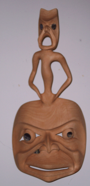
After several months of down payments, we’ve added the first mask to our collection of Northwest Coast art: “Spirit Moon Mask” by Ron Joseph Telek.

Telek is a great original – perhaps the great original in Northwest Coast art today. Inspired, they say, by a car accident in which he was legally dead for a few minutes, his work is largely concerned with images of transformation and shamanism. While his work obviously comes out of the northern tradition in British Columbia, it breaks with the tradition as much as it keeps it.

His work is quirky, asymmetrical, and fully of little details, and often more than a little disturbing. I’d call it the carved or sculpted equivalent of a Gothic novel – a dark, romantic, and highly individualistic style. Others have called him the first surrealist of the Northwest Coast, and likened some of his more disturbing images to Edvard Munch’s “The Scream.”

His imagination alone would make him one of the top carvers and sculptors on the coast today, but Telek is also a painstaking craftsman, much like his uncle Norman Tait, whom he once studied under. Like Tait, Telek is a master of using the grain of the wood to enhance his subject matter.

The same is true when he turns to other materials – there is a walrus tusk he did a couple of years back languishing in a Vancouver gallery which is so eeriely beautiful that it had to be moved further away from another piece of ivory so as not to outshine it.

Another characteristic of Telek’s work is that, in contrast to what might almost seem his imaginative excess, his finishing details are always meticulous and restrained – you won’t find any tarting up of a mask with rings of unmatched abalone or endless cascades of horse hair in Telek’s work, the way you do in less talented artists. And you never do see paint, which other artists sometimes cake on to hide defects. Like Tait, if Telek adds a finishing detail, it’s for effect.

And if all this wasn’t enough, Telek’s imagination seems endless. Other artists may have periods in their development, in which work after work resembles each other, but Telek’s periods don’t seem to last for more than a piece or two before he moves on to something new. Possibly, this restlessness works against him in the galleries, where many buyers want something familiar, but, I prefer to think of it as one more sign of an inventive and agile mind.

“Spirit Moon Mask” is one of Telek’s smaller, tamer pieces, but it strikes an interesting balance between tradition and the west coast contemporary style of architecture. But the type of odd details that make his other work so lively are there. The wall-eye, the bit of abalone that could either be a nose-piercing or a wound, the strained-looking cheekbones, the arms of the spirit rising from the moon that look like tentacles, the spirit’s arched back and round-mouthed scream — for such a simple piece, the number of unusual touches crammed into the mask is overwhelming.

Since our townhouse is small, we had been thinking of limiting ourselves to one work by each artist who attracted our attention. But, already, we are talking about making an exception in Telek’s case. Perhaps, too, we’ll save for eight or nine months and buy one of his really big works, even if we have to rent the townhouse next door to display it properly. Frankly, we’re hooked.

Read Full Post »