Feeds:
Posts
Comments

Posts Tagged ‘art’

Several years ago, Haisla carver Nathan Wilson was one of the standouts at the Freda Diesing School graduation exhibit. Unlike most of his classmates, he was already regularly selling masks to the galleries. They were well-finished, but, I thought them lacking in individuality. However, his masks also suggested that very soon he would manage that individuality – and I when I saw “ Tagwa” on Facebook, I knew immediately that he had. I immediately offered to buy it, nipping in ahead of several other buyers.

The only catch was that Wilson had done the panel for his YVR scholarship. That meant I would have to wait a year to take it home, while it hung in the Vancouver airport for a year. Then, ominously, when the year was up, Wilson said he wanted to make some adjustments to it.

Knowing something about carvers and perfectionism, I joked that the octopus would probably come back as a grizzly bear. Mercifully, on closer examination, Wilson decided to restrict himself to minor corrections, and the panel arrived at my front door fourteen months after I had reserved it.

“Tagwa” is an abstract piece, with the shape distorted to find the shape of the panel. In fact, the body of the octopus is upside down, with its beak at center left. The abstraction is heightened by the body, which – fittingly – resembles a loose sack of random shapes in which only the beak and eye are visible.

At first, only a few tentacles are visible, the others, presumably, being hidden by the octopus’ body. However, if you look closely, you start to realize that what at first appears to be the formlines for the body could actually be another two tentacles. You also realize that although four tentacle tips are visible in the right half of the panel, they twist in such a way that more tentacles may be present. Stare long enough, and the exact count becomes difficult to decide, because the tentacles seem to start twisting as you try to make sense of them.

The tentacles, they contrast with the body by having a contemporary design. Instead of the ovoids that many artists would have used to indicate the tentacle’s suckers, Wilson contents himself with plain ovals. Instead of a formline design, the tentacles themselves form the center of interest, twining and showing their two sides, one painted red and the other left unpainted cedar. If you look closely at the picture, you can see that the wood mimics the rubbery texture of an octopus’ skin.

This contrast between the two sides of the panel is heightened by its colors. The body reverses the traditional formline colors, making red the primary color and black the secondary one. In addition, as often happens in Haisla works, blue is added as a background color.

The result is a piece that immediately catches the eyes. It now hangs prominently in the center of one wall of my living room, where it catches my eye several times a day, and where in the last nine months it has become one of my favorites pieces. Wilson himself, I am happy to say, has continued to show his own sense of style in his more recent works, consistently proving himself the artist I always suspected he was.
nw

Read Full Post »

Many artists in their mid-Sixties are past their best work. Their art no longer engages them, and what made them original has grown stale, expressed only in minor works. Then there is Tahltan/Tlingit artist Dempsey Bob, whose face grows boyish with enthusiasm when he discusses his work, and who can be heard fretting about how to find time to realize all his plans. At sixty-six, Bob is as passionate as ever, and, as the work in “North,” his current show at the Equinox Gallery demonstrates in every piece, still at the height of his powers.

Part of the reason that Bob not only survives as an artist but flourishes after nearly five decades is his belief in constant development. Bob’s roots may be in First Nations traditions, but, firm in the conviction that these roots are one of the great artistic traditions of the world, he has not hesitated to explore in other directions as well. In particular, in the last decade, he has been involved in cultural exchanges with Maori artists, visiting New Zealand over half a dozen times to study a culture with striking similarities to his own. Somehow, his latest show seems to incorporate all such influences, at times suggesting everything from a Mayan glyph to European traditions while remaining an extension of his roots.

IMG_20140607_142325

Another sign of Bob’s diversity is that perhaps a quarter of the show is cast bronze. These bronzes are the product of a period that Bob went through 5-10 years ago in which he concentrated almost entirely on works in metal, doing little in wood except for large scale commissions in which he was apparently more supervisor than artist. Varying from a modern coffee table to traditional masks, Bob’s works in metal would seem major accomplishments in any other context. However, hung next to his works in wood, they seem lesser works. The lines that seem so effortless in cedar appear rigid and slightly forced in metal. Just as importantly, the relative uniformity of the metal seems strangely bare compared to the grain of the wood.

bronze1

frog-table

Bob’s wood pieces are impressive for several reasons. To start with, Bob leaves himself no place to hide, rarely using paint beyond a pair of black pupils here or red lips there. One or two pieces are even left unpainted altogether. The rare time that he uses larger regions of colors, as in the “Raven and the Box of Daylight” bentwood box, the result is all the more striking for its rarity. Mostly, Bob has only the wood to work with, and he rises to the challenge consistently with finishing details that rarely reveal the touch of a chisel or a vice.

beaver

bentwood-box

Another noticeable feature of Bob’s work is that his carving is deep and intricate – deeper and more intricate than just about any First Nations carver of the last seventy years. These characteristics are a sign of mastery, because, as often as not, they mean working against the grain, risking cracking or breakages in order to achieve the desired shape. Yet the taking of such pains is worth it, because the depths add another dimension to the carving, casting shadows that become as much a part of the sculpture as the wood itself, even though they are always changing with positioning or the time of the day. They share these features with his metal sculptures, of course, but their softer edges complement the wood in a way that the sharper edges of bronze never manage.

Bob’s subject matter is often traditional. But although he sometimes produces a relatively ordinary work as “Eagle Leader,” more often he takes a traditional shape to produce his own twist. His spirit catcher is several times larger than any that a shaman could ever have used on a sick bed. So, too, is his helmet, which is perhaps the standout of the show.

eagle-leader

helmet

Similarly, his transformation mask might be called post-modern. Like a traditional transformation mask, it is a mask within a mask. However, unlike a traditional mask, it is not fully rounded, but has one side that is flat so that it can be easily hung on the wall. Its shape amounts to a comment on the difference between a mask that is considered a work of art and one that a dancer would wear in the traditional winter ceremonies. After all, when the function has changed, why not change the shape? Bob’s answer is, perhaps, quietly humorous in its practicality, but also strikingly original.

transformation-mask
A photographer enthused to me at the opening of “North” that the way that Bob has made international influences his own while retaining ties to his origins would be instantly recognized by his ancestors of two centuries ago. He would have to explain that poles were rarer today than then, but once they understood that the stories were now depicted instead on sculptures hung on the walls, they would approve his work without reservation.

I understood immediately what he meant. Although the renaissance of First Nations art in the Pacific Northwest has come long distances in the last seventy years, only a handful of artists reach the complexity and absorption of other influences found in the nineteenth century. However, “North” proves, once and for all, that Bob is unquestionably one of those handful. In fact, in his mastery and extension of tradition, Bob just might be the greatest carver that the renaissance has produced.

Seeing two dozen of Bob’s works together is exhausting and inspiring at the same time. I am unlikely to ever afford his work, but knowing it exists is a comfort all the same – an overwhelming a reminder of what great art can be that leaves me wondering why we ever settle for anything less.

Read Full Post »

On April 25, I flew to Terrace for the sixth time to attend the graduation exhibit at the Freda Diesing School of Northwest Carving. As usual, the graduation was also a gathering of alumni, and the longhouse where the show is held was so heavy with the smell of varathane as students worked to the last minute to finish their pieces that leaning into one of the display cases could leave you dazed and dizzy.

longhouse

This year’s show was stronger than last year’s on two accounts. To start with, the first year class included at least two promsing artists. Kyle Tallio exhibited a hawk mask, whose elongated shape and and striking painting made it a standout:

kyle-tallio

Another first-year standout was Reuben Mack, who continue the tradition of his extended family (including Latham, Kyle, and Lyle) with a portrait mask that showed both a steady hand on the paint brush and an attention to detail that should serve him well if he chooses an artistic career:

reuben-mack

Yet another promising first-year was Kirsten McKay, this year’s winner of the Mature Student Award, who placed a Chilkat weaving design on a spoon with pleasing results:

kirsten-mckay-chilkat-spoon

Even more importantly, the work of several second year students demonstrated that they had put the last year to good use. Cyril Bennett-Nabess showed a notable improvement in both his painting and carving, displaying several masks, including this traditionally-shaped bear mask:

cyril-bennett-nabess-becoming-a-bear

Similarly, Roberta Quock showed the same high standards that made her an Honorable Mention for the Mature Student Award in 2013:

roberta-quock-thunderbird

The work of two students in particular stood out form. Lyle Quock, who stood out in his first year, showed an originality of design and color selection in the masks he displayed this year:

lyle-quock-moon-mask

lyle-quock

But if I had to choose a single artist as a standout, it would be Loretta Quock-Sort, an Honorable Mention for the 2013 Mature Student Award. Quock-Sort’s female portrait mask was one of the more original pieces in the show:

loretta-quock-sort-mask

loretta-quock-sort-leather-robe

But it was her work in fabric that stood out, including a leather robe with mask in their own display case, and the black and red robe that she wore for the graduation itself.

loretta-quock-sort

The show opens at The Spirit Wrestler Gallery in Vancouver at the end of May, possibly with a few works that were not ready in April. If you want to see what the next generation of First Nations artists are doing, you won’t find a better place to satisfy your curiosity and aesthetic senses.

Read Full Post »

As an artist, Carol Young has gone from strength to strength, so when her “Wolf Mask” became available for sale, I jumped at the chance to buy. In the not-too-distance future, I may not be able to afford her work, and I wanted – at least – a second piece of work to enjoy in my townhouse.

This premonition is based on how far and how fast Young has come as an artist. Less than five years ago, Carol Young began a new career as a carver. In her second year at the Freda Diesing School of Northwest Coast Art, she emerged as one of the most accomplished students in her graduate class, winning the encouragement of master carver Dempsey Bob and becoming the first recipient of the Mature Student Award. In the four years since then, she has gone on to develop a strong original style with a strong interest in the role of women and environmentalism in First Nations Culture. Recently, at sixty, she had her “Moon Matriarch” mask adapted for gold and silver Canadian coins.

“Wolf Mask” reminds me of Bill Reid’s comment that traditionally the wolf must have been a mythical creature to the Haida, because there are no wolves on Haida Gwaii. Like Reid’s own wolves, Young’s mask depicts a degree of ferocity missing from the depictions of other animals. It is a fantasy creature, with an exaggeratedly large mouth and teeth, with fangs that cannot be contained its jaws, and large, swept-back ears that suggest an aggressive alertness. The impression is rounded off – literally – by the U-shapes at the edge of the jaws and the eye sockets that creates a clenched look, as if the grimace on the mask is habitual.

This sense of ferocity is all the stronger because Young has left the mask mostly unpainted. The lack of paint makes the carving more pronounced. And when Young does add black to the wolf’s outsized pupils, they appear larger and wilder than they possibly could have if surrounded by any other paint – even another section of black.

More often than not, fur added to a NorthWest Coast mask is a step too far – a sign, usually, that the artist is uncertain about their skill and trying to hide any errors by over-embellishing. However, the fox fur that Young adds is an exception. Its untidy shagginess on the top of the mask adds to the ferocity, while its off-white color contrasts strongly with the natural color of the wood.

Unfortunately, the fur made shipping the mask to the United States impossible. But since that technicality is why I was able to buy it, I have no complaints. However I got my hands on Young’s “Wolf Mask,” I consider it one of the outstanding treasures in my art collection.

CY-wolf-mask


Read Full Post »

The Charles Edenshaw exhibit currently at the Vancouver Art Gallery is a rare opportunity to understand not only one of Canada’s greatest artists, but also his influence. The odds are against these two hundred pieces being shown together again any time soon, but, while they are together, they allow visitors to observe the elements of Edenshaw’s style, such as his growing awareness of negative space as part of the design. Just as importantly, the exhibit shows the importance of Edenshaw in the development of not only Bill Reid, but of the entire revival of Northwest Coast Art in the last sixty-five years.

This is an outcome that Charlie Edenshaw (as he was known during his lifetime until a more formal version of his name started being used as a sign of respect) could hardly imagine. We know little of his inner thoughts, but, as he started his day’s work with a prayer, preparing to hunch for hours over his latest work, he seems to have had little concern beyond making a living for his family. In fact, he once said that he was so tired of carving that in his next life he planned to avoid it altogether. When a descendant was one of the few of his generation not to experiment with art, he was widely believed to be Edenshaw’s reincarnation.

Bill Reid never hid the debt he owed to Edenshaw. I suspect, for example, that Reid’s love of deep carving may have come from seeing Edenshaw’s argillite carving, whose cutbacks are so deep that you can often stand to one side and see daylight on the other side. If you are know Reid’s work, you cannot spend ten minutes at the Edenshaw exhibit without being haunted by a sense of familiarity. Reid was not being the least bit humble in his comments about Edenshaw; he was only stating the truth about his own development.

Two exhibits make that influence especially clear. Near the start of the exhibit is Edenshaw’s famous sketch of Dogfish Woman – done, if I remember correctly, at the request of anthropologist Franz Boas. Although acknowledging that we no longer know the story of Dogfish Woman, Reid adapted the design many times in his career. Not only that, but dozens of other First Nations artists, both Haida and non-Haida, have copied the same basic pose and design in the last half century.

The second exhibit is in a display case of bracelets near the end of the exhibit. In the middle of the case are two bracelets, one by Edenshaw and one done by Reid in 1956. They are supposed to be of two different animals, but the use of negative space and even most of the features are identical – and Edenshaw’s has the strongest sense of line. Early in his career, Reid clearly not only studied Edenshaw, but, as developing artists often do, copied him almost exactly – just as dozens have studied and copied Reid since. The next time I go to the exhibit (which is so overwhelming as to be impossible to comprehend in a single visit), I mean to watch for other evidence of the influence.

Besides an appreciation for Edenshaw’s work by itself, the exhibit is important for understanding modern Northwest Coast Art. I do not think that I am detracting anything from Reid’s reputation to notice such signs of influence; one reason that Reid is so fascinating as an artist is that he began as a copyist, and the depths of his talent only blossomed fully thirty years later, in the last two decades of his life. To see what Reid owes to Edenshaw does nothing except to offer more insight into the process of his development.

Just as importantly, as a key figure in the Northwest Coast revival, Reid himself continues to influence dozens – possibly hundreds – of artists. Considering his debt to Edenshaw, it would not be too much to say that, without Edenshaw, the revival either would have been stunted, or else not happened at all.

Read Full Post »

When someone suggests that design doesn’t matter, I like to mention Jan Tschichold, whose ideas help to create modern typography and were considered so subversive that Nazi Germany gave him the choice of exile or imprisonment. I can’t say that typography was quite so important in my own life, but there was a period when it helped to keep me sane.

At the time, I was working as a technical writer, having realized that the reduction in tenured positions made academia a dead end. Technical writing was far more lucrative than teaching, and it taught me the importance of organization and brevity, but it was far from challenging. In six months, I had gone from a beginner to hiring my own sub-contractors, and I was looking for the next step.

I branched out into marketing, which quickly lead me to graphic design. I soon realized that typography was a craft in itself that most designers knew little about, and, the more I studied, the more fascinated I became.

Part of the appeal was the esoterica. To appreciate typography, you have to learn about ascenders and descenders, bowls and leading and all the details that most people see without observing. Moreover, the roots of typography were in the early Renaissance, although the modern concepts of design were less than a century old. If you had any hope of understanding what typography was about, you had to train your eye by absorbing obscure concepts that most people never even guessed existed.

Yet paradoxically – and contrary to what many believe – the point of typography is not to call attention to itself. In fact, design that called attention to itself can be called a failure by definition. The point of typography is to enhance the content, to make it more legible and, present it appropriately. Such goals are so contrary to those of our post-modern age that they seemed to me an example of art for art’s sake. After all, why else would someone labor over a design that, if successful, would affect people’s experience with only a handful ever appreciating what it accomplished? Such attitudes immediately commanded my respect. I wanted to understand what successful design was about.

Also, I soon realized that my growing obsession had a practical side. If I could design as well as write, I would become highly employable. I could market myself as an all-in-one service, combining writing, design, and project manager in a way that no one else was doing. Even more importantly, I would have enough variety in my work that I would rarely be bored.

It became common place for clients to tell me that they wanted accurate manuals, not pretty designs. Often, I was cleaning up after writers who thought the ability to put words on paper was all they needed, so the last thing clients wanted was someone else giving themselves airs. I did my best to deliver the hands-on accuracy that other writers avoided – but, for my own sake, I also gave clients well-designed manuals and help files without saying anything.

To my satisfaction, almost every client as they signed off would say some variation of, “I know I said I didn’t care about design – but damn, that design is something else.” I enjoyed giving them a little extra, and proving that accurate content and quality design were not polar opposites. To this day, I can look at my work from that period with artesianal pride at a job well-done.

Soon, however, my restlessness led me to management and finally to journalism. Both were satisfying in themselves, but neither gave much scope for design.

However, in the last few months, I’ve returned to typography, designing the book I’m writing and even designing templates for a client. I’ve probably forgotten more than I ever knew, and I never was more than an apprentice in the craft, but I find the work as satisfying as ever. As far as I’m concerned, combining writing with design is the closest I’m likely to come to what Bill Reid used to describe as “the well-made object”– a tiny piece of art in which I can demonstrate all my knowledge in every aspect of it.

Read Full Post »

I have been meaning to buy from Haida artist Carol Young for a couple of years, but, until now my spare cash and opportunities haven’t coincided. Not only was Young the first recipient of the Mature Student Award that I fund at the Freda Diesing School, but she is also one of the strongest women carvers currently at work on the coast, with an awareness of line reminiscent of her teacher Dempsey Bob, and a realism uniquely her own. In less than five years, she has gone from an adequate beginner to a carver with a style that promises to make her one of the great originals in Northwest Coast art.

“Wind-Rider” seems an appropriate place to begin buying from Young. Before Young attended the Freda Diesing, she sold Haida dolls on the Internet, and continues to give classes in doll-making. A couple of years ago, she placed a similar figure on a mask for an all-woman show at the Steinbreuck Gallery in Seattle. With its removable hat and cedar bark hair, the figure seems to embody the entire span of her career, so much so that I suggested to her that she should use it as a logo if she ever prints business cards or sets up a web site.

One of the things that makes the carving unusual is that human forms – especially naked ones – are rare in the Northwest Coast Renaissance. Classical works and oral tales sometimes show a decided earthiness, but, by the time of the local Renaissance, Christianity had changed the standards of what was appropriate. As I write, the Bill Reid Gallery is about to host a show of native erotica, featuring younger and avant-garde artists, but in general, the current artistic tradition approaches the human form cautiously, if at all.

By contrast, “Wind-Rider” depicts a semi-realistic naked female form, with a sensuous appreciation of the curves of its spine, buttocks, and thighs. Yet, at the same time, I would hesitate to describe it as erotic, and not just because the figure suggests a young girl rather than an adult woman. This is not a figure poised for the male gaze in some impossible contortion – nor for any other gaze at all, for that matter, considering its wild array of hair. The posture suggests that the rider is absorbed with the act of balancing and holding on, while the upward tilt of the head conveys a sense of wonder, with the eyes – the only part of the sculpture that is painted – fixed on something that only the rider can see. Meanwhile, the blank expression suggests concentration and determination. Sensuousness and innocence are not usually thought of as going together, yet somehow in “Wind-Rider” they seem to co-exist without any difficulty. In fact, you might say that the figure is sensuous because she is self-absorbed. But, however you parse it, the depiction is original in a way that nudes rarely manage.

Sensibly, Young has left most of the spoon unpainted, leaving the lines of the sculpture to speak for themselves. With most of the attention focused on the rider, she has also left the spoon plain. Yet the spoon, too, is well-proportioned, with a graceful curve to the handle and a ladle that is deep enough and wide enough to serve as a visual counter weight to the rider.

One viewer on Facebook immediately thought of witches riding broomsticks (to which Young immediately replied that the Haida have no concept of Witches). Personally, though, my first thought was of Whale Rider, a film whose protagonist is a Maori girl who is determined to break with tradition and become a chief. Not only does the Maori culture resemble that of the local first nations, but, like the film, Young’s sculpture seems all about following dreams and female empowerment.

From any perspective, “Wind-Rider” is a powerful and unusual work. Examining it, I wonder why I took so long to buy from Young and I’m determined not to wait too long before I do so again.

1077994_10151516927180264_1214331885_n

Read Full Post »

Most of the Northwest Coast art in my townhouse is in the formline style favored by the Northern First Nations in British Columbia. However, I am always willing to learn more about other coastal traditions, and slowly that’s what I’m doing. The only trouble is, relatively little is written about these other traditions, so most of my knowledge comes from looking at what working artists like Kelly Robinson are doing.

Robinson is a young artist of mixed Nuxalk and Nu-chah-nulth descent who is exploring both sides of his ancestry. In the last year or so, much of his wood carving (he is also an accomplished jeweler) has explored Nu-chah-nulth forms. In particular, he has built on the work of artists like Joe David and Art Thompson who revived the tradition and elevating it into fine art based on his time at the Freda Diesing School.

Fortunately for me, “Ancestor of Today” became available when I had just cashed a few cheques from editors. I first saw the mask in Cathedral Close, the garden outside the Bill Reid Gallery in downtown Vancouver, and, a couple of hours later, I was taking it home on the Skytrain in a bag I was clutching in a death-grip.

The inhabitants of the west of Vancouver Island, the Nu-chah-nulth (formerly called the Nootka and the West Coast) were in a position to be influenced by both the Kwakwaka’wakw, Nuxalk, and Heiltsuk to the east, and the Haida to the north. In fact, unlike most first nations around them, by 1900, Nu-chah-nulth had at least two different styles, a newer one based on formline, and the older, original style. There also seems to have been a third style reserved for the curtains used in the ceremonial mysteries, although I am not altogether certain.

At any rate, these mixed influences may explain the mixture found on “Ancestor of Today.” On the one hand, the mask includes elements that are universal in the coastal traditions, including the U-shapes and the labret that indicates high status. The hair, too, is arranged in a buzz-cut that I have seen in works from every nation.

On the other hand, the facial features all seem to me to be typically Nu-chah-nulth origin, from the raised eyebrows to the high forehead and the nose that swells around the nostril. One of the strongest distinguishing features are the outsized, shallow eye sockets. Unlike in the northern style, the eyes themselves are barely distinguished from the sockets. Here, they are no more than crescents indicate a closed eye, although they would probably not be much more detailed if the eyes were open. The eye sockets join the high cheekbones – another distinguishing feature – not in a plane, as in a northern style, but in a single line.

The painting, too, differs strongly from the northern style. The traditional red and black are the primary colors, but, they cover most of the mask, rather than being used only to highlight features like the lips, nostrils, and brows. Moreover, instead of the designs being painted across the face without much regard for the carving, the way they would be in the north, the designs on the bottom of the cheeks are on their own planes. Between the lips and the nostrils, a different approach is taken, with the inverted U-shape merging into the top list, and the unpainted border on each side of it into the nostrils.

(The mask’s use of gray and the unpainted wood as additional colors is also untypical of the northern style, although they may be Robinson’s innovations rather than indicating any particular tradition; I’ll have to ask him next time we’re in touch.)

The overall impression is of a simpler, bolder style than would be likely to come out of the north. It is enhanced by the slightly rough knife-finish – Robinson’s first effort at this technique, he tells me. To my modern eye, the closed eyes give it Buddha-like sense of calm dignity in keeping with the mask’s name, which asserts a claim that the tradition is still alive and evolving today.

I admire Robinson’s Nuxalk style work, especially the “Four Carpenters” and “Mother of Mischief” paintings, which hang in my living room. However, his Nu-chah-nulth work has its own fascination, especially since he is one of the few artists in the tradition who is trying to evolve the tradition. With “Ancestor of Today,” he manages the difficult trick of re-introducing the tradition while adding first-rate finishing and the steady hand on the paint brush that modern buyers expect. I’m looking forward to what he does next in this style.

100_1603

Read Full Post »

Mitch Adam’s “Dancer” is an example of how art keeps surprising me. I first picked up the piece (which fits comfortably in the palm of my hand), while having a late breakfast at the Northern Motor Inn in Terrace, and it immediately changed my mind about what an argillite piece could be.

Before seeing “Dancer,” I would have said I had firm ideas of what an argillite piece should be. It would be unpolished. It should be in a traditional style, and as detailed as possible.

Almost immediately, I saw that “Dancer” was none of these things. Yet, just as quickly, I realized that I wanted to buy it.

However, I shouldn’t have been surprised. Adams’ “Blue Moon Mask,” which is among the favorites in my collection, is an unusual piece as well. Moreover, Adams regularly produces surprises. Miniature masks in which laminated woods take the place of paint, functional carved pipes, yellow cedar sculptures with more detail than you would imagine the wood could take – through all these pieces, Adams has shown a knack for innovative designs and uses of media. I expect the unexpected but apt from him.

So why does this piece succeed against my expectations? Since I received the finished piece a week ago, it has been sitting just below my computer monitor, where I’ve been studying it at odd moments when my fingers pause on the keyboard, trying to figure out the answer.

The answer I’ve come up with is that the piece is sculpture reduced to its essential lines. The flight feathers are represented by three feathers that differ only in size and position, the feathers on the head to overlapping circles reminiscent of scale armor. Simple, unadorned ovoids join the wings to the body. Turn the sculpture around, and it is mostly unfinished, except for an ovoid with four tail feathers, each decorated by a simple T-shape.

Left to themselves, such decoration would be unexceptionable. However, they are not what the eye notices. Instead, what viewers notices is the strong lines of the piece – particularly curves – that I’ve noticed before in the best of Adams’ work. The top of each wing is matched by the curve of the beak on each side, forming strong but obvious crescents on each side. The shape of the head is an approximation in miniature of the half circle formed by the shoulders and the wings, and the bottom two wing-feathers on each side diminished echoes of the top one.

In addition, there is a strong center line. Initially established by the beak, it remains so strong that you still see where it should be in the empty space below it. Cleverly enough, that empty space forms an arrow, pointing up to the beak, and drawing the viewer’s eyes with it.

In the end, these lines and the negative spaces they create are what makes “Dancer” work. Like a successful formline, they draw the eye around the sculpture, keeping it moving. Since the polishing emphasizes them, it, too, is justified. A natural finish would de-emphasize both. Instead, by polishing, Adams has made the curves stand out, and the negative spaces look darker, to the benefit of both.

“Dancer” is a strong piece at its size. However, over the week that it has graced my townhouse, I find myself repeatedly wondering how it would work at a much larger size. My guess is that, with its lines, it would be an outstanding piece at any size.

dancer0

dancer-sideways

Read Full Post »

At First Nations art galleries in Vancouver, Mitch and Diana Adams have a reputation as an effective sales team. Being the artist, Mitch does much of the talking, but because Diana at one remove from the discussions with gallery owners, she is an astute observer of what is happening, and is actively involved in strategic planning.

Several weeks ago when I was in Terrace for the Freda Diesing School graduation ceremony, I asked her what advice she would give young artists about dealing with galleries. Diana responded in detail as we had dinner at Boston Pizza, with Mitch throwing in the occasional comment.

Diana is able to contribute because of her own lengthy experience in sales. “I grew up in a family restaurant business,” she says, “So selling comes naturally to me. As a waitress, my job was to sell the meal. My favorite situation was when people would go, ‘I don’t know. What do you recommend?’ I’d find out what don’t they want to eat, what’s their budget, what they are allergic to, and take it from there.”

Some of what she knows about sales comes from observing her father. However, Diana has been selling her own bead work for several decades. She still remembers her first effort at a Tupperware-like party, where she sold $450 worth of merchandise, confounding her parents’ expectations.

Since then, Diana and Mitch have sold regularly at music and craft festivals through northern British Columbia. For seventeen years, they have been regulars at the Terrace farmers’ market, during which time they have fine-tuned their partnership in sales.

Preparing and handling anxiety

Some artists, especially established ones, can sell to the major galleries in southwest British Columbia without ever visiting Vancouver or Victoria. However, the business of First Nations arts remains very much a face-to-face proposition, and young artists in particular are more likely to make sales when they talk to a gallery’s buyer directly.

Asked how she approaches selling Mitch’s work to a gallery, Diana emphasizes a strategic approach. “I take it on as though I’m applying for a job,” she says. “I do my background homework. I’ll look at a store or a gallery that I want to deal with. I will go in, and not tell them that I’m looking to sell to them. I will observe how they treat their customers. I’ll also see the quality of what they sell. If they have a pamphlet, I will take one, or Google them on the Internet.” She does not worry much about prices, figuring that is not her concern, but she will note at the quality of what is sold, and how staff treats customers.

The point of this research is to decide whether they want Mitch’s work in that gallery. “What a lot of artists don’t understand,” she says, “is that they have an option of deciding whether this is a gallery to deal with or not. I want to know that I’ll be dealing with someone who is dependable, approachable, fair to deal with, and able to give criticism. If I offer them something they’re not interested in, I want to be able to dialog about it. As much as I might want to be a client of theirs, or leave works on consignment, I need to know that I can have a professional working relationship with them.”

Before approaching a gallery’s buyer, Diana and Mitch discuss what pieces to show, their prices – both the price they want, and a bottom-line figure that they will accept as a last resort – and what to say about each piece. This preparation, she stresses, is absolutely essential. “Gallery owners have told us that’s one of their pet peeves, when artists approach them and they don’t know the price of an item. That’s a death-sentence, right there.”

She also notes that, on an introductory visit, artists can expect a lot of questions. Galleries “want to make sure that you are the artist, and not someone else. If you’re the artist, you would know the answers right down to the details.” Forgery and theft are regular events in local First Nations art, so galleries want an indication that the seller truly is the artist.

Another reason for preparation is that it helps to reduce nervousness. “It’s always nerve-wracking. I’ve done it countless times, but there’s still that excitement and anxiety, because you want to do well. But you can’t be overly anxious or insecure, or you’re going to fall flat on your face.”

Another way to reduce anxiety is to take someone with you. However, Diana immediately adds, “Don’t take anyone who’s going to undermine you. Don’t take anyone who doesn’t know anything about your art or will second-guess you.”

Instead, the second person should be either silent, or an active partner. “There’s been times when Mitch has forgot something,” she says, “but I always give him a chance to speak first. But if he forgets something, I’ll come forward. I’ll look at him, and if I know that he’s done talking, I will say my piece.”

According to Diana, planning not only relieves anxiety, but also helps to present yourself as a professional who is easy to deal with. She suggests role-playing the presentation of your artwork, and even approaching galleries you do not plan to deal with so that you can rehearse and prepare yourself for visits to the galleries you hope to work with.

Making the visit and the first impression

“We don’t expect a sale on first visit,” Diana says. “We hope we make a sale, but the whole point is making contact.

Her emphasis is on professionalism throughout. “Dress as though approaching a job,” she advises, “as though leaving a resume. Make sure that the work is well-presented, not carried in a garbage bag. Because if we have no respect for the art, it’s going to show. We use an artist’s portfolio, because presentation is everything. Some of the people we’ve approached have been quite reserved, but we still put on a professional smile, and say what our purpose is.”

Diana also suggests that body-language is important. “Smile,” she advises. “Have good eye contact [with the buyer]. “Don’t cross your arms. Remember to breathe.”

After the introduction, the actual presentation of the pieces is left to Mitch, on the grounds that as the artist he is the one best qualified to talk about them.. “I try to be halfway through explaining the piece as I hand it to them,” he says.

He also gives some thought to the order of presentation. “What I like to do is not give them my best piece right off the bat. Instead, I lead up to it. And I think they see it, too, that the best piece is still to come. But they’ll be lining the pieces up, and hopefully they’ll be being wowed by the pieces that aren’t the best ones.”

If the discussion turns towards the price of any of the pieces, the Adams’ policy is to hold firm to their original asking price, falling back slowly to their minimum only if they strongly want the sale.

“You can’t be desperate,” Diana says, adding as a warning, “never say to anyone, ‘I’ve got bills to pay.’ Never say that because, really, it has nothing to do with the gallery owner. That’s a form of manipulation. It’s a really poor sales technique, because the person who’s being spoken to feels bad and put on the spot. It leaves a bad taste in their mouth, and makes them want to avoid you in the future.”

Some buyers, according to Diana, will claim to find flaws as a tactic for lowering the purchase price; they should be ignored and not cause you to waver in your price. Others may mention what they perceive as flaws as explanations as to why they are not buying; their criticism can be considered later. In fact, once or twice, Mitch has gained credibility by acting on such criticism and taking a piece back to the criticizer for another look.

Revisiting

Many inexperienced artists are disappointed when they fail to sell after a first visit. Many will give up and avoid that gallery. However, as Diana emphasizes repeatedly, you shouldn’t count on making a sale after a first visit.

In fact, at one gallery, the Adamses visited three times before making a sale. “But we kept going back, introducing ourselves, and reminding the purchasing agent who we were. We didn’t take [rejection] personally; we just thought they weren’t able to purchase.”

The truth is, you may never know why most sales fail. Often, the reason will have little to do with you or the artwork, or only in the most indirect way. For example, “there’s some galleries that only buy big items, and Mitch does only miniatures. We needed to keep that in mind, and not take it personally. There’s no reason to be rude, even when they’re rude; we just stay professional, and thank them for their time.”

After an initial visit, Diana and Mitch discuss the experience, and decide whether they want to continue trying to sell to a particular gallery. Sometimes, they may decide not to return, even if the buyer seemed interested in Mitch’s work, because they have decided to deal with only a limited number of galleries so that they can focus on building long-term rapport.

If they do return for another visit, they prepare for subsequent visits in much the same way as the first. The main difference, Diana says is that “we’re not so tense.”
Also, the introduction may become more personal and friendly. “I try to remember something about that person that they shared with me,” Diana says, such as the birth of a grandchild or a trip they have recently taken. But “the contact is still professional. It’s intimate, but it’s not stepping over a line.”

Trying to sell your work to a gallery can often be difficult and full of anxiety. Unsurprisingly, mistakes can be made. For instance, Diana recalls “one time when Mitch got so nervous that he put his hand over his mouth, and what he was saying came across as very muffled. All I could do was reach over and pull his hand down, and he kind of looked at me like, ‘What are you doing?’ Then he realized what he had done.”

Diana continues, “Some people beat themselves up about moments like that, but there’s nothing you can really do except laugh.” She advises other artists not to dwell on such circumstances, but to focus on being prepared and professional, focusing not just on a first sale, but on a long-term relationship that will also eventually produced a second and a third sale, and many more over their career.

That is the approach that Diana and Mitch are taking, and so far it seems to be working. Listening to their war stories, it is obvious that it hasn’t always worked exactly as they hoped. However, it has worked well enough that Mitch is well on his way to establishing himself as an artist.

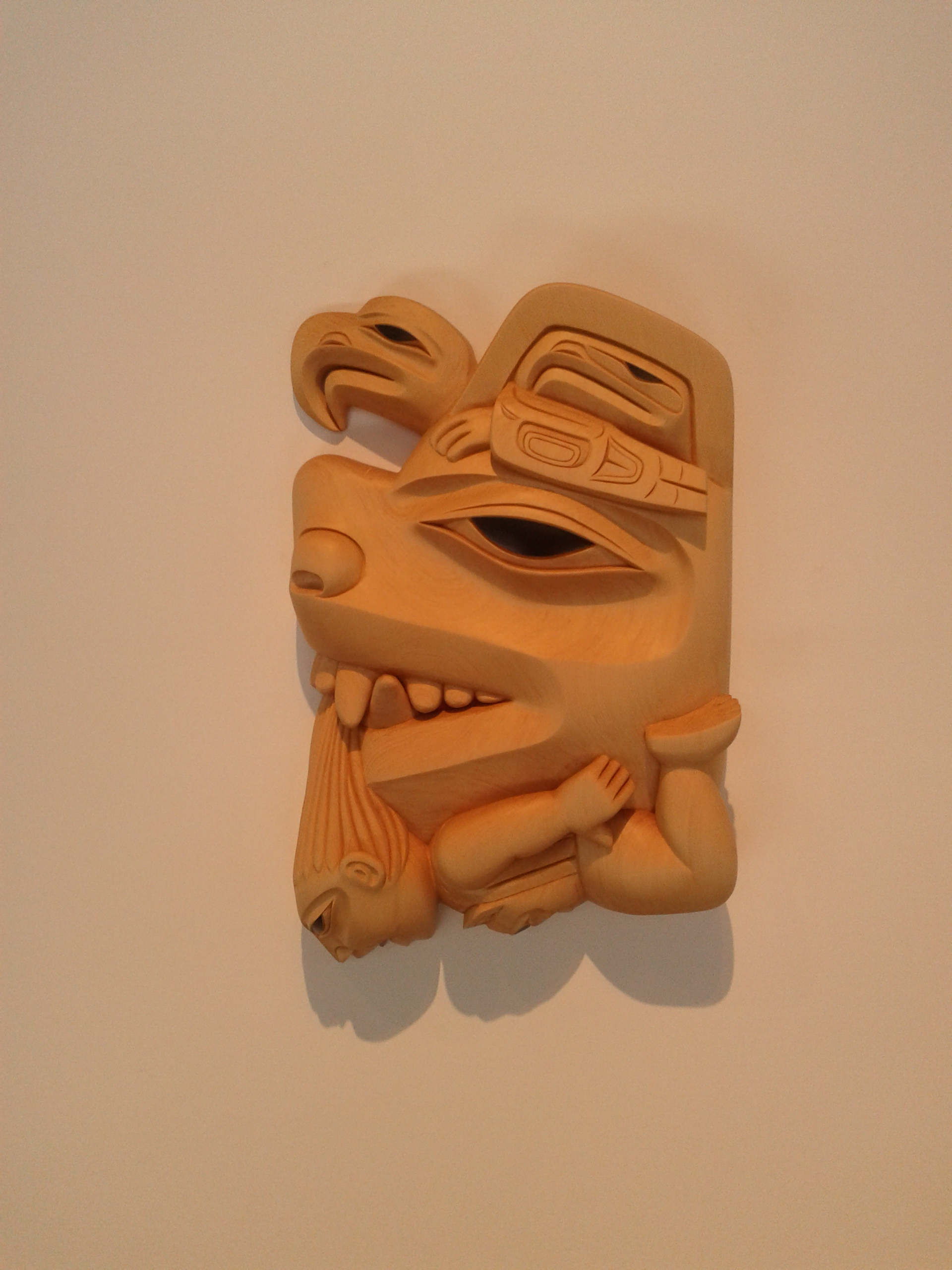
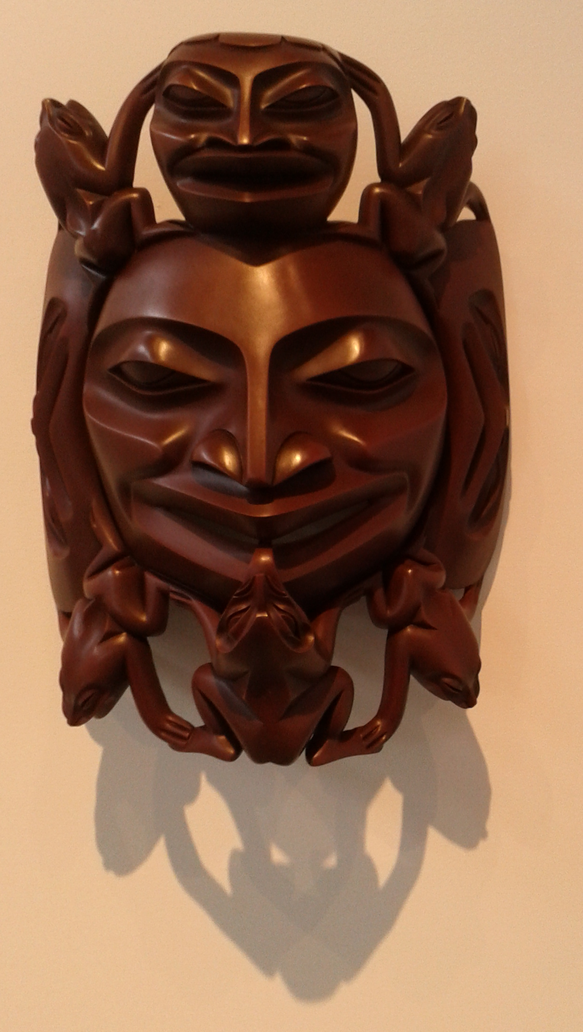
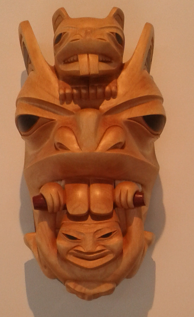
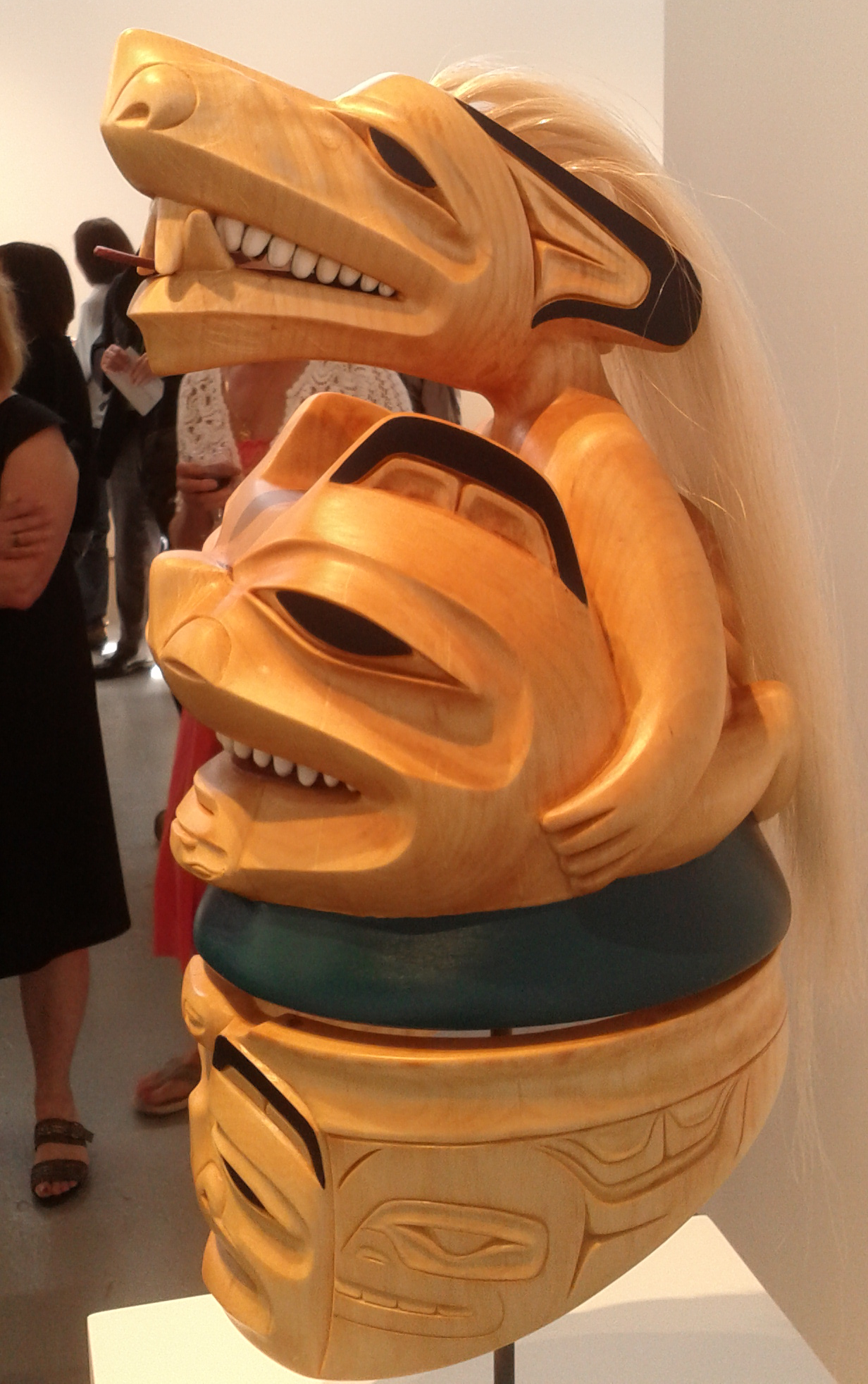
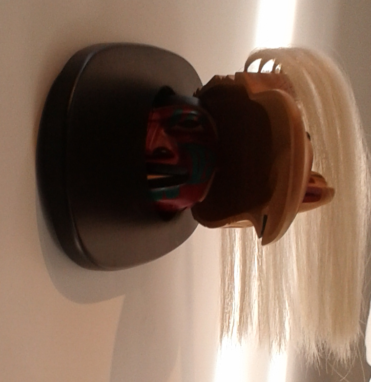
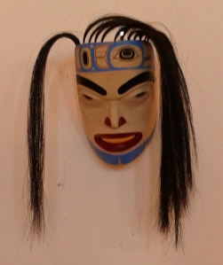
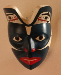
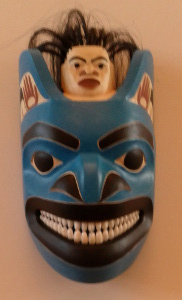
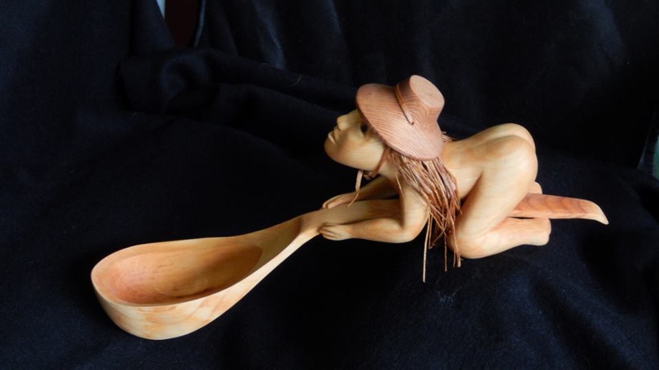
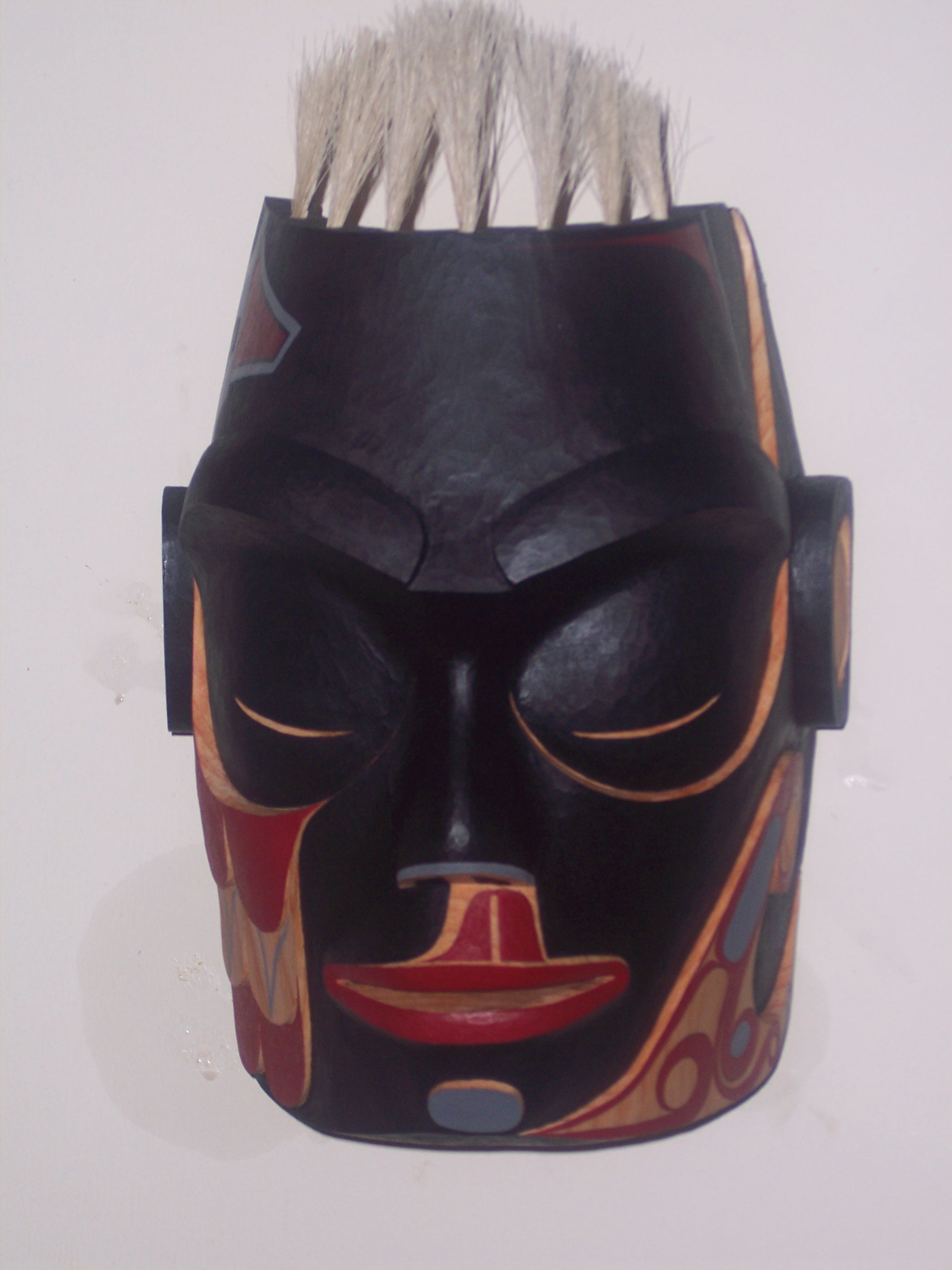
Much of the credit is due to his finishing skills and original designs – but at least as much should probably go to the successful sales strategies and partnership that Diana and Mitch have developed. Watch them even once, as I have done, and you’ll know how professionals deal in the world of First Nations art.

Read Full Post »

« Newer Posts - Older Posts »