Feeds:
Posts
Comments

Posts Tagged ‘Jared Kane’

This year’s graduation exhibit at the Freda Diesing School was held on April 19 and 20. It was by far the weakest of the five I have attended. In previous years, there have always been one or two students who were ready to become professional artists, but this year there were none, although a reassonably large number could be ready if they keep working for another year or two.

Unfortunately, this year’s show featured too many shaky hands on the paint brush and failures to find the grain. Too often, what passed at a distance was flawed close up.

However, that’s not to say that the exhibit was disappointing – just that it could have been better. The longhouse on the Terrace campus of Northwest Community College is always worth a lingering visit, and I never object to a preview of those who might become promising new artists in another few years.

longhouse-interior

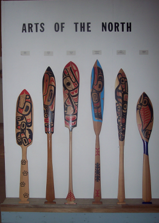
The work of many of the best artists was visible in the display of paddles at the entrance. This is probably no accident, since a painted paddle is one of the first assignments given to students in the school, so students had plenty of time to perfect their results.

entrance

Inside, I first scanned the exhibit for artists whose works I had seen before. Sam Mackay, the winner of the 2012 Mature Student Award produced a solid effort in his “Wolf Howling in the Moon” mask:

sam-mckay-wolf-howling


I also looked for works by Jared Kane, from whom I bought two prints last year. He proved to be one of the more imaginative carvers in the show, but the fact is obscured by the lack of finishing on many of his works, as well as his attempts to use light washes of paint that only look sloppy. His potential is obvious, but he seems to be working against himself in these respects:

jared-kane

This year’s Mature Student Winners (who only found out they had won at the show) also showed considerable potential. Steven Wesley, this year’s winner of the award, produced the very solid “Eagle Transformation:”

steven-wesley-eagle-transformation


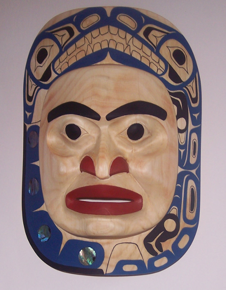
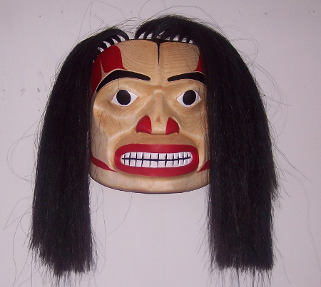
Roberta Quock, one of this year’s honorable mentions, produced “Wolf Mask,” one of the best finished and painted masks in the exhibit:

roberta-quock


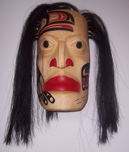
This year’s other honorable mention, Lorretta Quock Sort showed a similar talent. I particularly liked her mask, “Long Face Willie Campbell,” carved in honor of a grandfather she had never met and reserved to give to her parents::

lorretta-sort-long-willie-campbell

By the time I had looked around the show a few times, two artists stood out. The first was Lyle Mack, the latest from the large and talented Nuxalk family to attend the school. The painting on Mack’s “Beholder of the Light” was imperfect in one or two places, but with some retouching this frontlet could would no trouble meeting professional standards:

lyle-mack-frontlet

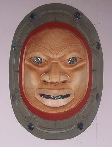
However, the most promising artist in the show was Angelo Cavagnaro. His “Gitmidiik Wild Man” mask and “Lunar Eclipse Mask” owe their success to their high standard of painting, but, although their treatments of their subjects are conventional, both are competently carved:

angelo-cavagnaro-wild-man

angelo-cavagnaro-luna-eclipse

Cavagnaro also contributed to the show a bowl entitled, “Supernatural Flounder” which was the most imaginative piece in the show – so much so that I took it home with me. Despite the roughness of some of the carving, this bowl, more than anything else, suggests what he might be capable of with another year or two of practice. When I posted a picture of it to Facebook, it immediately attracted Likes from four or five proffessional artists:

100_1585

Most of the pictures in the show will be in The Spirit Wrestler Gallery’s “Northern Exposure” show in Vancouver at the end of May. Several students were also planning to add additional pieces for the southern show, which I look forward to seeing. As always, I anticipate that show, but I look forward even more to seeing what first year students like Robert Quock and Lorretta Quock Sort will be doing next year, with another twelve months of development.


Read Full Post »

When I was in Terrace last April, I returned with two artist proofs from Jared “Citizen” Kane, a young First Nations artist who affects hip-hop clothes and attitudes. Both these works – one entitled simply “Moon” and the other “Love Birds” – interested me as examples of what computer-assisted art does easily and what it struggles with in Northwest Coast art.

Both these pieces are based on popular images. Neither image is claimed by a particular family, so artists can use them without being accused of appropriating someone else’s property. “Moon” is a successful blending of the traditional crescent of the moon with a more modern sketch of a face, while “Love Birds” combines a traditional split image with lightly concealed heart-shapes of European origin. “Moon” is striking for its simplicity, “Love Bird” for its intricacy, as well as for the placement of a central T-shape with foreshortened arms that could be interpreted as either male or female genitals, but both are identifiable at a glance as being designed on the computer.

I spend far too much time on a computer myself to see anything wrong with making art on the computer. The days are long past when people objected to pole makers rough-shaping the wood with chainsaws, and computers seem to me nothing more than another way that artists can make their work easier.

However, the idea of computer-assisted art remains far from generally accepted in Northwest Coast Art. In the case of several established artists who dislike the very idea, part of the reaction may be due to their own lack of computer literacy. However, they will add that they consider computer-assisted art lacking in warmth and individualism. But artists like Alano Edzerza have shown the possibility of bold, original works designed on the computer. And, really, the idea is no different from the manual templates used by some artists on the coast for over two centuries.

Still, computer-assisted art generally leaves its mark. Like many of the pieces created since Bill Holm in the 1960s codified the conventions of the northern formline tradition, it emphasizes geometry and symmetry in a way that traditional art did only part of the time. It is not so much that a piece like Kane’s “Moon” adds an unnecessary line to create a complete circle instead of a crescent, but that each of the ovoids, U-forms, and other shapes has a single template. Graphics software allows these templates to be scaled and rotated, or even distorted, but they remain obviously based on the same source.

In addition, because the templates are available, computer-generated designs tend to be less varied in general. In formline design, part of the craft is how the thickness of the formlilne changes according to the need of the design. Look, for example, at the work of Todd Stephens, a Terrace-based Nisga’a artist, and you will see that the broadest formline can be up to ten times that of the thinnest, which is often as thin as single brushstroke can make it. By contrast, in Kane’s “Love Bird,” the difference is may be four times.

Another place for variation in formline design is the variety of techniques for avoiding too much thickening of the line where two formlines meet. These techniques can include thinning the tips of one or both lines, or adding a T-shape or some other element in the middle of the two lines to thin out the filled space between them. Kane uses both techniques, but the thinning is minimal in both pieces, and he uses fewer varieties of techniques than many manual artists.

Although I suppose that in theory there is no reason that artists working on a computer could not make asymmetrical designs (which were a much larger part of the local traditions than is sometimes credited in these post-Holm days), or vary technique more, in practice they seldom do. The natural tendency is against both asymmetry and variation and for consistency. There is nothing wrong with this tendency, but it means that computer-assisted design is more likely to be bold rather than nuanced and varied. Even the relative intricacy of “Love Birds” looks far less detailed and more striking than a hand-drawn similar design, like Shawn Aster‘s “Raven Heart,”) another piece on display in my townhouse.

In general, though, Kane makes the computer work for him rather than against him, producing designs that almost insist on being enlarged, and, in “Love Birds,” adding more variation than many artists who have attempted to work on the computer. In the future, I’m going to keep my eye out for what he is designing – manually as well as on the computer.

Read Full Post »

Last week, I flew into Terrace to attend the end exhibit at the Freda Diesing School of Northwest Coast Art.

Of the four year end exhibits I’ve attended, this years’ was the weakest, with the fewest number of pieces on display and the lowest quality, but there were compensations. The show was partly a reunion of alumni, with former students such as Mitch Adams, Latham Mack, John Wilson, and Carol Young in attendance. And, as always, Waap Galts’ap, the longhouse on the campuse of Northwest Community College in Terrace, made for a setting that was both aesthetic and relaxing.

Nor was the show entirely lacking in pieces worth lingering over.

Larry Darrick displayed an abstract panel design that was all the more striking for being in black and white:

Darrick’s “Boogie Mask- Myth of Hairy Man, Bigfoot & Boogie Mask” was also worth a second look for its use of woven cedar for its mess of hair, although its copper nostrils and eyebrows seemed more elaborate than the simplicity of the carving would justify:

Among the spoons and bowls, the painting and lines of Lyle Mack’s “Transformation Spoon” was noticeable, so much so that I found myself wishing he had finished a mask or a painting for the show:

I was especially pleased to see that some of the high-quality work was done by last years’ winners of the Mature Student Award, which I sponsor. Barry Sampare, last years’ winner, showed more attention to detail and finish than most students:

Similarly, Evan Aster, who last year received an Honorable Mention for the Mature Student Award, displayed the same attention to the painted design as in last year’s exhibit to produce a mask of mildly eerie paleness:

Last year’s other Honorable Mention, Moses White, produced the strongest work of his that I’ve seen to date in “Oil Stained Warrior – Blood will spill before oil.” White’s mask had one side slightly higher than the other, but managed to be eye-catching just the same.

One of the standouts of the show was Nathan Wilson, who has already had some commercial success in the galleries. His “Defend the Village: Warrior Mask” seemed to show traces of the influence of John Wilson, with whom he worked privately in the past, but the boldness of design, as well as the mixture of materials (alder, horse hair, abalone, cedar bark, acrylic) was a a rare example of embellishments not overwhelming the design:

My only regret was that Wilson was not displaying more in the show.

First year student Jared “Citizen” Kane was another standout, with prints that were somewhat lacking in detail, but intricate enough that I bought both of them:

Still another standout was Paula Wesley, who plans to continue her art studies at Emily Carr next September. Although Wesley’s carvings looked a little rushed, and were not her best work, her two-dimensional pieces showed a pleasing discipline of line and a complexity of design, as in her “Releasing the Light”:

Wesley also created one of the strongest pieces in the show, a family box design that, had it been for sale, I would happily have bought:

However, pride of place in the show literally went to Kelly Robinson. Already a professional jeweler and painter, Robinson showed that he is equally promising as a carver. The central area of the exhibit was dominated by a display case with a spoon by Robinson, while two of his masks hung facing each other on either side:

In addition, Robinson’s painting, “Box Design (The 4 Carpenters)” hung at the main entrance of the longhouse, and was the most accomplished piece of the entire show:

The title refers to what might be called the celestial contractors in Nuxalk mythology who were charged with making the sun and other aspects of the world. The painting has a boldness and a mixture of traditional and contemporary that many visitors to the show admired, and I am proud to say that it will soon be on my living room wall.

With such artists as Kane, Robinson, Wilson and Wesley, the show was still worth seeing, and, as in past years, both the students and instructors couldn’t have been more welcoming. I look forward to seeing what the grads do next (and maybe buying more of their work), and how the first year students improve after another year of instruction.

Read Full Post »