Feeds:
Posts
Comments

Archive for the ‘indian art’ Category

I first became aware of Calvin Morberg’s work through a shark mask he sold to the Inuit Gallery. I was too late to buy it, but I did catch a glimpse of it. Although the finishing was a little rough, I was impressed by the originality of the design, and decided to keep an eye on his work. I tracked him down on Facebook, and, a couple of months later, I bought this eagle frontlet from him.

With its red background, abalone and harbour seal whiskers, in many ways, the frontlet is a typical Tlingit design. The general design is one that I have always admired for its boldness and embellishment – two traits that seem more common in Tlingit work than in any of the other northern First Nations. Tlingit work, I have always thought, has a touch of exoticness missing in Haida or Tsimshian or Nisga’a work, which I like to think helps to explain the traditional Tlingit reputation for being shamans. But, regardless of whether that is true or not, Morberg has carved a striking version of a common general form.

True, like the shark mask, this frontlet has a rough touch or two. In particular, the abalone is not well-matched, and, if you look closely, you can see the drilled hole in each piece that suggests Morberg has bought what was convenient – and not what best suited the piece.

However, these are minor flaws. As in all the other frontlets of this general design that I have seen, they are part of the background. What draws the eye is the central figure, and there Morberg shows his skill.

The central figure offers a set of planes consisting of the lower and top beak and the nares, all at contrasting and complementary angles, drawing the eye down to the wing feather tips at the bottom. From the bottom, the wing tips draw the eye back to the painted lower half, circling the design there until the inverted T-shapes at the top draws the eye back up to the eyes, and finally back to the beak via the eyebrows so that the process begins again. This is exactly what successful formline should do – trapping the eye, and keeping it moving around the entire shape. In fact, in moving about the central figure, you soon stop to notice the rest of the frontlet.

Nor is there any roughness to the finishing that would distract the eye in its progress. If the abalone provides a rough surface, the central figure provides a smooth one without sharp edges, and together they create a contrast as obvious at a glance as at a touch.

Another part of the central figure that I appreciate is the painting. To start with, Morberg has taken the unusual step of adding paint to the lower half; in several other eagle frontlets that I have seen, this area is usually occupied entirely by carved wings.

But even more interesting is the pale copper green, which seems to be a hallmark of Morberg’s work just now. Given the red background, he could hardly use red as the secondary color, and the green is an ideal choice, because it complements some of the shades in the abalone.

Also, of course, for those in the know, the color is a reminder that copper was a measure of wealth on the coast – a reminder that is especially fitting since frontlets are an indication of chieftainship, or at least high rank.

I don’t know where Morberg’s developing talent will go next. However, because of pieces like this eagle frontlet, I expect to hear more of him in years to come. I wouldn’t be the least surprised if, sooner or later, I buy other pieces from him.

Read Full Post »

One of the dangers of knowing artists (pity me!) is that, when they’re in town, they usually have pieces for sale. That is what happened a few weeks ago when Mitch and Diana Adams were in Vancouver a few weeks ago for the Chinese New Year celebrations. After dim sum, Mitch took my back to his mother-in-law’s apartment to show me what he had brought with him – and, inevitably I bought two: A Gagiid mask and a Killer Whale Comb.

The Gagiid features in the dances of Haida secret societies. The Gagiid is a castaway who, as he wanders the shoreline by himself, grows so crazed that in his endless foraging he devours sea urchins without removing the quills, which embed themselves around his mouth. Cryptozoologists often take the story as evidence for the existence of the Sasquatch, but this identification requires a giant leap of illogic, since the Gagiid is originally a normal man, and in the dances (if what I have heard is correct), the point is to reintegrate him into society. Today, at least, the Gagiid is frequently green, a depiction that often encourages Incredible Hulk jokes – a comparison that is actually closer than you might at first think, since the story of the Hulk is also about reintegrating him into society.

Mitch Adam’s Gagiid caught my attention because of the attention to details. His mask’s blue eyes are not an anomaly, and most likely not an effort to connect the Gagiid with Europeans; blue-eyed Haida were apparently noted by the first Europeans to reach Haida Gwaii in the eighteenth century. However, like a shaman, this Gagiid has eyes with pupils that roll upward, suggesting he is in an altered state of consciousness.

Other details follow naturally from the story. The Gagiid’s face is long and thin, as though he is half-starved. The gaps between his teeth suggest that some are missing, while those that remain are irregularly shaped and sized, as though they have been chipped, either through eating hard food or perhaps after too many falls on the rocks that line the shore. Moreover, not only are the lips swollen, but the the lower face is out of proportion, as though it has swelled, too. Similarly, the blood drawn by the sea-urchin quills (on the mask depicted as porcupine quills) is fresh and running on some, as though the wounds were fresh, and simply a ring of red on others, as though the wounds were made some time ago and the blood has dried.

What makes this detailing all the more impressive is the size of the mask: approximately sixteen by ten centimeters. I have seen masks twice or three times the size with less attention to detail (several with woolly eyebrows that give the Gagiid the appearance of Groucho Marx, an effect that Adams has avoided, I’m glad to say).

The same attention to detail is found in Adam’s Killer Whale comb, which is about the same height as the mask. Combs of this design, he tells me, were not for tidying a head of hair, as most people assume, but for untangling the warp of wool on a loom. Perhaps this knowledge of the shape’s purpose encouraged him – unlike the designers of many combs in Northwest art – to carve a comb that is actually functional, with flat sizes and tapering ends, and not just an approximation of the shape.

Made of yew, Adam’s comb benefits from the beauty of the tight and highly visible grain. However, the grain probably caused him trouble, too, since it runs vertically while the design is horizontal. On one side, the pupil of the eye looks as though it might been a knot, and, if you look closely, you can see several other places, such as the outer curves of the mouth or the shape of the nostrils, in which the two sides are not perfect mirror images. At any rate, even were identical sides possible, differences would remain, because the grain is much darker on one side than the other.

Ironically, the most regular part of the carving is the front design – probably the part least likely to be observed. Yet it is an indication of Adam’s determination and skill that the irregularities are minimized and unnoticeable to the casual eye. Having set himself a difficult task, he proves his skill by doing it extremely well.

Notice, too, how the design conforms to the shape of the comb. Only one design feature positively identifies the carving as a killer whale – the fin depicted on both sides of the handle.

Like “Peaceful Warrior,” the laminate mask I bought several months ago, these two pieces show Adams’ ability to work in miniature. He is perfectly capable of a stunning work at larger sizes, as his “Blue Moon Mask” demonstrates, but Adam’s attention to detail makes his smaller works consistently stand out from similarly-sized pieces from other artists.

My only reservation about buying these pieces is that, when I did, Adams lost the opportunity to show these work to the galleries while he was in town, and extend his reputation. I am sure that both would have sold. But, despite the danger of visiting an artist, I feel privileged to have had first chance at them, and to display them in my townhouse.

Read Full Post »

Gary Minaker Russ is probably the most imaginative argillite carver at work today. Resisting the pressure to do endless imitations of Bill Reid’s “Raven and the First Men” or to embellish his work with flashy but overdone inlays, he approaches each piece with imagination and integrity. The disadvantage of this approach is that his work is sometimes overlooked because it lacks the predictability needed for a successful brand, but the advantage is that he often produces works that are both beautiful and original, such as “Octopus Eating a Cockle Clam.”

“Octopus Eating a Cockle Clam” is an argillite rattle, with abalone eyes. The rattle itself is a clam shell with broken shell inside and surrounded by a web of red cedar made by weaver Maxine Edgar. Leather wraps the handle of a rattle, which rests in an argillite base.

Although the top of the base has a simple salmon-eye design, the rattle as a whole is a naturalistic rather than a formline design – an approach you sometimes see in historic argillite pieces, but rarely see in modern work. All eight tentacles are present, and, if you look closely, you can see the striations of muscle along the tentacles, and the lines of suckers where the underside of the tentacles are visible. The imitation of life is not total, giving way to artistic considerations in such details as the roundness of the head, the abalone eyes, and the darkness of the argillite, but in general the realism is much greater than you normally find in Haida art.

There is realism, too, in the general concept of the rattle; an octopus actually does crush clams and other shellfish in the way that the rattle depicts. Once you see it, the idea seems simple and ideally suited to the shape of a rattle – yet, so far as I have been able to find, no other artist, historic or contemporary, or in any medium has seen the analogy except Minaker Russ. The day that I bought it, he showed it to several passing Haida friends, and not one failed to exclaim about how unique the design was.

Another important aspect of “Octopus Eating a Cockle Clam” is the fact that it is mixed media. Viewing Northwest Coast Art, it is easy to forget that what you see would have been historically a part of everyday life. However, the fact that this piece is not only a functional rattle but also includes a staple seafood and the work of another artist firmly embeds it in the culture that it comes from.

The connection is all the stronger because, according to Minaker Russ, the clam shell was picked up on North Beach near Masset on Haida Gwaii, which is traditionally the place where Raven discovered the first people in a shell. Historically, the shell was not a clam until Bill Reid depicted it as one, nor did Reid depict a cockle shell; yet, all the same, to a modern audience, the clam shell emphasizes the cultural connection.

I admit to a certain guilt at buying a functional rattle that I will only shake gently from time to time, for fear of breaking the shell. But, aesthetically and culturally, “Octopus Eating a Cockle Clam” is a piece I feel privileged to see every day. It naturally draws the eye, so I’ve given in to the inevitable and positioned it on the focal point of the living room, where it belongs.


Read Full Post »

I’ve long admired the graphics work of Dean Heron, but a couple of months ago I realized that I didn’t have any in the townhouse. I quickly remedied that by buying “Northern Raven,” a small acrylic on paper painting that I’m sure will be the first of many purchases.

“Northern Raven” is a split design, with two views of the same figure connected to a central core. Historically, split designs were often used to fill a space, or to wrap the design around a curved surfaced like a handle or the bowl of a spoon. However, they were also frequently used, as here, on a flat surface. They have always struck me as one of the most pleasing forms of symmetrical design, because the fact that one side of the design mirrors the other reduces the static repetition of a perfectly balanced design.

In addition to this natural advantage, “Northern Raven” has several other qualities that make it stand out. To start with, split designs usually have the heads facing outward, leaving a space in the middle. Although reversals of this arrangement are not entirely unknown, they are still rare enough to be noticeable when you see them. By replacing what is usually blank space with design, here Heron creates a far busier design than he would otherwise have, which further helps to break down the staticness of the design.

Another departure from the norm is the use of blue as the secondary color in place of red. This is not an unheard-of innovation in contemporary art, but seeing it in what in other ways is a very traditional piece is somewhat unusual. Added to the pale blue of the paper itself, this choice of colors suggest a cool, icy quality that suggests the first half of the painting’s name (which I otherwise take as referring to the fact that Heron describes himself as a Kaska/Tlingit artist). It also has the advantage of being less arresting than any shade of red, which forces the eye to linger over the design and discover its details at leisure.

However, what really stands out for me is the hand-painted quality of the piece. In some modern First Nations art, the ovoids and u-shapes are geometrically precise, and often drawn by a template, with their curves created by a compass (or, at least, so it appears). If the design is split, the two sides are literally, not just figuratively mirrored, and often created by flipping one side over in a computer drawing application.

By contrast, “Northern Raven”has the appearance of being less geometrically oriented. Much of this sense is created by the thin blue lines outlining the heads. But there is also a suggestion of irregularity in some of the interior elements. Moreover, if you look closely, some of the mirrored elements, like the U and T shapes at the bottom left and right of the design are not completely identical. Such irregularities might easily give a sense of amateurishness, but in this design they add a more human quality, breaking down the symmetry and keeping the design from becoming an exercise in applied geometry.

My only criticism of “Northern Raven” is its scale. With its bold, regular formlines throughout much of the design, the piece deserves to twenty or thirty times its size, and serving as the house front to a longhouse. Otherwise, I consider it a fine place to begin my collection of Heron’s work.

Read Full Post »

Luke Marston is a Coast Salish artist whose work is much in demand. In the summer of 2009, he and his brother John had an exhibit at the Inuit Gallery that must have set records for the prices obtained by artists in their mid-careers. Since then, neither has sustained those prices, but each continues to be much sought-after (Luke, for the record, is the brother who does the astonishing masks and historical recreations). Never having had the money when I saw one of his works that I admired, I was glad to pick up a remarque of his print “Family.”

Released for his wedding, according to Elaine Monds of The Alcheringa Gallery, “Family” (I suppose) shows Marston’s eagle crest embracing the wolf crest of his bride. Because of its thick, dark lines, the wolf is the figure that stands out the most – the wing and leg of the eagle are noticeable only after your eye discerns the wolf, and the rest of the eagle only comes later.

However, as the eye takes in the complete design, the wolf – contrary to the ferocity you might expect – seems smaller and more fragile than the eagle, clinging for protection to the eagle. By contrast, the eagle seems more rigid and less emotional or vulnerable.

Given the occasion, it is tempting to speculate on whether this contrast suggests Marston’s view of his personality and his wife, or perhaps his feeling of protectiveness for her, although I have no idea whether that is true. However, the interpretation gains credibility when you consider that the eagle’s wing is raised as though sheltering the wolf, and that the wolf almost seems to be burrowing beneath it.

There is also a formalized sexuality in the design, with the eagle’s hock joint pointing towards the wolf’s mid-section suggesting a penis, although of course birds lack external sex organs. Similarly, while the interior design elements in the wolf’s thigh serve the practical purpose of reducing the thickness of the leg, the ovoid is almost positioned high enough to suggest an x-ray view of the uterus. This ovoid is echoed in the ovoid formed by the eagle’s claws, which are point at the wolf’s thigh.

Another contrast between the two figures is that the thinner lines of the eagle’s head and beak (and, to a lesser extent, the tail feathers) seem more realistically rendered than the rest of the design. Again, armchair psychology is tempting; in choosing to depict his crest in two different design styles, is Marston suggesting that he sees himself as belonging to two worlds or traditions? Or is the depiction merely a matter of design, created simply to balance the thicker lines of the rest of the design?

You can see comparable figures in most Northwest Coast traditions without having to search very far. However, despite that obvious fact, in some ways, this design hardly registers to my eye as a Northwest Coast design at all.

For one thing, few Northwest Coast designs leave the top and bottom of the design space undecorated except for a few simple lines.

Even more importantly, the all-black design and the sweeping curves remind me strongly of the work of Aubrey Beardsley. In fact, it is the curves that first draw my eye: The long line from the top of the eagle’s wing to the bottom of the design, the coat hanger-like design element at the top, and the curling line of the wolf’s tail. These three lines enclose most of the rest of the design in an off-centered oval, positioning the gaze of the viewer without being perfectly symmetrical itself. Supporting them are mirror-image angles such as those on the two heads, or the inversion of the two legs that is emphasized by the ovoid element in each. All these things give “Family” something approaching an Art Nouveau sensibility.

Last summer, I saw “Family” for sale without any additions. However, Marston has also chosen to release a number of the prints with a remarque in pencil in the blank space at the bottom of the design. The remarque shown here is frog. I have asked whether the frog is a family crest, but have not received any reply from Marston.

However, given the metamorphis in the frog’s life cycle and its amphibious habits, frogs are generally seen as figures of power throughout the Northwest Coast cultures. This background makes the frog a fitting symbol of a life transition such as marriage. But whether Marston himself chose it for that reason is uncertain; since other remarques include a raven or eagle, perhaps he doesn’t.

But whichever way you look at “Family,” it remains an elegant piece from an artist with an accomplished sense of design. I might even say that its simplicity and small size – about fifteen by forty centimeters – makes it more accessible than some of Marston’s larger pieces. I still hope to afford a major work by Marston one day, but, meanwhile, “Family” is a small sample of what he can do.

Read Full Post »

I think of Haisla artist John Wilson as primarily a mask carver, and certainly that is where most of his efforts have gone in the last few years. However, his prints show a certain talent for two-dimensional design as well, which is why I was pleased to pick up this abstract “Wolf.”

Most Northwest Coast Art is abstract to a greater or lesser extent, of course, in that it is highly stylized and uses a number of basic shapes not found in nature to achieve its effects. However, the sub-genre specifically referred to as abstract is less naturalistic than most. In an abstract piece, some of the distinguishing features of a subject are often missing or distorted and often only one or two remain. The figure is further distorted by the surface it is on. The end result is a figure far removed from the semi-naturalistic figures in the tradition – so much so that viewers either need the title or some familiarity with the art in order to know what is being depicted. These conditions open up possibilities for original self-expression that are often harder to find in semi-naturalistic figures.

All these generalities are true in “Wolf.” The bushy tail that is one of the defining characteristics of wolf figures (and often an opportunity for considerable ingenuity by artists) is squeezed into the rectangle of the figure below the jaw, so that at first you might mistake it for ornamentation. Only the short ears and perhaps the muzzle and teeth are left to identify the figure – and the muzzle and teeth might easily be a bear’s. Since the figure is turned sideways and presented upright, there is only one foot and a couple of claws, which increases the abstraction even further

What is left is mostly teeth and claws, creating an impression of fierceness, especially since the claws are outsized. This impression is strengthened further by the elaborateness of the eye with its tilt, as well as the red of the tail bisecting the image.

Technically, the print might be called a study in threes. Three parts of the wolf – the head, the tail, and the foot – are depicted. There are three black ovoids — the eye, foot and nostril – that frame the image, each with a slightly different shape as well as different interior decorations. In addition, three parallel lines –the tail itself, the bottom line of the heat and the top of the foot – cut across the picture. Three black lines form the foot, although only part of the two claws are parallel. In addition, the eye is made elaborate by three clusters of U-shapes, each with some variation of a T-shape inside it to thin it out. For variation, the patterns of three are sometimes broken, as in the red decorations around the eye, only two of which have a tripartite structure, but the grouping are enough to give the figure of “Wolf” a strong unity.

An especially interesting cluster of threes is the tail with its knick in the middle. It is minimalistically echoed in the thin red line beneath the claws, and in the mirror image that touches the ear on one side and the muzzle on the other.. I am not absolutely sure of Wilson’s intention, but the way that the top structure mirrors that of the tail suggests to me that it is part of the tail, so you have to imagine the tail wrapping around the wolf, stretching from the bottom of the image to the top behind the figure, where you can’t see it.

The formlines, too, are worth pointing out. For much of their lengths, they are a uniform thickness, and bend at almost the same angle. However, they are saved from being monotonous by their long, tapering ends, and surprisingly few other techniques. Instead, they create a sense of boldness that seems to fit with the ferocity of the wolf.

In fact, if I had to use one word for “Wolf,” that word would be “bold.” In a way, I regret that the print is so small, because “Wolf” is a design that almost demands to be blown up for a house-front or some other large-scale depiction.

(Note: Being a responsible blogger, I want to take this opportunity to strongly deny the rumor that the print is also available in a limited edition of one in pink and mauve. This alleged alternative version does not exist, and you should not ask the artist about it. Nor did you view it here if you are interrogated. Okay?.)


Read Full Post »

Ten years ago, Wayne Young was a promising journeyman in Northwest Coast art. Taught by such well-known figures as Dempsey Bob and Robert and Norman Tait, he had an enviable reputation for imaginative, often asymmetrical designs, and for fine finishing details on his carving. Now, however, illness keeps him from working. Since new works from him seem unlikely, when I first noticed this miniature argillite transformation mask of a raven and a human on the Alcheringa Gallery web site two years ago, I was immediately interested in buying it.

Not only was I interested in the artist, but I figured that the piece had to be one of a kind. I mean, a mask not only made of argillite, but with two faces? And one no more than fifteen centimeters long and six high? The thick hinges that the outer face swings upon and the fine screws drilled into the argillite are evidence of the difficulty in the construction – and also all the explanation necessary of why no one else is likely to try to imitate the piece.

However, obtaining the piece proved a challenge. When I visited the gallery fifteen months ago, none of the staff knew where it was. In fact, despite the fact it was still on the web site, they could never remember seeing it, and were sure it must be lost. However, three months ago, I queried again. This time, the gallery director answered, and could locate it.

Ordinarily, I don’t haggle over price. However, ten months previous, the mask had been part of an on-site auction, with a quick price that was two-thirds the listed price. Since the gallery had had the piece for seven years, I sensed it might be eager to sell it, so I offered the quick price. It was accepted, and I took a day trip to Victoria primarily to carry it safely home.

I declined the frame and beige and brown matting the gallery had added. I thought the frame did not do the mask justice; I am currently awaiting an argillite stand to display it properly.

Unfortunately, too, time has not been kind to the piece. Another artist who remembers seeing the piece when it was new remembers the outer mask closing evenly. Now, one hinge is slightly twisted, and one side of the mask is lower than the other when closed. A drop of glue on a couple of the screws might be useful, too, and perhaps a replacement of the black cord on the controls.

However, despite these imperfections, I consider the mask well worth having. The carving is simpler than most of Young’s work, but the lines need to be bold on a piece of such minute dimensions if they are to be discernible. Finer lines would be nearly invisible, and therefore wasted – nor would argillite lend itself to them. The fact that Young knew the restrictions of the size and the medium says a lot about his skill as an artist.

I could almost believe that Young deliberately set out to challenge himself by putting obstacles in his own path. If he didn’t, he must have soon discovered them. But, either way, he overcame the obstacles, not with inlays and other distractions, but with a well-designed, cleanly carved, understated bit of excellence. I consider myself lucky to have obtained it, and my only regret is that new pieces from Young are unlikely.

Read Full Post »

I never buy art unless it catches the eye or intrigues me in some other way. However, some purchases loom larger than others , and Gary Minaker Russ’ “Haida Sharkwoman” is one of them. I am not talking about price (although “Haida Sharkwoman” is one of the more expensive pieces that I’ve bought), nor size (although at fifty-three pounds, it is one of the heaviest), but about artistic integrity and excellence, both of which the piece has to spare.

Minaker is best-known as an argillite carver. Working with hand tools and preferring natural finishes, he has a tendency to go his his own way that some gallery owners think has hurt his career, but that keeps his work original. In the last few years, he has been resisting the pressure to carve for the market and produce copies of Bill Reid’s “Raven and First Men” or endless variations on Raven stealing the light. He has also been chafing at the growing tendency for inlays of precious and semi-precious stones and metals on argillite, which drives up the prices while rarely improving the actual lines of carvings.

Consequently, he has been branching out and trying to create a new market in Brazilian soapstone in the hopes of finding greater artistic freedom. He has had mixed success, he tells me: private collectors have no trouble accepting his new direction, but many galleries do. Still, he perseveres, partly because it is easier to find large pieces of soapstone than of argillite to produce such pieces as “Haida Sharkwoman.”

Forty-five centimeters long and thirty-five wide, “Haida Sharkwoman” is carved on one side and flat on the back. The asymmetrical curve on the right, Minaker says, was in the raw block, and only required refining.

Sharkwoman (not to be confused with Dogfish Woman, whom Charles Edenshaw and Bill Reid made famous) is a subject that Minaker has returned to many times in his work, just as Beau Dick keeps returning to the Bukwis and Tsonoqua. He suggests, only half-jokingly, that the subject reflects the difficulties he has had with the women in his life, adding that he tries to restrict himself to no more than one return to the subject each year.

The sculpture shows a woman half-way through a transformation into a shark. In modern northwest coast art, such a transformation is often depicted as a twisting of a person’s existing limbs, rather like the werewolf transformations seen in modern computer-generated special effects. That approach is unquestionably dramatic, but Minaker has chosen to depict the new shape as a blanket draped over the figure, as in the old stories. Here, you have the shark’s fins falling over the woman’s head like a hood, as her face, still showing her labret, is slowly transformed by the gills and flat snout of the shark.

The sculpture is dominated by the abstract carving style of the face and the fins. However, at the bottom right is a more realistic set of fingers half-covered by hair. This contrast emphasizes the transformation; it is only when your glance falls on the realistic hand that you realize that the transformation is taking place.

Notice, too, that the position of the hand suggests that the woman is propping herself up on her stomach against a rock, waiting for the transformation to complete so that she can begin to breathe the water.

The carving is further enhanced by one of the most sinuous and three-dimensional formlines that I have ever seen, beginning at the lower right of the fin, and twisting up to the eyebrows. From there, it continues around the face and jawbone to rejoin the right fin again, keeping the viewers’ eye in constant motion. And, should you detour down the nose or around the lip, the gills are on both cheeks to force your gaze back to the main formline. As a result, you soon tend to attribute the movement of your own eyes to the sculpture itself, and start imagining that its eyes are moving to watch you – not necessarily in a menacing way, but definitely an alert one.

I say “necessarily,” because the impression that “Haida Sharkwoman” makes can vary wildly. The combination of the formline and the reflective quality of the soapstone makes the sculpture look dramatically different in various lights. I have seen it a pale beige in bright sunlight, looking serene; golden in the reflected light of a flash, looking otherworldly, and dark in the shadows, looking sinister. The piece is so varied that I can get a different perspective on it simply by moving it to a different location.

One thing I’ve noticed, though, is that it tends to dominate a room, no matter where it’s put. After several experiments, I’ve given in and placed it on top of the TV cabinet, which most of the living room centers on anyway. As a major piece of art, it seems to belong there.

Read Full Post »

Miniature masks and sculpture are a test of an artist’s skill. They are merciless about showing who has a steady hand on the carving tool or the paint brush, and who cares about finishing details. Often, too, they demonstrate an artist’s ingenuity.  Tsimshian / Haida Mitch Adam’s “Peaceful Warrior” (shown below roughly full size) is an example of all these things, which is why I jumped to buy it when I learned it was available.

The mask is one of two that Adams carved from a block of laminated wood (the other is currently in the Spirit Wrestler Gallery). Except for a few pieces, such the eyebrows, the pupils, the lower lip, and part of the nostrils, what you see is not paint, but the natural colors of different layers of wood. From the outside working in, the layers are Swamp Ash, Ebony, Mahogany, Maple and Wenge. Adams has chosen to make so few additions to the block that you might call the result an example of minimalism.

Adams, who seems to be making miniatures one of his specialties, writes, “I enjoy carving this size of mask, to challenge my self and to see what level of detail and character I can get out of these woods. [I] try to carve and finish it as it would be done for a full size mask.”
Faced with such ingenious economy, what can I do except try to imitate it, and let the mask speak for itself?

Read Full Post »

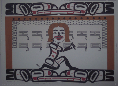
If my late spouse Patricia Louise Williams had been an opera buff, I might have arranged a special performance in her name for charity. Had she loved walking in a particular park, I might have arranged for a bench with her name to be placed there. But, because three of her favorite things were needle art (embroidery, cross-stitch and other related techniques), our parrots,  and Northwest Coast art, I took an inspiration from Rande Cook’s “The Poet” and commissioned a limited edition of 20 prints and 5 artist proofs from Haisla artist John Wilson, one of our favorite artists.

The design process was interesting, because I had never been so heavily involved in it before. John and I chatted about what would go into the print a couple of times on Facebook before coming up with the final idea. I also talked with Mitch Adams, the artist-turned-printmaker as he was producing the prints and last minute changes were needed.

Essentially, the print is meant as a one to one transposition of her life into the cultures of the northern coast. The print shows a stylized woman (complete with labret) at a loom, which is a bit of wish fulfillment, because traditional weaving was something that Trish had dabbled in and always wanted to go more deeply into. Similarly, our four parrots become four ravens, their counterparts in the northern hemisphere, who also happen to be psychopomps – that is, conductors of the dead into the afterlife.

The print includes a number of reference and in-jokes, some public, and some private. The pattern on the loom is unfinished, reflecting the fact that Trish died relatively young, and with many things unfinished. Moreover, the pattern itself is Raven’s Tail, one of the oldest weaving patterns known on the coast, which ties in with Trish’s lifelong archaeological interests.

In the same way, the tongues of the ravens are touching, which traditionally indicates communication or the imparting of wisdom. If you have ever heard either parrots or ravens, you will know just how unlikely that sounds when applied to them.

To catch the other references, you would need to have known Trish. She was always holding needles in her mouth as she worked, which could make a kiss in passing a dangerous proposition. Also, like all needle art practitioners, she was always dropping needles – which one of us would eventually find by being stabbed in the foot. It’s all part of the gentle humor in the print which reflects Trish’s own.

I suppose some people might leap to accuse me of cultural expropriation. But if nineteenth century argillite carvers could depict Europeans in top hats, or Norman Tait could carve a mask that included a camera,  I think that “Needlewoman” is on safe grounds. People often forget the sense of humor in Northwest Coast art, and I make no apology for restoring some of it, especially when it’s appropriate to Trish.

Like all art, “Needle Woman is comforting to have – and so is sharing copies of it with those closest to Trish.

Thanks, John, for an original and moving piece of art.

Read Full Post »

« Newer Posts - Older Posts »