Feeds:
Posts
Comments

Archive for the ‘art appreciation’ Category

“How does this compare to a show down south?” John Wilson asked me last week, shortly after I arrived at the Freda Diesing School Student Art Exhibition in Terrace. He seemed surprised when I told him that a 23 person show with some 75 pieces almost never happened, but it’s true. The annual show is one of the largest annual exhibits of modern Northwest Coast Art anywhere.

The show lasted only two days, with a private viewing for friends and family on Friday and a public viewing on Saturday. The location is the Freda Diesing Studio on the Terrace campus of Northwest Community College, a well-lit building with a large lower floor ordinarily occupied by work benches and a loft for a more conventional class room setting:

fd-studio1

Just inside the door, above the table with the show catalog and price list were a few prints by Freda Diesing herself, including a self-portrait mask:
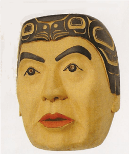
fd-self-portrait

These works were not for sale, but stood as tutelary spirits of the show – or, more precisely, as the standards to which the students should aspire.

Several months ago, I reviewed the school’s mid-term show via a collection of pictures sent to me by John Wilson. That show was mostly painting and sketches, the first year class in particular having not begun its study of carving at the time. By contrast, the year-end show had a few two-dimensional pieces, but consisted largely of paddles, spoons, and masks.

Painted paddles are closer to two dimensional than three dimensional works, so I was not surprised when two of the best-designed paddles were from Shawn Aster and Latham Mack, two artists who were among the standouts at the earlier shows and scholarship winners at the graduation ceremonies that accompanied the private viewing:

shawn-aster-paddle

latham-mack-paddle

However, making the transition from the two-dimensional craft of painting to the three-dimensional one of carving does not always comes easily, and many students are still making it. Latham Mack, for instance (who as a Nuxalk, is learning his second style of carving), is well on the way, using the same blue that I am starting to recognize as characteristic of his two-dimensional designs:
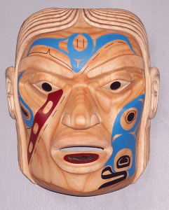
latham-mack

By contrast, a mask by Shawn Aster shows a sense of surfaces, but seems more tentative, with a shallowness in the carving and a thinness of line that makes you only appreciate the mask up close, as seen in this (unfortunately cropped) picture:

shawn-aster-mask

A similar lack of ease in three dimensions is true of Todd Stephens, another scholarship winner from whom I’ve bought several paintings:

todd-stephens

Other students showed similar learning curves – and, as might be expected in a student show – a certain tendency to conformity – although Norman McLean, Sr., in a triumph of social sensibility over aesthetics did do a bright pink mask, as well as a spoon with a more discrete pink ribbon around the handle as fund-raisers for breast cancer. Still, there were some interesting pieces here and there.

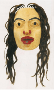
Sophia Patricia Beaton, another scholarship winner, had only one piece in the show, but the wavy hair and the obviously feminine face and the labret were original enough to make me wonder what the rest of her work might be like:
sophia-beaton

I also noticed James Weget-McNeil’s frog mask, which, although in a very different style, reminded me of some of the faux-artifacts that Beau Dick has been carving recently:

james-weget-mcneil1

However, much of the interesting carving came from mature students with more experience.

Charles Richard Wesley, whose work I noticed in the mid-term show, came up with two interestingly intricate masks:

charles-richard-wesley

I also appreciated John Wilson’s work, which he says represents an advance in finishing details over his earlier work – pointing, for example, an indentation of the eye sockets at the top of the nose:

john-wilson

These are just some of the pieces in the show, but, aside from the bowls (something needing to be left out), they give an idea of the variety to be seen at the show. I appreciate the chance to see students learning and mastering their craft, and while some flaws and weaknesses are apparent, there are just as many examples of solid and skilled works.

In fact, I could have come away from the show considerably poorer. Fortunately or unfortunately, depending on my shifting perspective, most of the pieces I considered buying were marked NFS, many earmarked for a show at the Spirit Wrestler Gallery in Vancouver later this month.

But buying is only one reason to attend such a show. A far better reason is spend a few hours surrounded by efforts of art – and that, so far as I am concerned, is more than enough reason for me to want to attend next year’s show.

My thanks to Stan Bevan for seeing that I got an invitation. That small kindness gave me an enriching day.

Read Full Post »

In January, we missed by hours buying a dragonfly frontlet that Nisga’a master carver Norman Tait and his carving partner Lucinda Turner sold through the Inuit Gallery. The gallery told us that its staff would ask the team to do another frontlet, but we had heard nothing for a couple of months and were just concluding that a second one would not be available when we received email notice that it had arrived.

Did we snap it up quickly? somebody asked me via chat. Put it this way: We received the notice at 3:10. I replied that we would buy it at 3:12 – despite the fact that we prefer not to buy sight unseen, and are saving to pay our taxes. Some opportunities you just have to take when they arise, and, having missed the first frontlet, we were determined not to miss this one.

You see, Norman Tait is one of the four artists we most wanted a carving from (the others were Beau Dick, Stan Bevan, and Tait’s nephew Ron Telek). Tait is one of the most acclaimed Northwest Coast artists alive – and rightfully so, given his attention to detail and his careful finishing. In the last two decades, these distinguishing features have been supplemented by Lucinda Turner, who brings the same qualities to carving.

The only problem is, Tait’s acclaim means that their masks start at about $12,000. While this price is more than deserved, it means that their work is largely out of our price range unless we do some extremely careful financial planning over a year or more. By contrast, the frontlet is more within our price range.

More importantly, the frontlet is a miniature masterpiece in its own right. While in many ways the frontlet’s depiction of a beaver is traditional, it is full of small finishing details — the flare of the nostrils, the roundness of the palms of the hands and the soles of the feet, the roundness of the tail, the prominence of the front teeth and the curled lip – that lift it out of the mundane.

I like, too, the contrast between the heavy lines and planes of the figure and the lightly inscribed shapes along the border, to say nothing of how the beaver’s ears are incorporated in the border so as not to interrupt the line of the head. All the elements in the border are traditional, yet they are so lightly carved that they almost look like the letters of some unknown alphabet.

In short, everything about the frontlet indicates that it is the work of someone who is as comfortable with carving tools as I am with a keyboard or pen. Although it is undeniably a minor work, it displays Tait’s skill so completely that you can easily extrapolate from it what his poles and larger sculptures are like. As a friend said, having the frontlet in our home is bit like having a cartoon from Picasso.

We hung the frontlet near a similarly-sized piece by Ron Telek. That position gave us the additional pleasure of comparing the work of the master and his former apprentice. We could see that the same attention to detail and finishing was present in both works, but there was nothing you could call imitative in Telek’s work. He had learned the craft from Tait, but each carver has an imagination and style all his own.

Norman Tait: Beaver Frontlet

Norman Tait and Lucinda Turner: Beaver Frontlet

Read Full Post »

Six weeks ago, Haisla artist John Wilson sent me pictures from the Freda Diesing School’s mid-term show. Since then, I’ve been trying to contact the artists whose work impressed me. Eventually, I hope to buy work from three or four of them. But, so far, the only one whose work has found its way into our house is Todd Stephens.

I’ve exchanged a few emails with Stephens, but I know very little about him besides the fact that he is Nisga’a, a young father, and one of last years’ recipients of the YVR Art Foundation Awards at the school. But I do know that he is an artist with a studied simplicity of form and enough understanding of the traditional northern style that he is already showing a strong signs of a personal style.

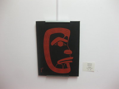
todd-stephens-red-warrior2

You can see Stephen’s simplicity of form in “Red Warrior,” the first piece of his work that attracted my attention. This small acrylic on canvas uses the barest minimum of lines to suggest a traditional maskin a non-traditional style. The thickest parts on the face – the eye and brow, the nostril, and the mouth – ate the parts most likely to be painted on a mask. On the outside, the columns of three lines, with irregular spaces between them help to break up the thickness of the line. The black background and the use of red as a primary color add a touch of innovation to a piece that otherwise is effective largely because of its simplicity. That Stephens should have reisisted the urge to elaborate is very much to his credit – generally, only a much more experienced artist would have trusted so much to simplicity.

Todd Stephens, "Industry"

In “Industry,” Stephens paints a traditional beaver in a traditional pose. He takes considerable care to avoid the thickening of formlines, mostly by tapering them and arching them where they meet.

At first, his major innovation in “Industry” seems to be in having the tail down, rather than held up parallel in front of the body. But, if you compare it to other versions of the beaver in this position (like the Richard Hunt print below), you notice thta it is a rectangular form, rather than the usual squae one. This change makes the body much leaner than in other artists’ versions, especially in relation to the head and hands, resulting in a much less-stolid figure than usual.

Richard Hunt, "Kwa-quilth Beaver"

Even more importantly, the thinner body leaves less room for secondary designs than in other people’s versions. As a result, the arms, legs, and body are decorated simply with only one or two elements apiece, which further emphasizes the outsized hands and feet – an exaggeration that fits in with the title of the piece. And, because so much of the beaver is rendered simply, the head and the tail are, too. The result is a boldness that makes “Industry” far more effective than most Northwest Coast Beavers.

Another of Stephen’s pieces that we have agreed to buy but not yet paid for is “Jorga and I,” a depiction of Stephens and his young daughter with the heads of the animals of their tribes (since the Nisga’a are matrilineal, of course, his daughter belongs to her mother’s tribe). The fact that the mythological heads are black, the traditional primary color in northern works, and the human bodies are red, the traditional secondary color makes the piece a statement of identity, saying clearly, “We are Nisga’a first” — and, because the hands are also black, perhaps “and artists” should be added to the statement.

Todd Stephens, "Jorga and I"

The protective hunching of the figure of Stephens, and the placement of his hands over his daughter’s eyes gives a modern and gently moving touch to the piece. Another modern touch is given by the overlapping of the artists’ hands and his daughter’s eyes, an element I do not recall seeing anywhere else. However, like “Industry,” much of the design of “Jorga and I” is traditional yet distinctive, with close attention paid to formlines, and the use of the distinctively Nisga’a T-shape inside forms to help further reduce their thickness.

This ability to combine a modern sensibility with a mastery of traditional design is the main reason that I think Stephens has a career in art if he wants one and is willing to work hard enough. Stephens still has things to learn, such as trusting to the power of white space enough to give wider margins on his designs, but the fundamentals are so obviously there, especially in the more complicated “Jorga and I,” that he seems likely to learn them – and fairly quickly, too.

Read Full Post »

Like most enthusiasts of Northwest Coast art, I am familiar with Haisla artist Lyle Wilson mainly because of his gold and silver jewelry. I was vaguely aware that he was also a carver, but for every pole I’ve seen by him, I must have seen a dozen of his gold or silver bracelets or pendants. That is what makes the West Vancouver Museum’s show “North Star: The Art of Lyle Wilson” so interesting: by focusing on his painting and carving, it shows a side of Wilson that most people only occasionally see.

The show consists of about fifty pieces chosen by Wilson. Ranging from the most traditional of designs painted on cedar to stylized aluminum and a painted acoustic guitar, and from a map of British Columbia’s first nations displayed on the PNE to pieces from his own collection of his works, the selections in the show show Wilson not just as a master artist (I already knew he was that), but also as far more versatile than I realized. The exhibit does include several pieces of Wilson’s jewelry, including one piece that was designed specially for the show, and is being raffled off . However, in size as well as number, it is the paintings on cedar and other sculptures that dominate the two rooms of the museum’s gallery.

At least half a dozen pieces in the show were paintings on cedar. The local first nations, of course, have been painting designs on cedars for centuries, but most Northwest Coast artists today prefer paper to cedar, and prints to painting. By contrast, Wilson’s apparent liking for cedar is not only traditional, but gives his paintings a three-dimensionality that even canvas cannot match, bringing them closer to masks and other carved objects. The grain also gives his painting an additional aspect to catch the eye. On one small painting of a heron, Wilson even combines a background of red cedar with a yellow cedar frame, the contrast adding another source of visual appeal.

Although the show does include several paintings on paper, and one sketch of a miniature pole that is also in the show, they are easy to overlook compared to the works on cedar. One especially interesting piece, which several visitors have declared the best in the show, is a marine scene called “Raven and the Fisherman,” with a blue line separating the canoe, raven and sun above the water from the teeming undersea world of orcas, seals, salmons, sharks, octopuses, eels, and crabs that take up three-quarters of the the painting and bisected by a red fishing line. While individual figures conform to the northern formline tradition, apart from their heavy use of red, the overall composition is asymmetrical and chaotic. Yet, far from appearing naive, the crowded painting against the wooden medium is more suggestive of a classical Chinese screen than anything else.
Another masterful work is of a dogfish, and seems to represent the moment when Dogfish Woman transformed for life in the sea. With its sheer size and the two red eyes with cross-hatched irises and pupils with designs in them, it easily dominated its space, and the gallery wisely placed it as far as possible from other works. Even by the door, across two rooms, it caught and held the eye.

Other examples of Wilson’s woodwork in the show ranged from two intricately carved wooden plates – one designed around salmon, and another, a freestanding sculpture, a yew pendant, and a model spirit canoe.

However, what vied most with the paintings on cedar for my attention were Wilson’s recent works in aluminum. New media are more the rule than the exception in Northwest coast art (consider the rise of silver, gold and argillite in the 19th century, or the recent popularity of glass), but the metal sculptures I have seen by other artists have largely seemed to me simplistic and too post-modern to be wholly successful.

By contrast, Wilson’s four aluminum works in the show manage to be both modern and traditional at the same time. They include a sculpture done for the show, a small version of the “Orca Chief” that is in the international departures lounge of the Vancouver airport, and one in which the medal is painted red. Set parallel to the wall by posts, they pose new design questions to the traditional forms – for instance, how do you minimize the thickness of the juncture of formlines when the freestanding parts have to be supported by one another? Wilson’s answer is a mixture of layers, a cutting away of corners and other techniques. At the same time, the sculptures are so detailed and finely cut that they are easily a match for traditional media in visual interest.

Another interesting aspect of the aluminum sculptures is that, because they stand away from the wall, they create interesting labyrinths of shadows on the walls behind them. In effect, the shadows become part of the sculpture – and, when you consider that, for centuries, many pieces of Northwest Coast art were seen largely by firelight, a completely appropriate part.

The museum staff member on duty obligingly let me take pictures so long as they were only done with a digital camera. However, she asked that I not use them professionally. I take that to mean that they should not be published in any way, which means that, unfortunately, I cannot add the pictures I took to this blog entry. Instead, all I can do is to recommend the Lyle Wilson show in the highest possible terms. If you’re like me, you’ll come away with a whole new perspective on Wilson, and even greater respect (if that were possible) for his skill and versatility as an artist.

Read Full Post »

The Freda Diesing School of Northwest Coast Art in Terrace teaches not only design and carving, but also the business of being an artist. For this reason, its program includes several school shows. A few weeks ago, when I heard that the mid-term show was being held, my Internet acquaintance John Wilson said he would take some pictures for me.

I expected maybe half a dozen pictures. Instead, he sent fifty, covering most of the show and giving me a preview of the next generation of Northwest Coast artists, at least so far as sketches and paintings go.

The presentation of some of the works left something to be desired (unless, of course, you think brown parcel paper or cardboard makes a good matting), but I hardly noticed such shortcomings. Since I am just learning some of the fine points of formline and other elements of Northwest Coast design – strictly from an enthusiast’s viewpoint – I’ve had many pleasurable hours over the last few weeks pouring over the photos.

I can’t hope to mention every picture I looked at. In particular, I won’t mention John Wilson’s contributions, since I’ve blogged about his work in some detail before. However, when I narrowed them down to eight or nine, I found that I was consistently picking the same three or four artists – one of whom I already knew, and the rest of whom were new to me.

One of the pictures that stood out for me was Charles Wesley’s double whale. I am always partial to split designs, and this one caught my eye immediately, with its symmetry of lines and color. The formlines on the top of the body of the whales might be a little thick, especially at the shoulders where they meet the bottom formline, but the thickness does give a boldness to the design. Elsewhere, though, the junction of formlines is neatly minimized – especially where the bodies meet the tail. Moreover, the u-shapes between the heads and shoulders and the matching red and black designs on the body and outside it show the attention to detail of a true perfectionist.

46

By contrast, Latham Mack’s killer-whale uses a different perspective, showing its subject head-on in a style that is more common to carving that two-dimensions, and that seems to flatten the snout . In this piece, the formlines are so thick that the design could easily have been a disaster, but mack manages to pull them off with lots of tapering and white space. at the joins I like, too, the way that the design is framed by ovoids, and similar shapes are re-used in slightly different positions throughout. Another interesting element is the way that the design on the fin suggests a hat with a potlatch ring, a detail that suggests both chieftainship and transformation.

13

Another artist whose work caught my eye is Todd Stephens, who had several works in the show, including a beaver and a simple mask. What appeals to me is the elegant simplicity of his designs. For instance, on Stephen’s beaver, the formlline becomes the arms. Stephens also consistently minimizes the thickness of merging formlines, inserting spaces and spacers to control them. All these formlines nearing but only touching at a point or two give a realistic restlessness to the beaver, adding up to more than what Bill Reid called “the obligatory Canadian content.”

03

As for Stephen’s mask, it is interesting for being more a sketch of a mask than a two-dimensional face and for its inversion of the primary colors. Add the simplicity, and the result is a surprisingly contemporary look.

29

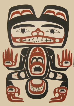
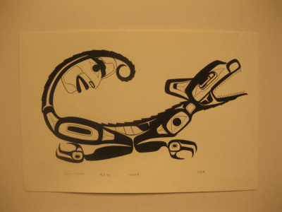
But perhaps the most interesting pieces in the show were by Shawn Aster, a young artist from whom I’ve already commissioned a painting, but whose show pieces I picked out without knowing who did them. Aster has several pieces in the show, but two in particular are strikingly original. The wolf seems almost archaic in its design (look at the teeth and the body decorations) while having enough traditional elements to place it squarely within the northern tradition. The spikiness in the design, which suggests fur, and the spirit in the tail, as well as the posture, which seems a mixture of a howl and a crouching to spring are other details I appreciate.

49

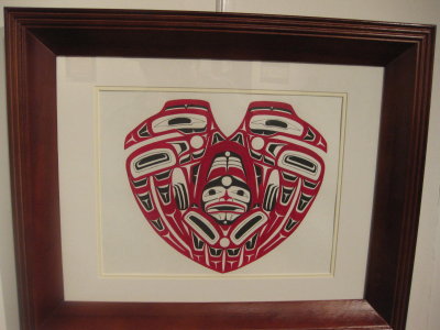
Aster’s conjoined birds are equally intriguing. The compression of the elements into the overall shape brings the already abstract elements of Northwest Coast design to an even greater level of abstraction. Meanwhile, the contrast between the serenity of the birds’ faces and the tormented, imprisoned figure between them adds another element of interest to the composition. Considering the timing of the show and the overall shape, I suppose you could consider this a Valentine’s Day design, with the central figure representing the strain of two people in a relationship – but, no matter how you interpret this design, it is one of the standouts of the show.

22

Some of these artists I hope to buy a painting or two from. Others I plan to keep an eye on. John Wilson tells me that another show is planned for the end of term in April, and I can only hope to get a remote viewing of it as well.

Read Full Post »

John Wilson, who describes his work as “contemporary Haisla,” has only been selling his work for a few years. And, so far, he has confined himself largely to portrait masks, although he has also done drums and some graphics worth releasing as limited edition prints. I consider his “Blue Hand Mask” (which should actually be read as “Blue, Hand Mask”) an accomplished example of the portrait genre, and am pleased to add it to our collection.

If you have read Bill Holm’s An Analysis of Form, you will immediately identify the “Blue Face Mask” as being in the northern style: although the nostrils and lips are painted solidly, the hand and the spirit-helper on the left temple cut across the facial features. In fact, you cannot tell where the spirit-helper ends and the eyebrow begins – that is, what is natural and what is painted, or what is mundane and what is supernatural. Also typical of the northern style is the predominance of black, followed by red.

What is less typical is the band of blue. Cutting across the eye socket and eyelid, the band is an unusual shade. It has the effect of drawing your glance to the blackness of the pupils, giving a sense of fierceness or determination.

The painted hand is a visual pun. It has an umbilical-like connection to the spirit-helper that runs below the chin and up the left cheek. In other words, the spirit-helper is literally lending a hand. And, just to reinforce the pun, the obvious thumb shows that it is a left hand, originating on the same side as the spirit-helper.

One of the things that makes this mask stand out is the sheer skill of carving. Unlike many carvers early in their career, Wilson thinks in planes. That means he is working with the wood, rather than against it. At the same time, the mask is closer to realism than a strictly traditional piece in such features as the chin, the eye sockets, and eyes – which is what makes the mask contemporary.

Another outstanding feature of the mask is the way that Wilson has carved and sanded down to the grain that is suitable in different parts of the face. On the forehead, the ridges of grain meet almost in the center, while on the left cheek, the concentric circles of the grain emphasize the plane of the cheek bone. Even more interestingly, beneath the eyes are what might almost be reflections of them in the grain. Some bits of this attention to the grain are lost beneath the paint, but, because the paint is minimized, much of it remains visible.

Portrait masks are an easy genre to under-estimate. They lack the exoticness of a mythological theme or a stylized animal that many people seem to want in Northwest Coast art. But, if you look closely at the best examples of them, like the “Blue Hand Mask,” then you can start to appreciate them as a genre in which artists are thrown back entirely on their own skill. You can also understand why I think that John Wilson is an artist who is likely to make a name for himself.
low-res-blue-hand-mask

(Note: Somebody should explain to galleries that, when shipping masks with hair, they need to make some effort to keep the hair from getting tangled. As you can see, I am still trying to straighten out the hair)

Read Full Post »

Ask me to interpret anything – the cause of events, people’s motivations, the symbolism in a novel or a dream – and I usually opt for all the explanations that seem supported. To suggest anything else has always seemed overly simplistic to me, and so false as to be a distortion (in which case, why offer the interpretation?). For the same reason, I’m always vaguely irked by the efforts to impose banal interpretations on merchandise sold to the general public.

You know the kind of thing I mean. Buy a brooch with a Celtic knotwork design, and you’re apt to be handed a little card that insists that the design signifies the general connectedness of life. A trefoil design is a reference to the Christian Holy Trinity, and a dog faithfulness, and a ship the journey of life. Or something like that – I may be wrong on the particulars, because they’re usually too banal to remember, but you get the general idea.

People do the same thing with Northwest Coast art. The other day, for instance, I received in the mail a few pages from the gallery where I had bought a rattle by Ron Telek that depicted an eagle – the rattle – transforming into a wolf – the base. On one page, the gallery pointed out that Telek’s work, while derived from Nisga’a tradition, was intensely personal in nature. On another page, I got canned explanations about what an eagle and a wolf supposedly meant in traditional art. In other words, one information sheet clearly pointed out the inapplicability of the other.

As for the explanations themselves, each was a hundred words of meaninglessness. In brief, though, the eagle was described as being all about nobility and the wolf about savagery. To which I can only reply: Really? To all artists in all first nations? When the wolf was a clan or family crest in many cases?

And let’s not even begin to delve into the fact that no artist of any merit starts off with nothing but symbolic meanings in mind, any more than any great novelist starts off intending to write The Great Novel of Our Time. In both cases, they simply create, and leave the meaning to the critics.

But, besides the obvious falseness of such explanations, what really annoys me is that, by being handed such explanations, people are being mislead. They are encouraged to think that art is a simple and straightforward, and important only for its so-called meaning. Even worse, instead of seeing a work for themselves, they are being told what to think. And, once they are told what to think, they may never see anything else.

I suppose that there is a demand for such simple explanations. After all, many people desire simple explanations and world-views. But I don’t see why anyone should pander to this desire, especially when, ninety-nine times out of a hundred, it’s a distortion of reality. Why encourage a delusion?

Look, I want to say when faced with such explanations. Life isn’t like that. It’s convoluted, and complicated, and messy. And, rather than do violence to your powers of perception, why not just accept the general untidiness and learn to enjoy it? You miss so much by denying the complexity.

Read Full Post »

You don’t discover the fact right away, but if you start buying Northwest Coast art regularly, you soon learn that most art galleries stock two types of works: The type that gets displayed, and the type that sells without ever been hung in the gallery or appearing on a web-site.

The type that never gets displayed comes from a number of sources. It may be a piece that is being resold after the original buyer has died, lost interest, or needs to make room in their connection. Sometimes, it is a piece by a top artist for whom the demand is so great that the gallery staff have a shrewd idea of who might buy it. It may be a piece that has been brought into the store for an upcoming exhibition.

Occasionally, it is a piece that is half-finished, such as the half-finished panel in one gallery that was abandoned because it developed a crack, or the telephone chest I saw at one gallery that had Bill Gates’ initials on it because the artist thought only someone like Gates would want to buy it – but he didn’t. The origin can even be as simple as a piece that the gallery currently has no room for, and has tucked away in a closet that most potential customers never see.

Another source of undisplayed art is the artists themselves. Some artists, particularly better known ones, have enough of a following that they don’t need the galleries except as a form of marketing. Much of their work is either begun as a commission or else sold soon after completion to people on the artist’s contact list.

Whatever the exact origin, these undisplayed pieces are frequently the best or the quirkiest work available. For instance, I know of one gallery that has a collection of original acrylics by an artist who recently died. As soon as news of the artist’s death reached the gallery, the owner pulled the pieces until he could decide what to do with them, and hasn’t displayed them since.

In another case, a highly regarded but not very prolific artist delivered his latest masterpiece to the gallery. The gallery never displayed it, but sent word to a few select customers. Despite the high price tag, the work was sold within two weeks. In a similar case, a master carver placed his latest work on consignment, and the gallery sold it in less than 24 hours. Only a handful of regular customers got to see so much as an online photo.

If you want to see such work, the only way you can is to cultivate relationships with the senior staff at galleries or with the artists. Some artists prefer not to deal directly with buyers, but, otherwise, many staff members and artists are only too pleased to talk about what interests them. They can teach you a lot, and, as they get to know you, introduce you to the work of other artists, and, if you let them know your interests, they will gradually include you in the list of people who learn when undisplayed work becomes available. But building relationships is the only way you are likely to have a chance to buy – or just admire – some of the best work in the field.

Read Full Post »

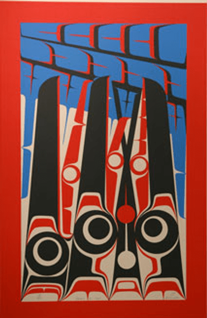
Northwest Coast art is semi-abstract to begin with, and continues to have a strong tradition. For these reasons, abstract or post-modern work in the field is rare. Perhaps the best-known movements in those directions come from Michael Nicoll Yahgulanaas’ Haida Manga or Andrew Dexel (Enpaauk)’s graffiti-inspired canvases. However, long before either of these efforts, Doug Cranmer was making his own movements towards abstraction or post-modernism. In the mid-1970s, he did a series of abstract paintings, several of which were turned into limited edition prints in 2005, and some of which have been released to a handful of galleries in the last month. Recently, we were privileged to take home a print of “Ravens in Nest,” which is compositionally the most interesting of the recently released prints.

At first, the idea of abstracts coming from someone like Doug Cranmer seems unlikely. After all , Cranmer comes from the first generation of artists in the Northwest Coast Renaissance, have learned carving from Mungo Martin. Later, he worked with Bill Reid on poles and houses that were commissioned by the University of British Columbia.

And in the mid-Seventies, who else was doing abstracts? Back then, even Bill Reid had just completed his mastery of traditional form and had yet to edge towards the free-form works of his last period. It would be almost two decades, too, before Robert Davidson would become one of the best known artists to move towards abstraction and post-modernism.

However, in an interview excerpted on the Museum of Anthropology web page, Cranmer explains that he was reacting against the orthodoxy created by Bill Holm’s book Analysis of Form, the first to codify the basic elements in Northwest Coast art.

“After the book came out, all of a sudden there was a right and a wrong way of doing things. We never had that before,” Cranmer said. “The book has served its purpose in explaining Indian designs and elements, but a lot of people followed the book to the letter: as a result, their work has come out all looking the same.”

Apparently in reaction to this tendency, in 1974-5, Cranmer began a series of 48 paintings. “I was doing them differently for the sake of being different.” he said. “I was doing things in Northwest Coast-type design elements that didn’t look like a bird, a fish, an animal, a man or a woman. It worked for a while, but then I noticed that they [the paintings] were starting to look like something again.”

If you look at “Ravens in Nest,” you can see this anarchistic outburst very clearly. The classic formline of Northwest Coat art barely puts in an appearance in the print. Instead, that flexible container of design elements which is generally black, is replaced by a thick red border. Perfect circles replace ovoids. U-shapes, unusually colored blue, float freely across the top, changing direction on each line, and change shapes along the bottom. Blue and red are the main colors, not black. The expected curve of the young ravens’ beaks – an identifying element of a raven in the traditional art — is reduced to the slightest tip possible Instead of the classic symmetry, everything is decidedly unbalanced.

You might almost say that “Ravens in Nest” is a Northwest Coast print because of all the things that it does not do. Like early post-modern works, the print works to the degree that you know the tradition that it is reacting against.

Furthermore, the more you do know, the more what Cranmer has done makes you think about traditional Northwest Coast forms. In fact, while Cranmer may have been reacting against orthodoxy, what he has produced is just as dependent on tradition as any piece that carefully follows the norms outlined by Holm. The only difference is that “Ravens in Nest” is dependent on tradition as its polar opposite, rather than as a key to its technique.

At the same time, while you can easily intellectualize about the piece, its subject remains clear: four hungry and clamoring young ravens. I don’t know if Cranmer intended the effect, but the floating U-shapes seem a graphical representation of the sound they are making, chaotic and clashing.

Such paintings were only a momentary experiment with Cranmer, but they had few if any imitators. The result is that the prints still offer a unique and challenging perspective thirty years after the original paintings. I am not fond of the average abstract, but in Cranmer’s I see a bold and innovative exception that I am proud to hang on our wall.
doug-cranmer-ravens-in-nest

Read Full Post »

Northwest Coast jewelry can easily cost thousands of dollars, especially if you are buying a gold piece. But, fortunately for those with neither the cash nor commitment to spend that sort of money, you can easily find quality designs –usually in silver — for under $300. Naturally, for that price, you don’t get an exclusive design, but you will find intriguing ones.

Here are several random examples I get from looking around the bedroom:

  • Like much of Alano Edzerza’s work in any medium, this ring of a frog head is bold and dramatic, with simple but effective lines. It is also one of the heaviest rings I’ve owned, with a band nearly three-quarters of a centimeter wide at the back. I’ve joked that I’m going to get another four, and I’ll have an effective set of brass – or silver — knuckles.

    gwaai-edenshaw-silver-frog

  • By contrast, this frog ring by Haida jeweler Gwaii Edenshaw is altogether more delicate, although suitable for either a man or a woman. This one is unusual for Edenshaw, in that it is silver, rather than the gold he usually works in (although a more expensive version has gold eyes, and an even more expensive one is cast in 18 karat gold, which is about as impure as he generally goes). It is also not particularly Haida in design, except for the ridges down the frog’s back. But it is a whimsical piece, with the frog resting its head on its front flippers and its back flippers locked together on the band on the back.
  • gwaai-edenshaw-silver-frog

  • These earrings are another commercial design by Gwaii Edenshaw, light, with the design just barely visible. They’re suggestive of worn petroglyphs, or perhaps a hand-inscribed design.
  • gwaai-edenshaw-small-earrings

  • Marcel Russ did this unusual design based on the myth of Raven stealing the light. This topic is a common one in many media in Northwest Coast art, and to pull it off, the artist really needs to come up with a different design. Russ’ approach is to show only the Raven’s head and the sun or moon in his beak. The result is a contemporary piece that retains strong roots in tradition.
  • marcel-russ-raven-steals-the-light-earrings1

All these pieces are highly affordable, and the last two are available for $100 or less. In all cases, you would be lucky to find comparable sophistication in a mainstream jewelry store. For the same price, you’d probably get an abstract design, or a mounted semi-precious stone with next to no design at all, and probably with a lower silver content besides.

Of course, Northwest Coast jewelry does have its share of what I think of as touristjunk (all one word), but for the same price as the touristjunk, without much effort you can find superior works like these ones.

Read Full Post »

« Newer Posts - Older Posts »