Feeds:
Posts
Comments

Archive for the ‘art’ Category

When someone suggests that design doesn’t matter, I like to mention Jan Tschichold, whose ideas help to create modern typography and were considered so subversive that Nazi Germany gave him the choice of exile or imprisonment. I can’t say that typography was quite so important in my own life, but there was a period when it helped to keep me sane.

At the time, I was working as a technical writer, having realized that the reduction in tenured positions made academia a dead end. Technical writing was far more lucrative than teaching, and it taught me the importance of organization and brevity, but it was far from challenging. In six months, I had gone from a beginner to hiring my own sub-contractors, and I was looking for the next step.

I branched out into marketing, which quickly lead me to graphic design. I soon realized that typography was a craft in itself that most designers knew little about, and, the more I studied, the more fascinated I became.

Part of the appeal was the esoterica. To appreciate typography, you have to learn about ascenders and descenders, bowls and leading and all the details that most people see without observing. Moreover, the roots of typography were in the early Renaissance, although the modern concepts of design were less than a century old. If you had any hope of understanding what typography was about, you had to train your eye by absorbing obscure concepts that most people never even guessed existed.

Yet paradoxically – and contrary to what many believe – the point of typography is not to call attention to itself. In fact, design that called attention to itself can be called a failure by definition. The point of typography is to enhance the content, to make it more legible and, present it appropriately. Such goals are so contrary to those of our post-modern age that they seemed to me an example of art for art’s sake. After all, why else would someone labor over a design that, if successful, would affect people’s experience with only a handful ever appreciating what it accomplished? Such attitudes immediately commanded my respect. I wanted to understand what successful design was about.

Also, I soon realized that my growing obsession had a practical side. If I could design as well as write, I would become highly employable. I could market myself as an all-in-one service, combining writing, design, and project manager in a way that no one else was doing. Even more importantly, I would have enough variety in my work that I would rarely be bored.

It became common place for clients to tell me that they wanted accurate manuals, not pretty designs. Often, I was cleaning up after writers who thought the ability to put words on paper was all they needed, so the last thing clients wanted was someone else giving themselves airs. I did my best to deliver the hands-on accuracy that other writers avoided – but, for my own sake, I also gave clients well-designed manuals and help files without saying anything.

To my satisfaction, almost every client as they signed off would say some variation of, “I know I said I didn’t care about design – but damn, that design is something else.” I enjoyed giving them a little extra, and proving that accurate content and quality design were not polar opposites. To this day, I can look at my work from that period with artesianal pride at a job well-done.

Soon, however, my restlessness led me to management and finally to journalism. Both were satisfying in themselves, but neither gave much scope for design.

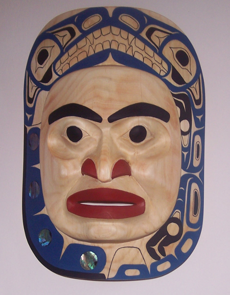
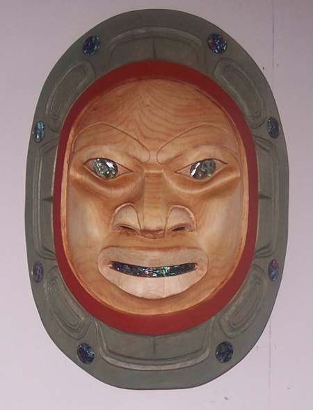
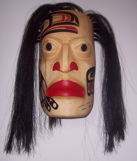
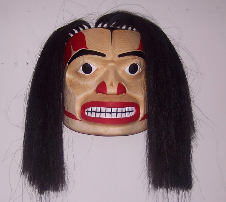
However, in the last few months, I’ve returned to typography, designing the book I’m writing and even designing templates for a client. I’ve probably forgotten more than I ever knew, and I never was more than an apprentice in the craft, but I find the work as satisfying as ever. As far as I’m concerned, combining writing with design is the closest I’m likely to come to what Bill Reid used to describe as “the well-made object”– a tiny piece of art in which I can demonstrate all my knowledge in every aspect of it.

Read Full Post »

I have been meaning to buy from Haida artist Carol Young for a couple of years, but, until now my spare cash and opportunities haven’t coincided. Not only was Young the first recipient of the Mature Student Award that I fund at the Freda Diesing School, but she is also one of the strongest women carvers currently at work on the coast, with an awareness of line reminiscent of her teacher Dempsey Bob, and a realism uniquely her own. In less than five years, she has gone from an adequate beginner to a carver with a style that promises to make her one of the great originals in Northwest Coast art.

“Wind-Rider” seems an appropriate place to begin buying from Young. Before Young attended the Freda Diesing, she sold Haida dolls on the Internet, and continues to give classes in doll-making. A couple of years ago, she placed a similar figure on a mask for an all-woman show at the Steinbreuck Gallery in Seattle. With its removable hat and cedar bark hair, the figure seems to embody the entire span of her career, so much so that I suggested to her that she should use it as a logo if she ever prints business cards or sets up a web site.

One of the things that makes the carving unusual is that human forms – especially naked ones – are rare in the Northwest Coast Renaissance. Classical works and oral tales sometimes show a decided earthiness, but, by the time of the local Renaissance, Christianity had changed the standards of what was appropriate. As I write, the Bill Reid Gallery is about to host a show of native erotica, featuring younger and avant-garde artists, but in general, the current artistic tradition approaches the human form cautiously, if at all.

By contrast, “Wind-Rider” depicts a semi-realistic naked female form, with a sensuous appreciation of the curves of its spine, buttocks, and thighs. Yet, at the same time, I would hesitate to describe it as erotic, and not just because the figure suggests a young girl rather than an adult woman. This is not a figure poised for the male gaze in some impossible contortion – nor for any other gaze at all, for that matter, considering its wild array of hair. The posture suggests that the rider is absorbed with the act of balancing and holding on, while the upward tilt of the head conveys a sense of wonder, with the eyes – the only part of the sculpture that is painted – fixed on something that only the rider can see. Meanwhile, the blank expression suggests concentration and determination. Sensuousness and innocence are not usually thought of as going together, yet somehow in “Wind-Rider” they seem to co-exist without any difficulty. In fact, you might say that the figure is sensuous because she is self-absorbed. But, however you parse it, the depiction is original in a way that nudes rarely manage.

Sensibly, Young has left most of the spoon unpainted, leaving the lines of the sculpture to speak for themselves. With most of the attention focused on the rider, she has also left the spoon plain. Yet the spoon, too, is well-proportioned, with a graceful curve to the handle and a ladle that is deep enough and wide enough to serve as a visual counter weight to the rider.

One viewer on Facebook immediately thought of witches riding broomsticks (to which Young immediately replied that the Haida have no concept of Witches). Personally, though, my first thought was of Whale Rider, a film whose protagonist is a Maori girl who is determined to break with tradition and become a chief. Not only does the Maori culture resemble that of the local first nations, but, like the film, Young’s sculpture seems all about following dreams and female empowerment.

From any perspective, “Wind-Rider” is a powerful and unusual work. Examining it, I wonder why I took so long to buy from Young and I’m determined not to wait too long before I do so again.

1077994_10151516927180264_1214331885_n

Read Full Post »

Most of the Northwest Coast art in my townhouse is in the formline style favored by the Northern First Nations in British Columbia. However, I am always willing to learn more about other coastal traditions, and slowly that’s what I’m doing. The only trouble is, relatively little is written about these other traditions, so most of my knowledge comes from looking at what working artists like Kelly Robinson are doing.

Robinson is a young artist of mixed Nuxalk and Nu-chah-nulth descent who is exploring both sides of his ancestry. In the last year or so, much of his wood carving (he is also an accomplished jeweler) has explored Nu-chah-nulth forms. In particular, he has built on the work of artists like Joe David and Art Thompson who revived the tradition and elevating it into fine art based on his time at the Freda Diesing School.

Fortunately for me, “Ancestor of Today” became available when I had just cashed a few cheques from editors. I first saw the mask in Cathedral Close, the garden outside the Bill Reid Gallery in downtown Vancouver, and, a couple of hours later, I was taking it home on the Skytrain in a bag I was clutching in a death-grip.

The inhabitants of the west of Vancouver Island, the Nu-chah-nulth (formerly called the Nootka and the West Coast) were in a position to be influenced by both the Kwakwaka’wakw, Nuxalk, and Heiltsuk to the east, and the Haida to the north. In fact, unlike most first nations around them, by 1900, Nu-chah-nulth had at least two different styles, a newer one based on formline, and the older, original style. There also seems to have been a third style reserved for the curtains used in the ceremonial mysteries, although I am not altogether certain.

At any rate, these mixed influences may explain the mixture found on “Ancestor of Today.” On the one hand, the mask includes elements that are universal in the coastal traditions, including the U-shapes and the labret that indicates high status. The hair, too, is arranged in a buzz-cut that I have seen in works from every nation.

On the other hand, the facial features all seem to me to be typically Nu-chah-nulth origin, from the raised eyebrows to the high forehead and the nose that swells around the nostril. One of the strongest distinguishing features are the outsized, shallow eye sockets. Unlike in the northern style, the eyes themselves are barely distinguished from the sockets. Here, they are no more than crescents indicate a closed eye, although they would probably not be much more detailed if the eyes were open. The eye sockets join the high cheekbones – another distinguishing feature – not in a plane, as in a northern style, but in a single line.

The painting, too, differs strongly from the northern style. The traditional red and black are the primary colors, but, they cover most of the mask, rather than being used only to highlight features like the lips, nostrils, and brows. Moreover, instead of the designs being painted across the face without much regard for the carving, the way they would be in the north, the designs on the bottom of the cheeks are on their own planes. Between the lips and the nostrils, a different approach is taken, with the inverted U-shape merging into the top list, and the unpainted border on each side of it into the nostrils.

(The mask’s use of gray and the unpainted wood as additional colors is also untypical of the northern style, although they may be Robinson’s innovations rather than indicating any particular tradition; I’ll have to ask him next time we’re in touch.)

The overall impression is of a simpler, bolder style than would be likely to come out of the north. It is enhanced by the slightly rough knife-finish – Robinson’s first effort at this technique, he tells me. To my modern eye, the closed eyes give it Buddha-like sense of calm dignity in keeping with the mask’s name, which asserts a claim that the tradition is still alive and evolving today.

I admire Robinson’s Nuxalk style work, especially the “Four Carpenters” and “Mother of Mischief” paintings, which hang in my living room. However, his Nu-chah-nulth work has its own fascination, especially since he is one of the few artists in the tradition who is trying to evolve the tradition. With “Ancestor of Today,” he manages the difficult trick of re-introducing the tradition while adding first-rate finishing and the steady hand on the paint brush that modern buyers expect. I’m looking forward to what he does next in this style.

100_1603

Read Full Post »

Sometimes, you may find an artist whose work you admire, but have trouble finding the exact piece you want to buy. Or maybe the artist is selling privately, and few of their works are available on the open market. In such circumstances, you might consider commissioning a piece – but be sure you know what you’re doing before you go ahead. The financial arrangements, the decisions about the subject matter, and how and when the finished work is delivered all require careful thought before the commission goes ahead.

You can commission art either through a gallery, or directly from the artist. Going through a gallery gives you the advantage of expert advice, and could make getting a refund easier if too many problems arise. It is also considered proper etiquette to go through the gallery if it has introduced the artist to you.

However, one problem with commissioning through a gallery is that you will usually pay more overall. Some galleries, too, are so anxious to preserve their position as go-betweens that they will will go to extraordinary lengths to prevent you from meeting the artist, even with a gallery employee. This attitude means that deciding the subject matter is much more difficult. In fact, in one case, it caused the artist and I – both of whom were originally perfectly willing to observe proper etiquette – to make our own arrangements.

By contrast, a direct commission usually takes less time to arrange. You may receive a price closer to the wholesale price – but don’t count on it. You may also have trouble contacting the artist, although these days so many are on social media that is less of a problem than it was a few years ago.

But the most serious problem with a direct commission – for both you and the artist – is whether you can trust each other. Bad faith and outright theft sometimes happen on both sides of a direct commission, so before any money changes hands, you should learn what you can about the artist’s reputation (if they are experienced, they will be doing the same about you). After all, you could be spending thousands of dollars, and, if something goes wrong, your only recourse may be small claims court.

Whatever way you approach the artist, the subject and the design should be a balance between what you want and the artist’s interests. Personally, I see no reason to commission a standard mask such as a Hamatsa raven or a sculpture based on Raven’s theft of the light unless you have an interesting variation in mind. For me, the whole point of a commission is to get something unusual, and to give the artist a chance to do something the market might not otherwise allow them to do.

For that reason, I like to suggest a general subject or design, and hope that the artist will be intrigued enough to develop it in their own way. If possible, I ask for sketches to approve before the final work begins. What I am looking for is something that both intrigues the artist and will satisfy me.

Before the commission begins, you also need to discuss the financial arrangement. Some artists may expect no money until the commission is finished. However, a more common arrangement is for the buyer to pay one-third when the deal is accepted, one-third when the artist finishes, and one-third after any final adjustments requested by the buyer. This arrangement minimizes any possible loss for the buyer, and compensates the artist for their time if the buyer walks away from the deal.

Another matter you should specify is the approximate delivery time. Despite all the jokes artists make about “Indian time,” an increasingly number of artists these days take a professional attitude and do their best to meet their obligations, but, even so, the emphasis here is on “approximate.” You are dealing with art, not utilitarian manufacture, and by definition artists are perfectionists. As a result, a strict deadline would be almost meaningless even if you insisted on it. With the best of intention, slippage may happen, and, so long as you are kept informed, shouldn’t be a matter for concern unless it drags on indefinitely.

Even if completion is delayed, you may be content to wait. One commission took two years to complete – so long that I sometimes concluded that it would never happen. However, I felt reasonably sure that the artist meant to meet his obligation, and, in the end, he delivered a piece that I regularly describe as breathtaking.

As I said, it all comes down to how much you and the artist trust each other.

Speaking of which, it can’t hurt to write down the terms of the commission and have both you and the artist sign it, especially if the two of you have never worked together. In many cases, though, a commission is a verbal agreement, aside from any receipts you may receive from any gallery involved.

With all these considerations, commissioning can be an exhausting experience – and, sometimes, a harrowing one. So why attempt it? The answer is simple: a commission is a mental collaboration. As the buyer, you may not raise a carving tool or dip a paint brush, yet seeing the completed work can be an exhilarating experience. It gives you a small taste of what the Medicis must have felt as patrons of Renaissance Florence – a mixture of pleasure and pride that, indirectly the piece of work in front of you would never have existed except for you. Despite the many setbacks that can happen, that is an addictive feeling that you can easily come to want again and again.

Read Full Post »

Mitch Adam’s “Dancer” is an example of how art keeps surprising me. I first picked up the piece (which fits comfortably in the palm of my hand), while having a late breakfast at the Northern Motor Inn in Terrace, and it immediately changed my mind about what an argillite piece could be.

Before seeing “Dancer,” I would have said I had firm ideas of what an argillite piece should be. It would be unpolished. It should be in a traditional style, and as detailed as possible.

Almost immediately, I saw that “Dancer” was none of these things. Yet, just as quickly, I realized that I wanted to buy it.

However, I shouldn’t have been surprised. Adams’ “Blue Moon Mask,” which is among the favorites in my collection, is an unusual piece as well. Moreover, Adams regularly produces surprises. Miniature masks in which laminated woods take the place of paint, functional carved pipes, yellow cedar sculptures with more detail than you would imagine the wood could take – through all these pieces, Adams has shown a knack for innovative designs and uses of media. I expect the unexpected but apt from him.

So why does this piece succeed against my expectations? Since I received the finished piece a week ago, it has been sitting just below my computer monitor, where I’ve been studying it at odd moments when my fingers pause on the keyboard, trying to figure out the answer.

The answer I’ve come up with is that the piece is sculpture reduced to its essential lines. The flight feathers are represented by three feathers that differ only in size and position, the feathers on the head to overlapping circles reminiscent of scale armor. Simple, unadorned ovoids join the wings to the body. Turn the sculpture around, and it is mostly unfinished, except for an ovoid with four tail feathers, each decorated by a simple T-shape.

Left to themselves, such decoration would be unexceptionable. However, they are not what the eye notices. Instead, what viewers notices is the strong lines of the piece – particularly curves – that I’ve noticed before in the best of Adams’ work. The top of each wing is matched by the curve of the beak on each side, forming strong but obvious crescents on each side. The shape of the head is an approximation in miniature of the half circle formed by the shoulders and the wings, and the bottom two wing-feathers on each side diminished echoes of the top one.

In addition, there is a strong center line. Initially established by the beak, it remains so strong that you still see where it should be in the empty space below it. Cleverly enough, that empty space forms an arrow, pointing up to the beak, and drawing the viewer’s eyes with it.

In the end, these lines and the negative spaces they create are what makes “Dancer” work. Like a successful formline, they draw the eye around the sculpture, keeping it moving. Since the polishing emphasizes them, it, too, is justified. A natural finish would de-emphasize both. Instead, by polishing, Adams has made the curves stand out, and the negative spaces look darker, to the benefit of both.

“Dancer” is a strong piece at its size. However, over the week that it has graced my townhouse, I find myself repeatedly wondering how it would work at a much larger size. My guess is that, with its lines, it would be an outstanding piece at any size.

dancer0

dancer-sideways

Read Full Post »

This year’s graduation exhibit at the Freda Diesing School was held on April 19 and 20. It was by far the weakest of the five I have attended. In previous years, there have always been one or two students who were ready to become professional artists, but this year there were none, although a reassonably large number could be ready if they keep working for another year or two.

Unfortunately, this year’s show featured too many shaky hands on the paint brush and failures to find the grain. Too often, what passed at a distance was flawed close up.

However, that’s not to say that the exhibit was disappointing – just that it could have been better. The longhouse on the Terrace campus of Northwest Community College is always worth a lingering visit, and I never object to a preview of those who might become promising new artists in another few years.

longhouse-interior

The work of many of the best artists was visible in the display of paddles at the entrance. This is probably no accident, since a painted paddle is one of the first assignments given to students in the school, so students had plenty of time to perfect their results.

entrance

Inside, I first scanned the exhibit for artists whose works I had seen before. Sam Mackay, the winner of the 2012 Mature Student Award produced a solid effort in his “Wolf Howling in the Moon” mask:

sam-mckay-wolf-howling


I also looked for works by Jared Kane, from whom I bought two prints last year. He proved to be one of the more imaginative carvers in the show, but the fact is obscured by the lack of finishing on many of his works, as well as his attempts to use light washes of paint that only look sloppy. His potential is obvious, but he seems to be working against himself in these respects:

jared-kane

This year’s Mature Student Winners (who only found out they had won at the show) also showed considerable potential. Steven Wesley, this year’s winner of the award, produced the very solid “Eagle Transformation:”

steven-wesley-eagle-transformation


Roberta Quock, one of this year’s honorable mentions, produced “Wolf Mask,” one of the best finished and painted masks in the exhibit:

roberta-quock


This year’s other honorable mention, Lorretta Quock Sort showed a similar talent. I particularly liked her mask, “Long Face Willie Campbell,” carved in honor of a grandfather she had never met and reserved to give to her parents::

lorretta-sort-long-willie-campbell

By the time I had looked around the show a few times, two artists stood out. The first was Lyle Mack, the latest from the large and talented Nuxalk family to attend the school. The painting on Mack’s “Beholder of the Light” was imperfect in one or two places, but with some retouching this frontlet could would no trouble meeting professional standards:

lyle-mack-frontlet

However, the most promising artist in the show was Angelo Cavagnaro. His “Gitmidiik Wild Man” mask and “Lunar Eclipse Mask” owe their success to their high standard of painting, but, although their treatments of their subjects are conventional, both are competently carved:

angelo-cavagnaro-wild-man

angelo-cavagnaro-luna-eclipse

Cavagnaro also contributed to the show a bowl entitled, “Supernatural Flounder” which was the most imaginative piece in the show – so much so that I took it home with me. Despite the roughness of some of the carving, this bowl, more than anything else, suggests what he might be capable of with another year or two of practice. When I posted a picture of it to Facebook, it immediately attracted Likes from four or five proffessional artists:

100_1585

Most of the pictures in the show will be in The Spirit Wrestler Gallery’s “Northern Exposure” show in Vancouver at the end of May. Several students were also planning to add additional pieces for the southern show, which I look forward to seeing. As always, I anticipate that show, but I look forward even more to seeing what first year students like Robert Quock and Lorretta Quock Sort will be doing next year, with another twelve months of development.


Read Full Post »

When Angelo Cavagnaro was completing his projects for his second year at the Freda Diesing School of Northwest Coast Arts, senior adviser Dempsey Bob stopped by his work bench.

“What’s that?” Bob joked. “A flounder?”

Cavagnaro says that he had intended the bowl to be a halibut, as its shape and the two eyes on one side suggests. However, remembering Bob’s comment, he named it“ Supernatural Flounder.” It’s a fittingly whimsical title for what I consider a whimsical piece.

“Supernatural Flounder” reflects not only the importance of fishing to traditional Northwest Coast cultures, but of grease. While the northwest coast of North America historically supplied the abundance of food necessary for cultures centered on status and art, the diet was low in fat, or grease as it was generally known.

Just as in medieval Europe, people craved grease incessantly. In fact. stores of grease – usually from the oily oolichan or candle fish, whose season was in early spring, when supplies would be at their lowest – were a sign of wealth. To this day, it remains a traditional delicacy. Historically, it was a treat at feasts and ceremonies, where it would be served to guests in highly decorated bowls. Some of these bowls were about the size of Cavagnaro’s piece, holding enough grease for a single serving. Others were a couple of metres long, and must have served dozens.

“Supernatural Flounder” is a transformation piece, like many that I have bought. The human face in the tail suggests that the fish – whether halibut or flounder – is one of those supernatural creatures that can assume human form. Many depictions of such creatures show them in the moment of transition, which is often shown as dramatically agonizing, like some of the computer-generated transformations of werewolves in modern horror films.

However, Cavagnaro takes a somewhat different approach. The body of the bowl is simply carved, with fins indicated by rough shapes scored with a couple of lines apiece. That leaves the human and fish faces to be emphasized, their lips and nostrils painted with the same red, and their eyes with the same black. There are differences in the shapes of the eyes and their sockets, but if you look at the piece long enough, the resemblance is undeniable. Both have the same blankness, inviting a comparison which explains why I call the piece whimsical – in the end, the human face ends up looking not that different from the fish’s. The result is a creature that looks at home with its dual nature, whose stomach just happens to be where the bowl is.

As a carving, “Supernatural Flounder” could stand more attention to finishing details. The interior of the bowl is rough, and there are many places on the carving where the artist’s working against the grain is still obvious. On a piece that is so minimally painted, such details stand out, and need to be thought about. But the general shape and proportions is well-thought out, and Cavagnaro shows the same steady hand on the paint brush as in his other works.

In the end, the bowl turned out to be the only piece I bought at the graduate show. As I write, it sits on a sideboard a few paces away, where I can enjoy by turning my head a few centimeters.

100_1585

Read Full Post »

Last weekend, I flew north to Terrace to give out the Mature Student Award at the Freda Diesing School graduation. This was the fourth year I have sponsored the award, and the third in which one main recipient and two honorable mentions were named. The award honors students twenty-five and older, recognizing that returning students face challenges in returning to school that younger students don’t, yet often contribute grreatly to a class.

The main recipient was Steven Wesley, a member of the Eagle side of the Haida Nation. Wesley fished for many years, then returned to school in 1997 to earn his high school diploma. “I wanted to be a role model for my daughters,” he said. “I wanted to show them that even their Dad could get his Grade Twelve.

Wesley went on to become a bus driver and trucker. However, he relates that, in 2002, “A friend handed me a knife and a block of wood and asked if I wanted to carve. And ever since I kept pursuing my dream of becoming an artist,” he says.

Although mostly self-taught and learning by observing others, Wesley was accepted at the K’san School in 2004. However, he had to turn down the position due to lack of funding. When he applied to the Freda Diesing School in 2008, he was luckier in finding support.”I just wanted to learn everything,” he says. “I taught myself how to do the ovoids and U shapes but I wasn’t sure they were the way they should be. So, coming back, I wanted to learn from the beginning again. “

However, for Wesley, the most satisfying part of his first year was learning about negative space in carving: “how deep, how high, how wide. I knew the forms, but I didn’t know how to use negative space in my designs.”

He plans to return for his second year in September, and to carve and paint over the summer. “The more you carve, the less you forget,” he says.

One of the two honorable mentions was given to Roberta Quock, a Tahltan from Telegraph Creek who grew up in Merritt and Kamloops. Long interested in painting and beadwork, she says, “I’ve always wanted to go to this school to study more and to learn carving and study more of the culture.”

Besides beginning to learn how to carve, Quock found the first year class a friendly place to learn. “We really bonded together, and we helped each other out,” she says. “We looked out for each other like a family.”

Quock also plans to return for her second year, studying beside her brother Lyle.

The other honorable mention went to Lorretta Quock Sort, a Tahltan of the Crow Clan. An experienced textile artist, for some time Sort has been making fire bags (ammunition pouches) that the president of the Tahltan nation has been distributing as gifts.

Sort’s first ventures into carving will all be given away to her parents and three children. She explains, “My Mom always told me that when you do something for the first time you should give it away. You’re not supposed to keep it or sell it. But, coming from such a large family, it was hard to decide who got what.”
Like the other winners, Sort plans to keep busy over the summer. She has already set herself the task of doing a mask and bowl over the summer, as well commissions for two button blankets and more fire bags, which these days are popular as women’s purses.

Wesley, Quock, and Sort were all among the more accomplished students in this year’s exhibition. I look forward to seeing them develop in their second year, and I’m pleased to have played a small role in their development as artists.

Read Full Post »

I love argillite. Of all the media used by the First Nations artists of the Pacific Northwest, argillite has by far the most mystique and romance, as well as the greatest visual appeal.

Argillite is a black slate found only on Slatechuck Mountain on Haida Gwaii. Similar slates have been in a few other places around the world, but have slightly different chemical compositions that make them less suitable for carving (or so I’ve been told). Only members of the Haida nation are supposed to be allowed on the mountain, and families have unofficial quarries whose exact locations they try to keep secret.

Rumors persist of a logging road that makes access to the quarries easier, but, generally, artists either have to carry out the argillite they quarry on their backs down a narrow trail, or else buy what others chose to sell – usually at about five dollars a pound on Haida Gwaii, and as much as twenty dollars a pound in Vancouver. The tradition has been to keep argillite out of the hands of non-Haida, although a black market makes small amounts generally available to other artists, who generally turn it into pendants.

The history of argillite carving is equally romantic in its obscurity. The standard account is that argillite carving did not begin until 1820, and that the pipes that were among the first carvings known were never actually used. However, while European tools and interest in curios made the 19th century a Golden Age of argillite carving, it seems unlikely that such a sophisticated art form could emerge suddenly without at least a few centuries of tradition. Studies of early pipes show a residue that prove that some early pipes were definitely used, but, since heat can crack argillite, most likely it was a medium reserved for shamans and other ceremonial use before the nineteenth century.

But whatever the truth of the matter, argillite carvings became a major trade good in the 1800s. Unlike other traditional art, these carvings consisted of far more than family crests and the stories that families and title holders held the right to tell. Instead, the carvers of the time also depicted the animals, peoples, and plants of everyday life. Sometimes, they imitated the patterns of the china plates carried by American traders. Other times, they made miniatures of houses and canoes. At times, they depicted the Haida viewpoint of the European traders and immigrants, offering some of the few contemporary depictions of colonization from the perspective of the colonized.

Nineteenth century argillite was not completely naturalistic. For instance, a head is generally one-third the length of the body. However, much of it is painstakingly detailed, with muscles on arms and legs or the individual strands of a rope all clearly delineated in a way that the more traditional wood carving almost never is. During its development, argillite carving also developed its own stock poses, such as a shaman holding a rattle in his upraised right hand and a knife in his left.

Like other art forms, argillite carving suffered because of epidemics and Christianization. However, because it was a trade good, argillite carving never declined quite as much as more traditional forms. Probably, it helped, too, that Charles Edenshaw, one of the first great Haida carvers whose name and career we know, was a skilled argillite carver – although this aspect of his art was omitted altogether from the recent exhibit of the works of Charles and Isobel Edenshaw at the Museum of Anthropology.

Today, argillite is a niche market. Bill Reid was influenced by argillite design, but only experimented with the actual medium. Similarly, while Robert Davidson as a teenager sold model totem poles in argillite for the tourist trade, it has never been his favorite medium. The same is true of artists such as Jay Simeon, Ernest Swanson, Gwaai Edenshaw or Marcel Russ, although all of these artists can produce outstanding argillite pieces when they take the time.

The trouble seems to be that argillite is more temperamental than wood, silver, or gold. It is dirty to work with, resistant to tools, and prone to flaws that can destroy hours of work with one misplaced stroke. Because of its water content, it can shatter in the cold. Artists like Christian White or Gary Minaker Russ who have done most of their work in argillite are essentially specialists, appealing to a relatively small and expensive market. Excluding pendants and miniatures, galleries rarely have more than two or three pieces of argillite at any one time, and prices usually begin at about $8000.

Nor has the reputation of argillite been helped by the growing practice in the last decade of inlaying pieces with gold, silver, and semi-precious stones. Often, such inlays are added before carving begins, seriously interfering with the artist’s ability to add detail, and, almost always, they are added in lieu of detailed carving. Moreover, because such inlays are expensive, they add substantially to prices, which means that buyers are being asked to pay more for inferior work that increases very little in value.

Quality argillite pieces are still being carved, but to find them buyers either have to visit Haida Gwaii or at least deal with artists directly. However, the effort to find quality can be well worth the effort.

Even when left with its natural finish, argillite has a reflective finish that makes a carving rich in shadows and highlights. These shadows and highlights change with the available light, but always adds a unique impression of depth and motion. They make argillite a medium that demands to be touched, and its carving traced over and over with the fingers – in fact, many believe that frequent handling prolongs the life of a carving, because the oils from human hands replenish the moisture that was originally in the slate.

Elegant and mysterious, quality argillite carvings are an under-appreciated glory of Northwest Coast art that never fail to capture and intrigue the eye.

Read Full Post »

Which upcoming First Nation artists in the Pacific Northwest are worth having a look at? Giving an answer is not easy, because traditional art forms and contemporary variations are thriving as never before.

Still, if I had to give answer, these are the seven artists I would tell people to look for. Many post their work on Facebook, or somewhere else on the Internet:

  •  Mitch Adams (Haida): Adams has made a specialty of miniatures – everything from masks to combs and usable pipes – and of exploring different kinds of woods – including ebony and laminated blocks in which the layers substitute for paint. However, his best work so far has been in carving sculptures about thirty to forty centimeters high.
  •  Morgan Green (Tsimshian): Many Northwest Coast artists show versatility, but few can match Green. Her work includes cloth and leather design, wood carving, ceramics, and, more recently, metal work. Although in the past she seemed more interested in experimenting with new media than in developing her art, for the past couple of years, she has focused on jewelry and metal sculpture.
  •  Latham Mack (Nuxalk): Mack first attracted attention at the Freda Diesing School for his design work. However, since graduating, Mack has continued to apprentice with Dempsey Bob, and his discipline and carving is starting to reach the same standards as his designs.
  •  Kelly Robinson (Nuxalk, Nuchunulth): Robinson began as a painter, but since branched out into jewelry and carving. His work in both of his traditions has a strong sense of individuality, but in Nuchunulth style, he has the distinction of being one of the first to treat his subject as high art, rather than historical re-creation.
  • Todd Stephens (Nisga’a): As a carver, Stephens still needs practice, but few artists of any experience can match him as a designer. Study the details of his paintings, such as the different ways that the join of two formlines is thinned out, and you will soon know most of what you should be looking for.
  •  John Wilson (Haisla): Primarily a carver, Wilson is known for the speed with which he can finish high-quality masks. More recently, he has landed commissions for corporate logos and artwork. He is rapidly becoming the best Haisla artist since Lyle Wilson, but, right now, his work is extremely reasonably priced.
  •  Carol Young (Haida): The first winner of the Freda Diesing School’s Mature Student Award, Young first emerged as an artist to watch during her second year at the school, when she started doing naturalistic, unpainted masks. Since then, she has gone from strength to strength with more traditional carvings, some painted, some not. Once or twice, she has introduced female themes into her work.

Other artists who are less successful (so far) but still worth searching out include:

  •  Sean Aster (Tsimshian): Aster is one of the strongest designers who has graduated from the Freda Diesing School. Unfortunately, he does not seem to have marketed his work as well as it deserves.
  • Cody McCoy(Salishan): McCoy has won two YVR art awards, but he is marketing his work in both First Nations galleries and in mainstream shows as surrealism. The best of his work is strikingly original, with traditional forms half-hidden in the thick, restless brush strokes.
  •  Colin K. Morrison (Tsimshian): Morrison is an outstanding carver. However, he only produces a few pieces a year, so the danger is that he might eventually choose another way to earn a living.
  •  Chazz Mack (Nuxalk): Well-known for his design work, Mack seems to do much of his work for family and friends, instead of making many attempts to develop his reputation.
  •  Nathan Wilson (Haisla): Wilson’s high-standards of craft are obvious, but his design sense is sometimes no more than adequate and could use more individuality. However, sooner or later, I expect consistently strong work from him.

Neither of these lists is anything like complete. There are always promising artists whose work does not appear in Vancouver or Victoria, or in galleries anywhere, so I am sure to have missed some. If so, my apologies – chances are, my ignorance explains any omissions, not any judgment of quality.

Read Full Post »

« Newer Posts - Older Posts »