Feeds:
Posts
Comments

Posts Tagged ‘British Columbia’

Over the last few years, I have spent more than my share of time visiting in hospitals. Visiting a patient in a private room has its advantages – I once marked several batches of essays in one – but can be lonely for the patient unless they have a constant stream of visitors. A semi-private room is better, depending on who the other patient is, but can turn into a nightmare, as happened once when the other patient was from a psychiatric ward and had to be strapped down because he was under the illusion that he was defending the west coast against a Chinese invasion. So, on the whole, a four-bed room is usually the best balance between privacy and company.

For instance, over the past three weeks, the four-bed room where I have been spending several hours every day has presented a variety of people coming and going, some pleasant, some eccentric, but all providing stimulation to one another with their differences.

One was a woman who in sixty years had been both a hairdresser and a prison guard. She was outspoken, and obviously restraining her language, but unfailingly polite to the nurses and everyone else. She quickly became friends with the person I was visiting, and the two of them soon started trading the contents of their meal trays like kids at recess, and watching out for each other.

At the start of my visits, another of the bed was occupied by a soft-spoken man who had recently retired from sales. His wife, a puppeteer, was another frequent visitor. He participated lightly in the conversation, and everyone knew he was a Christian fundamentalist, but it was only on his last night that he revealed his missionary instinct. In response to a few questions, he got out an oversized Bible and a stack of computer printouts and immediately started trying to convert the ex-hairdresser-prison guard. It was a mark of her restraint that she didn’t lose her temper with him, although she complained long and bitterly after he left.

The fundamentalist was followed by a man who kept the curtains drawn around his bed and said as little as possible. He, in turn, was followed by a male nurse who took some advantage of his conventional good looks, but also interceded with the ward nurses on behalf of other patients. After him came a folk singer from Prince Edward Island, hospitalized on the other side of the continent after he had come to sing at a family wedding and contracted laryngitis. He spoke little (unsurprisingly), but showed a strong streak of kindness when he did.

The other bed in the room was initially occupied by a young Vietnamese woman. She would talk, but she spent a lot of her time on her cell phone or watching videos on a portable player with her legs draped over her bed tray. Either her sister or her boyfriend would crawl into bed with her at night, a practice that disturbed the nurses, but seems to me a reasonable way to help lessen the strain of being in hospital.

When the Vietnamese woman left, her bed was taken by a homeless man who worked part time as a roofer. He had the most prehensile toes I had ever seen, and was absolutely filthy. Despite cracked ribs, he was always descending six floors to go for a smoke – and I suspect, to judge from his behavior, for his drug of choice as well. Talking to him, I got the impression that his brains and reality were not quite in sync. However, his brains worked well enough for him to realize that he had a good place to stay, and he only left when it was clear that the next step would be to have security escort him out.

None of these people were extraordinary. You could probably pick half a dozen strangers at random on the street and find an equally interesting assortment. But on the street, of course, you would never learn much about them. In a hospital room, where little happens between doctors’ visits and being wheeled away for tests, people have to pass the time somehow, and while some opt for a portable TV, sooner or later most people talk. And, because they have so little to do, anyone who does talk invariably ends up saying more about themselves than they would in other settings. Probably, it helps that the first questions anyone is asked is why they are in a hospital – a private detail that makes giving more private details easy.

I’m not sure if I or the patient I was visiting will ever see these people again. Both of us took several people’s contact information, but a promise to keep in touch made when you are sharing the experience of being in the hospital is easy to break afterwards. You can’t help suspecting that you knew the other people only in special circumstances, and that in their ordinary lives they might be strangers – and strangers who are not at all eager to see anyone from a time when they were helpless, bored, and far from their best. Still, for the time of a hospital stay, the people in a four-bed room provide a variety and interest that any other form of hospital accommodation cannot hope to match.

Read Full Post »

If Facebook has done anything, it has helped make users more aware of privacy issues on the Internet. Personally, though, the issue of privacy has always seemed plain enough.

Like many middle-aged people, I’m sometimes appalled by what the majority of people seem willing to disclose on the Internet. Many people seem to forget that they’re not just having a one-on-one conversation, but leaving a trace that anybody – or, at least on Facebook, dozens or hundreds, depending on their number of friends – can read. They disclose not only their plans for the night, but even the details of their sexual encounters and relationships.

In some cases, this disclosure may be given because the person giving it is a genuinely warm person. In other, the Tom Cruise Syndrome may be in full play – you know, the idea that, if you declare your emotions publicly enough or loudly enough or often enough, you and everyone else will come to believe it. Mostly, though, I have the impression that people just don’t think of the audience to which they’re broadcasting; I’ve noticed the same tendency to get lost in a private world with people talking on their phones in public. But, whatever the reason, I think the term “overshare” becomes relevant here.

By contrast, I am more cautious about what I disclose. I’ve been using the Internet since 1991, so I’ve had more time to think about such things than the average Internet user. Also, writing is a burlesque-like game of alternately revealing and concealing your person, so writing as I do for tens or hundreds of thousands on a regular basis tends to bring privacy issues into focus. Moreover, I have got myself into trouble with an indiscreet email or two. All of this experience makes me cautious about what I will say online, so much so that there are some topics on which I simply won’t express my opinion. You can ask me in person or maybe on the phone if you know me well, but some things I want to keep off the record.

I don’t mind my contact information being available, so long as spammers can’t get hold of it too easily. It was long ago scattered across the Internet anyway.

My personal rule is simple: I imagine that I am speaking what I write online at a crowded party. Before I post, I ask myself if I would be embarrassed if a sudden silence fell over the party and everybody could hear what I was saying. If the answer is yes, then I don’t post it. Everything’s really that simple.

When I talk about other people (especially those closest to me), I may adapt the rule: If a sudden silence fell over the party while I was talking about them, would they be embarrassed?. But, often, I want to quote someone or mention what they are doing or how they affect me. In these cases, I generally try to anonymize them, removing any reference that isn’t strictly necessary so that the person I am talking about will be hard for most of my audience to identify.

Such a policy isn’t completely convenient. It limits what I talk about online. Often, a story is diminished if I remove the references. Once or twice, people have also jumped to wild conclusions about me because of what I haven’t mentioned; for example, because I rarely mentioned my partner, some people have assumed that I am a loner or accused me of being gay.

But these problems are rare enough that I can live with them. Certainly, they’re less of a problem than leaving a trail of embarrassing comments or photos that can come back to haunt me.


Read Full Post »

The last time I saw a Robert Davidson retrospective was his Eagle of the Dawn show in 1993. Back then, all I knew about Northwest Coast Art was that I liked it. But, having learned a little since then, I appreciated the Surrey Art Gallery’s “Eagle Transforming: The Prints of Robert Davidson” as a chance to put my thoughts about Davidson’s work in some sort of order.

My superficial impression has always been that Davidson’s prints have changed dramatically in the last forty-two years. However, my second time around the gallery, I started to see the continuities.

For instance, from the start of his career, Davidson’s formlines have varied dramatically in thickness. He is especially fond of long tapers at the end of a line, such as the end of a feather, or at the end of elongated fingers or claws. Because of this habit, his formlines keep the eye moving far more than most artists’, which would account for the sense of movement in many of his designs.

Frequently, too, Davidson promotes red from the secondary to the primary formline color (although he uses a brighter red now than when he started), sometimes omitting black altogether, or else using it as the background for a print. When he does use a traditional black formline, he often used red as the primary formline on limbs or figures inside a larger one.

In addition, from very early in his career, Davidson has looked for unusual shapes to contain his designs. Although working in an art tradition that tends towards the symmetrical, Davidson often makes his designs asymmetrical. He is perfectly capable of a traditionally symmetrical design, as in “Eagle: Oliver Adan’s Potlatch Gift,” but his symmetrical designs have a stiffness (or perhaps a formality) that his other work does not. You might almost think that his symmetrical designs were exercises – and not wholly successful exercises, at that. Other artists succeed with symmetrical designs, but Davidson, I would suggest, is not strongly interested in them.

Accompanying the asymmetry is a search for form. A few years into his print designs, Davidson is already projecting his design on to a whale fin. Circular designs are also frequent in his work, both confining shapes and appearing as negative spaces in such works as the 1987 “Seven Ravens.” I was surprised not to see many split forms in the exhibit, but perhaps the reason is that split forms tend to be symmetrical by definition.

This interest in irregular and different shapes has served Davidson well over the years. “Butterflies,” printed in 1977, escapes the potential banality of its subject by placing the design into two circles. Similarly, a hummingbird design from a couple of years later avoids the usual cuteness of the subject by making it a stocky creature with wings attached to powerful shoulders.

Davidson’s least successful works? Those with extensive areas of cross-hatching, which work well in engraved metals or on carved wood, but tend to look unfinished in a print – especially since Davidson does little to vary them.

Nor is Davidson at his best with more than a few colors. Davidson’s palette is relatively small. In addition to red and black, it includes a royal blue and a turquoise. But, when he ventures beyond these four colors, the result can seem garish rather than bold, which may be why his color choice remains relatively cautious.

For me, one result of seeing so much of Davidson’s work side by side is that I now realize that his movement towards abstraction in the last decade is less of a break than I had previously thought. I knew, of course, that he had continued to do more traditional works while doing his annual prints, but I had tended to view the abstractions as facile works – as small ideas printed large to lend them an interest that they wouldn’t otherwise have.

I still think of these abstractions, which often take the form of closeups of a small part of a larger design, as working against themselves, because they expect the eye to linger when the basic tenets of the tradition have the effect of keeping the eye moving. However, even though I consider them unsuccessful, I can see now that they are a natural extension of interests that he has had all along.

My only complaint about the exhibit as a whole is that, by including only prints, it robs the individual pieces of part of their context. Davidson is a carver and jewelry-make as well as a print designer, and, to my eye, many of the prints in the show show the influence of these other media (for example, the cross-hatching).

However even with this omission, “Eagle Transforming” is well-worth a few hours and several trips around it. If you are like me, you will only notice some aspects on the second or third viewing.

And to those visitors who left comments saying that they don’t care much for Northwest Coast Art, all I can say is that they are barbarians who don’t know fine art when they are confronted by it. For myself, the only reason that I don’t look forward to the day when some of Davidson’s designs join Bill Reid’s on Canadian currency is that, when that day comes, he will probably be dead, and then we will have nothing new from him to admire.

Read Full Post »

I’ve been looking forward to the virtual gallery of Bill Reid’s works ever since I heard a first whisper of it over a year ago. However, perhaps I anticipated too much, because, now that The Raven’s Call is online, I find myself disappointed. I’ve bookmarked the site, and plan to return to it regularly, but, all the time I’m using it, I keep thinking that it could have been something much more.

The first problem with the site is the navigation. The home page offers four menu items – of which only two, Who was Bill Reid? and Bill Reid’s Art, actually deserve to be at the top of the menu. Of the other two, The Unfinished Story is amusing but slight, while In the Classroom appeals to a narrow group of visitors, and suggests possibly unjustified assumptions about the users of the site. Are visitors really elementary and high school classes, or are they mainly adult art lovers and students of First Nations culture?

The second problem is that while the site has an astonishing amount of material, both visual and aural, most of it is simply categorized and labeled as though it is a museum specimen. For instance, in Who Was Bill Reid? You can view a pictorial history of his life, and a series of aural clips by both Reid and others. Similarly, in Bill Reid’s Art, you can see slide shows labeled Sculptures and Containers; Paintings, Prints and Drawings, and Jewelery. However, because nothing is done to place any of this material in context, the effect is like browsing through the drawers of a museum archive.

The result is an experience is interesting but dry and minimally engaging – so much so that it fails to do justice to either Reid or his work. It is only in the biography Bill Reid’s Journey that any of this material is put into context. Rather than just the bare facts about where a photo was taken or when a piece of jewelry was created and what it is made of, I suspect that most users would prefer to have a few hundred words giving anecdotes and explanations of how each item fits into Reid’s life or development of an artist.

Still another problem is that site designers show more interest in fitting graphics into the viewing page that displaying them at a size where they can be studied in detail. This tendency is especially obvious in larger pieces like “Mythic Messengers,” where the insistence on presenting the work as a whole results in a view that is only marginally better than the thumbnail. Some details of these larger pieces would go a long way towards helping viewers appreciate Reid’s work.

I would like to say that The Raven’s Call is the online monument that Reid’s genius deserves. If nothing else, I would prefer to offer praise commensurate with the three years that the site took to assemble. However, in all honesty, I cannot. The Raven’s Call might almost be a remnant from the mid-1990s, rather than a modern site.

Even its terms of use, which tries to limit borrowing from the site to fair use, seems archaic in web terms. After all, Reid’s work is well known, so there can be no question of anyone claiming it as their own. For another, the pictures are low resolution, so any use of them is going to be extremely limited anyway. Had the site designers contented themselves with a Creative Commons Attribution license, asking only that borrowers acknowledge the source of the material they were using, there might be some chance of the license being respected. Instead, the site simply looks old-fashioned in opting for terms of use that cannot possibly be enforced.

I’d like to think that the present version of the site is only the beginning – that, slowly, it will evolve the context that is currently lacking. But, for now, the main impression I take away (aside from the awe that Reid’s work always leaves me with) is of good intentions and results that were far less than should have been.

Read Full Post »

I spent the afternoon at the opening for the Northern Exposure show at the Spirit Wrestler Gallery. This is an annual show for the Freda Diesing School of Northwest Art, featuring the graduating class and the pick of the work by first year students. Besides giving students some extra cash, the show also teaches students how to deal with a gallery and an exhibition. So, naturally, when I was talking to the students, a common topic was whether they should try to place more pieces in galleries or find other ways to make a living from their art.

The question, I found, is hard to answer in the abstract. Not only does the answer depend on the galleries involved, but I suspect that the details of the answer are starting to change.

On the one hand, a gallery that is enthusiastic about an artists’ work can be the best advertising that the artist can have. The gallery staff can draw visitors’ attention to the artist to increase their sales. The gallery can act as an unofficial agent, passing commissions on to the artist. I’ve heard of gallery owners advising artists about what is selling, and the prices that buyers are willing to pay. They can promote an artist in a group show – or, better yet, a solo show. Artists can’t expect a gallery to promise to buy regularly (“That would mean we were taking on responsibility for an artist earning a living,” one gallery employee remarked to me), but an unofficial agreement that an artist will give a gallery first right of refusal for new works can benefit everyone.

On the other hand, horror stories about galleries are common. I have on good – but strictly anonymous – authority that certain gallery owners regularly break verbal agreements, all the while insisting that written contracts aren’t necessary. Some, too, delay payment for months; in one case I know about, the artist had to wait ten months for over ten thousand dollars. Artists who ask about such delays have had gallery owners scream abuse at them.

However, regardless of how a gallery treats artists, all of them have one thing in common: They stand between artists and their audience. This relation has the advantage of freeing artists from having to promote themselves. But it also means that 40-60% of the total price of a piece goes to the gallery. Considering that literary agents charge 15-20% for the same services, artists may feel that the price is too high, no matter how good the services are.

Fortunately, for artists who feel that way, the Internet provides some alternatives. Websites, Facebook fan pages, and microblogs like Twitter all provide ways for artists to interact directly with their audiences, bypassing the galleries entirely, if they choose. With free software content management systems like Joomla! or Drupal, artists can even conduct online auctions, using Paypal or credit card services for payment. As for pricing, artists can charge more than the wholesale price they receive and still offer prices that are lower than a gallery would charge.

And, increasingly, artists are taking full advantage of these alternatives. One senior First Nations artist says that 80% of his sales come from the Internet. Another estimates that about one-third of his sales are online, and is trying to boost that fraction every way he can.

But artists pay a price when taking control of their sales in this way. They have to learn marketing skills, which can make them nervous and uncomfortable if they are inexperienced or introverted. They have to learn the principles of commercial design, which are very different from the art they create. They not only have to create their initial web pages or Facebook pages, but keep them constantly replenished with new content, because nothing looks less professional than a long outdated web presence. If buyers are unsatisfied, they have to deal with the problem themselves. Most important of all, they either have to spend time on business and promotion – perhaps as much as a third of their working hours, especially at first – or find a sympathetic friend or family member or maybe a consultant to do the work for them. With these demands, some artists might feel that the price for taking full control of their career is too high.

Yet another problem is that an artist can make a living promoting themselves, but, in doing so, they become invisible to the traditional art market. If that happens, then the artists may not be mentioned in art books, or approached by governments and other institutions for large commissions.

My own suspicion is that, despite the disadvantages, an increasing number of artists will start to market themselves. Most Northwest Coast artists I know are doing some online promotion, although none (so far as I know) are doing all they could. In the future, galleries will continue to exist, but they may have less control over artists than they have traditionally had, because the alternatives will be too well-known.

Whatever happens, artists today have a choice that they didn’t have fifteen years ago. However, what choices they should make depends very much on their own skills, personality, and preferences.

Read Full Post »

The Northwest Coast art in our home includes many contemporary pieces. However, I am also fascinated by traditional pieces, particularly recreations of historical masks according to modern sensibilities. That is why, when John Wilson’s “Voices of Our Ancestors” (aka “Portrait Mask”) became available, I jumped at the chance to buy it.

John Wilson, "Spirit of Our Ancestors"

“Voices of Our Ancestors” is based on two historical Haisla masks in J. C. H. King’s “Portrait Masks from the Northwest Coast of America,” a book first published in 1979. It is a mask well worth studying for its own sake, all the more so because examples of Haisla design are relatively rare. When you do see them, you have no trouble placing the Haisla geographically, because their art often seems like a combination of Kwakwaka’wakw and Tsimshian traditions. Nor is Wilson’s mask an exception.

Artists Unknown, Historic Haisla Masks

However, what especially interests me is Wilson’s reinterpretation of the historic masks. To start with, Wilson chooses a less rounded, more northern shape for the mask. This change is accompanied by some changes in proportions, such as a wider space between the lips and nose, and a higher placement of the ears. He has also decided not to include the teeth that are in the originals, and replaced the originals’ rounded eyes with more smaller, more slanted ones. In addition, the cheekbones of Wilson’s mask are far less prominent than in the originals. The result is a less human, more supernatural look – a fitting change, considering that the mask is a work of a modern man looking back on the past.

Another noticeable difference is in the selection of colors. This difference is not just a matter of what was available; one of the older masks actually has a brighter red than the one that Wilson uses. By contrast, even allowing for aging, the historical piece has a more subdued blue than Wilson uses. Wilson also accents the red by drawing thicker formlines, and using it in places where the historical piece uses blue.

Wilson has followed the general designs of the original, including the stylized mustache and goatee, but almost always he has put his own interpretation on them. For instance, he has taken the rows of parallel lines just visible on the colored original, and added them as a design element below the nose, replacing the rather uninspired blobs of cross-hatching, and perhaps suggesting mustache stubble.

However, the largest difference between Wilson’s mask and its inspiration is in the form lines. Although formline influence is obvious in the originals, Wilson’s formlines are more disciplined, with more variation in thickness and more balance. For instance, where the formlines on the forehead in the original meets above the left eye, Wilson’s meet between the eyes. Similarly, where the original has formlines meet on on the cheeks, Wilson’s meet at the nostril.

Probably the most obvious difference in the design is on the cheeks, where the formline helps to replace the cross-hatching, and the blue u-shapes are greatly reduced in size. Even more importantly, the red formline that follows the line of the cheek curves upwards rather than downwards as in the original, doing more than any single element to make the modern mask less human and more arresting than the originals.

“Spirit of Our Ancestors” is obviously influenced by the sources that Wilson acknowledges, but clearly it is more than imitation, or an unthinking copying of a classical piece. Wilson’s mask is more balanced piece of work than either of the originals, with a stronger northern influence as well. Although somewhat of a new direction for Wilson, it more than succeeds on its own terms. Wilson has not simply copied, but repeatedly improved as well.

Read Full Post »

A couple of weeks ago when I was in Terrace, Dean Heron drove me the fifteen kilometers northeast to the Kitselas Canyon National Historic Site. We left the highway, bounced up a gravel road through some second growth forest to a gate and, after opening it, descended to the top of the site.

I’ve been hearing about construction on the site for a couple of years and the work that teachers, students, and graduates of the Freda Diesing School of Northwest Coast Art had been doing there, but nothing really prepared me for the site or the scope of the effort. The top of the site was dominated by a nearby mountain, so dramatically close that I could never quite keep it out of my glance, or resist looking up at it (or be unaware of it at my back):

To date, four longhouses have been completed. A fifth is largely complete but unpainted and will eventually display a wolf design, if I remember correctly.

In front of the line of longhouses, are the carved figures of a grizzly bear and a beaver:

Each of the longhouses, Heron explained to me, would become the showcase for a different aspect of the local Tsimshian culture. About a hundred meters across the gravel was the future gift shop and the washroom.

However, the current buildings were just the start of the plans. Eventually, part of the leveled gravel will become a ground for dances and ceremonies. And, behind the gift house, a path lead down to the archaeological site where the original village had been located. I would have liked to descend to the site, where an interpretive center was being built, but Heron was unsure of his right to go there. He had a key to the gate, and having worked on the top of the site, had no hesitation about going there, but the archaeological site was another matter – perhaps because he was not a member of the Kitselas First Nation.

Nor could we enter any of the longhouses, because alarms had been added recently to them. Naturally, I was disappointed, but I was glad that some pre-cautions were being taken, because apparently one of the longhouses had already been broken into. In fact, considering some of the art work there, I can see a day coming when the site has security staff around the clock.

Still, even without seeing everything, I was impressed, both by what had been done and what I imagined the finished result would be. Between the magnificence of the setting and the carvings by Dempsey Bob, Stan Bevan, and their current and ex-pupils, Kitselas Canyon has every chance of being the cultural and tourist landmark it is intended to become. Personally, I can’t wait to see what it should become in a few years — and I’m grateful to Dean for the preview.

Read Full Post »

I have read about and seen something of the culture of the Haida, Tsimshian, Nisga’a and other First Nations of the northern British Columbia coast. However, I know little about the Nuxalk of the central coast beyond the fact that the nation prefers not to be referred to as the Bella Coola, as they once were. For that reason, when Latham Mack, one of this years’ graduates of the Freda Diesing School danced a Nuxalk mask, I was an attentive member of the audience.

I am used to thinking of Latham Mack, who twice won the YVR Art Foundation scholarship, as a designer more than a carver. Certainly, he has done far more designs than masks to this point, including a limited edition print. However, as part of his final work in the Freda Diesing program, Mack finished two Thunder masks, a blue one for the year end exhibit and the upcoming  show at the Spirit Wrestler gallery, and a black one that he has announced that he will keep in his private collection.

Both masks reflect the story of the four brothers who saw a dancing figure on the mountain who created the thunder – an important story in the Nuxalk tradition. The hooked nose and flaring nostrils are a traditional part of the figure’s depiction.The small branches attached to the head, presumably to suggest lightning, are also traditional, although Mack’s mask makes greater use of them than several others that I’ve seen pictures of. This tradition, as Mack emphasized to me, is separate from the Thunderbird of the Kwakwaka’wakw or other First Nations, with the central figure representing the spirit of the storm.

Latham Mack tells me, “Two major dance rituals make up our winter dance ceremonies, the Sisaok (ancestral family dances) and the Kusiut (secret society ceremonies). The Thunder dance is performed by members of the Kusiut society. According to Bella Coola belief, the supernatural ones in the upper land resemble human beings in performing Kusiut dances. Corresponding to the prowess of his patron, the dance of his human protégé is one of the most important Kusiut rituals. Only the strongest of course danced the Thunder because of the movements and physical fitness you had to be in to actually dance it. Only the families who owned the story actually danced it, but as the years have gone by, we have lost the identity of those owners. So now it’s basically owned by the whole Nuxalk people.”

Mack goes on to say that, “The dance of Thunder can be performed with four, two or one masked dancers, depending on the prerogative of the protégé. When the dance is done with four Thunders, these represent the four brothers in the oral tradition. Numerous dances lead up to the Thunder dance, the Herald introduces the dance of Thunder. He beats his stick on the floor and announces the impending Thunder dance.”

Many dances can lead up to the Thunder dance, but, in this case, the performance was divided into three sections, each introduced and narrated by a member of Mack’s family who also provided a rattle accompaniment.

Since the mask had never been used before, the ceremony began with a blessing of the mask by sprinkling down over it.

Then, before Mack’s actual dance, three female members of his family prepared the area in which he would dance with their own dance. It was a stately dance, done with upraised palms and constant circular steps. The narrator explained that this preparation was a traditional role for women in Nuxalk dances.

Then Mack danced. He wore an apron threaded with loose pieces of wood that he shook for percussion, and wooden clappers on his back.

Frequently, he threw himself down on his knees and climbed to his feet again.

His hands and lower arms made constant flickering gestures, as if to shoo people away, but actually to bestow blessings upon the audience.

It was an energetic dance, enough to scare several young children at the front of the audience, who quickly moved away. He also wore cuffs around his ankles and wrists and the modern innovation of knee pads (which was wise, since he was dancing on a concrete floor, and would have otherwise damaged his knees). It was an obviously exhausting performance, powerful and contrasting sharply with the graceful motions of the women’s dance a few moments before

All too often, those of us who are not directly involved in First Nations culture can forget that the masks that we admire have a ceremonial purpose — or are supposed to have. Mack’s dance was a small reminder of this basic fact, and left me wondering where I could find more about Nuxalk culture.

(Note: Ordinarily, this dance is not photographed, but Latham Mack’s grandfather, Lawrence Mack (Lhulhulhnimut), a chief of the Grizzly clan from the ancestral village of Nusq’lst gave permission for those in attendance to photograph it. He also graciously gave me permission to post the pictures I took on this blog. Needless to say, any mistaken cultural references here are due to my ignorance or to lapses in my memory, and not to his kindness. Should anyone see any mistakes, please let me know so that I can correct them.).

Read Full Post »

Mitch Adams is an artist I’ve been watching for some time. From the pictures he’s posted on Facebook in the last year, I suspected that it was only a matter of time before I saw one of his works that I wanted to buy. And, sure enough, when I walked into the 2010 Freda Diesing School Student Art Exhibition, his “Blue Moon Mask” immediately caught my eye. I consider it one of the finer examples of contemporary Northwest Coast art that I’ve seen in the last year – an opinion with which some traditionalists strongly disagree.

I am not the only one to think so highly of the mask. I know of at least half a dozen people who would have been happy to buy it, and who wished that it had not been marked as not for sale. Two of those people were frankly envious when I told them that, after I expressed my admiration, Adams decided not to send it to the upcoming Spirit Wrestler show after all, but to sell it to me. One even asked me if I would resell it.

Similarly, when I posted a picture of it in my review of the exhibition, one viewer called it “the most stunning mask I have ever seen.”

To me, such reactions seem perfectly logical for anyone who has troubled to look at the mask. Although “Blue Moon Mask” is covered entirely with paint, the paint is not so thick that you cannot see the smoothness of the carving.If anything, the palest blue on the mask tends to emphasis the plans of the carving, making them into shadows rather than lines.

The careful selection of the shades of blues is equally obvious, from the pale, almost white skin color to the darker blue on the outer rim, and makes the mask seem ever-changing, especially with the tear tracks falling from the eyes. Depending on the light and the angle, the mask can look serene, corpse-like, or even like the heavy makeup of a Goth on Friday night. It is a work that is both accessible and ambiguous at the same time.

Some aspects of the work are traditional. Looking through galleries or museums, you should have no trouble finding other moon masks of the same general shape. Many details are traditional, too, including the eyebrows and nostrils, and the array of U-shapes and ovoids surrounding the face.

Yet the work departs from the northern tradition in at least two key ways. For one thing, in the northern tradition, blue is a third color, used in small amounts if it is present at all. Black and red are the typical colors, with a third being added by the natural color of the wood. A departure from this norm is, by itself, enough to define a work as contemporary.

For another thing, the use of paint on the entire mask is unusual in Adam’s Haida and Tsimshian tradition (although not entirely unheard of, either). The northern tradition tends to be sparing in its use of paint, with designs painted across the mask that ignore the features beneath them. Adams’ decision to paint the entire mask would be more common in the Kwakwaka’wakw tradition, although, even there, his use of different shades of the same color instead of contrasting ones would be more characteristic of modern artists such as Beau Dick or perhaps Simon Dick.

To make these departures is a risk – but I believe it is a necessary one, of the kind needed to keep Northwest Coast art developing and relevant. Nor is it a unique one. Historically, the art form has long been a combination of local conventions meeting industrial societies’ technologies and sensibilities. So-called tradition has long changed and benefited from artists’ discoveries of metal tools, industrially produced paints, and, much later, of power tools. Similarly, the first European influence on subject matter is over a century and a half old, in top-hatted figures on poles and sailing ships on argillite plates. From this perspective, what Adams does in “Blue Moon Mask” is not radical, and should be easy to appreciate.

Yet, sadly, a minority noticed “Blue Moon Mask”’s departure from strict tradition and could not get past it. I am told that one teacher reacted strongly to it, and that another one joked about it. Even worse, some students, seeing the teachers’ reactions, immediately imitated them rather than using their own eyes.

These reactions strike me as both unfortunate and short-sighted. The basis of Northwest Coast art will always be the traditional work. If nothing else, the contemporary needs the traditional to react against.

Yet I do not see why admiration for the traditional must include a rejection of everything contemporary. True, you may prefer one over the other, or prefer one in your own work. But what you like and what is done well are by no means synonymous. Nor does preferring one require that you condemn the other.

Personally, I refuse to take sides. “Blue Moon Mask” is a technically skilled piece, and amidst our collection of traditional works by artists like Norman Tait or Richard Hunt and of contemporary pieces by artists like Alano Edzerza or Ron Telek, it claims a place on our wall on its own merits. It’s a piece that I consider myself lucky to live with, and I’m proud to have our keeping.

Read Full Post »

This was only the second year that I attended the Freda Diesing School’s year end exhibition, but the show has become a must-see for me. For one thing, it is one of the largest exhibitions of Northwest Coast art in any given year. For another, I never know what I might find, either because a student is unknown, or has taken a giant leap forward in their understanding of their art.

The 2010 show was slightly smaller than the previous year’s, and emphasized carving more than design, although a few limited edition prints and drawings were available up in the loft, as well as a sampling of giclee prints by second year student Mitch Adams. But in compensation, the level of carving was higher than last year, probably because, instead of specifying that each student submit three pieces to the show, the teachers urged students to focus on producing their best work, and starting it early (even so, there were many groans about last minute all-night sessions).

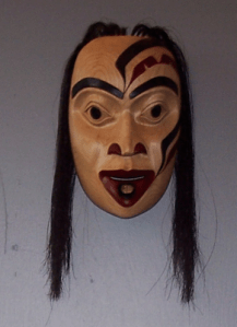
Close to the door were masks by people whose work I have bought in the past. John Wilson contributed his hawk woman mask to the show, which I had seen pictures of, but was glad to see in person:

Wilson also contributed a large spoon, whose beaver handle included more detail work than I had seen before in his work:

Besides Wilson’s mask hung Colin Morrison’s second mask, whose red design made the wood look like a sun-tan, and contrasted with the white hair he used:

Moving on from Wilson’s and Morrison’s masks, I quickly discovered work from artists I remembered from 2009. Previous YVR award winner Shawn Aster, whose main interest seems to be design rather than carving, contributed a mask whose interest is largely in the painting:

Second year Metis artist Mathew Daratha was one of the more prolific contributors to the show, displaying several masks, such as this one:

Still another second year student, Latham Mack, the two-times recipient of the YVR Award, was allowed to carve in his family’s traditional Nuxalk style, producing a strikingly different Thunder Mask:

Mack also danced a similar mask after the graduation ceremony.

But perhaps the most development among the second year students was shown by Sheldon Dennis, whose carving showed a considerable advance over his work last year, as well as a strong sense of originality:

Female students continue to be a minority at the school, but those enrolled in the first year class this year made a strong showing. Cherish Alexander showed a talent for combining feminine faces with bold designs:

Carol Young, the winner of the first Mature Student Award, showed a similar interest in women’s faces, and added a traditional labret to indicate high status in one of her masks:

Another first year female student, Nina Bolton chose a more traditional shape for her mask, but gave it a strong, contrasting design when she painted it:

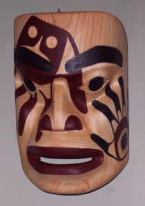
Some of the most striking work in the show was created by Chazz Mack, Latham Mack’s cousin. Chaz Mack include two pieces in the show: a small print, and a mask whose painted design shows a strong sense of line in its curves:

However, if the show had a single outstanding piece, it was Mitch Adams’ “Blue Moon Mask.” The piece was the despair of at least one of the school’s teachers, all of whom work in the northern style and favor masks with much less paint than “Blue Moon Mask,” but its clean lines and carefully selected palette made it a crowd favorite, with at least half a dozen people clamoring to buy it:

When Adams agreed to sell it to me, several other would-be buyers frankly expressed their jealousy, and cursed their lack of initiative; apparently, I was the only one who actually asked Adams if he was firm about the Not For Sale label.

In fact, if the show had a fault, it was that most of the best pieces were labeled as not for sale for one reason or the other. If I had had my way, I could have returned home with another three or four pieces from this years’ show.

However, that’s a selfish wish. Many of the pieces marked as not for sale were reserved for the upcoming Northern Exposure show at Vancouver’s Spirit Wrestler Gallery. For many students, the show is their first chance to display their work to a large audience, so I can hardly blame them for withholding their work from sale. All of them thoroughly deserve that chance, and I hope that I will have many chances in the future to buy their work.

Read Full Post »

« Newer Posts - Older Posts »